Today’s card isn’t for any challenges, it just one of the cards I threw together before returning to non-stamping land.
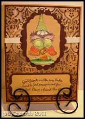 Yes, it’s another acrylic distress card, this time I used the Cuttlebug Textile folder with an Adirondack Acrylic Dabber in Gold with Walnut Stain Distress Ink. I do love this technique, and I’m still trying new colors together. I even did snowflakes with a Silver Dabber and Dusty Concord Distress……but don’t be distressed, I didn’t make anything with it yet.
Since I was pressed for time, I didn’t want to stamp & color, so I looked through some pre-stamped colored images and found this one. The image is from a SU set called Knobbly Gnomes. I don’t remember what ink I used to stamp it with, but I can tell you it was stamped on watercolor paper and colored with Twinkling H2o’s.
I cut the image out and picked out some cardstock to finish the card. The layer behind the image (lt. brown) was cut and embossed with a Nestie Label Four die. The next layer cut with a Nestie Scalloped Oval (dk. brown), a piece of grosgrain ribbon runs behind the top three layers, and wraps behind the next two layers. Next is the acrylic distress layer, backed with a dark brown layer, and the base card is the same lt. brown as the sentiment layer and the Labels Four layer.
The sentiment is from the same stamp set, stamped with Walnut Stain Distress Ink. Since the sentiment is so long, it didn’t fit on anything I had punch wise. So I tried using an EK Success punch Journal Plate, cutting a piece of paper to size, and running it up through the bottom to snip off the edge. Then layered it onto a piece of dk. brown cut to size and the corner snipped with a corner rounder punch.
Thanks for stopping by, and I really enjoy getting comments.
Happy Stamping!
judy
Another Football Frenzy card for challenge #96 at House Mouse & Friends.
 This was actually the first image I stamped to go with the acrylic distress background on yesterday’s card, but right in the middle of making yesterday’s card a new idea popped into my head and I switched images.
The main image for today’s card is a HM stamp called Chewable Aspirin. It was stamped on white cardstock with Memento Tuxedo Black ink, colored with Prismacolored pencils, then cut out. I added stickles to the ice cube and drips. The aspirin bottle cotton is a combination of two MS flocking powders (swan & pewter). The eyes were colored with a black glaze pen, and one dotted with a white gel pen, then laid aside to dry.
I started looking for sentiments to go with this image, and that is when the switcheroo of images came about, and when yesterday’s card came about.
The sentiment is from a SU set called Always In My Thoughts, stamped on white with Memento Tuxedo Black ink, then punched out with a circle punch. I decided to specify even more, so I chose the SU set Alphabits, stamped on white with Memento Tuxedo Black, then punched each letter out with a 1/4” hole punch. For this Faux Sympathy card I used Steeler colors (black, gold & white).
The footballs are from a CDS set call Accessory Fun, stamped with Memento Tuxedo Black and sponged with Vintage Photo Distress, cut out, and placed in each corner.
My Raven fan husband loved this card, it even got a chuckle out of him. I am back in non-stamping land now, and I am having withdrawal. I can’t wait to get back to my stamps.
Thanks for stopping by, and I really enjoy the comments.
Happy Stamping!
judy
Are you ready for some football? Challenge #96 at House Mouse & Friends is a football frenzy challenge.
 When I went to check on what the challenge was today, I had a great surprise….I won the last challenge! After that shock the next one was that the challenge is a football frenzy, I was lost, in more ways than one. I don’t have any HM football stamps, I don’t really like football, oh I’ll sit and watch a game with my husband every now and then, but I don’t have the slightest idea what is going on half the time. As far as a favorite team, I picked the Steelers just because my hubby doesn’t like them…..he is a Ravens fan. I have always said football is just a bunch of over paid and overgrown men running around jumping on top each other, I sure can’t see sitting around yelling at the TV when a game is on, I won’t mention any names, but his initials are husband
 . I do like the Super Bowl…..for the commercials and the half-time show. So for my card I sort of went with the green & yellow, but threw in the black & gold too.
Yes, I did yet another acrylic distress technique card, but I did try something new with it. All along I have been using the Adirondack Acrylic Dabbers, I have a whole rack of the little acrylic paint bottles like Folk Art and Apple Barrel, now call me stupid, but I was wondering if they would work too. DAH! I guess acrylic paint is acrylic paint no matter what they say. I definitely won’t have to buy anymore paint for a while. So I picked out a bottle of Apple Barrel yellow, that I thought would match the Packer color and painted my paper with a paintbrush, that I had embossed with a Cuttlebug folder from the Heritage Collection.
I know they sell the dabber tops, I have four brand new ones, that I have had for a while, I guess I’m saving them for a rainy day. Anyway, I used the heat gun to speed up drying, then sanded the paper and sponged with Peeled Paint Distress, and wiped with a damp paper towel. I am happy to say it worked like a charm. I looked through my HM stamps to see what image I could use and came up with a couple. I even made a second card, because half way through the project, another idea hit me, and I switched the original image I had for this card to this image.
I will be leaving here tomorrow and returning to non-stamping land, and won’t be able to make any new cards for a while, so the past two nights I have been up half the night trying to crank some extra cards out.
Ok, back to this card. The base card is black, the next layer is gold cut to size (the Steelers lost, so their colors in under the Packer colors) . I chose the HM stamp Mudpie Tells 02 for this card. He was stamped on white with Memento Tuxedo Black, colored with Prismacolored pencils & Goo Gone, then cut out. A black Glaze pen was used on his eye.
All three white circles were punched, then sponged around the edges with Peeled Paint Distress Ink. In my warped little brain, I chose circles for spotlighting. Doesn’t Mudpie look like he wants to giggle? Hence the sentiment from an SU set called Warm Words stamped with Peeled Paint. The letters on the big circle are brads I have had forever, and never use. The numbers were punched.
Thanks for stopping by, I really enjoy getting comments.
Happy Stamping!
judy
Today’s card is another entry for the Speedy TV challenge #56, to do a tone on tone card with the main image popped.
 I created this card a couple of days ago, trying out some new techniques. I love the Acrylic Distress Technique, and started out with a color I haven’t used for it yet (Aged Mahogany Distress). The embossing folder used is a Cuttlebug from the Heritage Collection, and the Adirondack Dabber is Pearl.
The base card is just a piece of plain cardstock matching the Distress ink. The next layer up is plain white cut to size. Then the Acrylic Distress layer. The scalloped oval was white, cut with a Nestie scalloped oval die, and sponged with Aged Mahogany. The white oval was cut and embossed with a Nestie oval die.
Since the image had to be popped, I chose something easy to cut out, a SU set called A New Little Someone. I tried something new (to me) water coloring with Distress Ink. Which you can definitely see I need practice at. The image was stamped on white with Memento Tuxedo Black ink. I dabbed the ink pad on a plastic mat and spritzed some water in it, then using a water brush colored the image with Aged Mahogany, repeating these steps for Wild Honey and Tattered Rose. Cut the image out, took a needle and black thread, and stitched the seam up the middle.
The sentiment is from the SU set Teeny Tiny Wishes. Stamped with Versamark on white and heat embossed with detail black ep, then sponged with Aged Mahogany. I was going to use Hello Baby, but thought the card too dark for a baby card, so I changed to a get well card. While writing this post, I just had the weirdest thought……..what colors do the Goth dressers use for baby cards? Can you see a baby card done in black? Maybe this could have been a Goth baby card. I can’t think about things like this now, I’ll have to think about it tomorrow.
After the card was assembled I added Stickles for the eyes, and to the bow.
Thanks for stopping by, and getting comments makes my day. If you should have an answer for the Goth baby cards please by all means leave me a comment, maybe we could start something new.
Happy Stamping!
judy
I have combined two challenges for today’s card, the first being a challenge at Speedy TV, the second is a sketch challenge from CPS.
 I already had another card made for week 56 at Speedy TV, which is tone on tone with the main image popped to post today, but when I saw the new sketch challenge #219 at CPS, I switched off and made a new card. It’s funny, but my other card has just about the same layout as the sketch challenge, and I hadn’t even looked to see what the CPS challenge was. I will probably post it tomorrow.
I have been playing around with the Acrylic Distress Technique, by trying out different colors, I just love it, as you can probably tell. Acrylic Distress is done by running your cardstock through an embossing folder, painting it with acrylic paint, after it dries sand the high spots, wipe off the dust and sponge a distress ink over the painted areas, then wipe with a damp cloth. The distress ink will not stick to the acrylic paint. If you missed some spots, or would like the raised spots to be darker, just repeat the steps.
For today’s card I chose the CDS set Dirt Rides. The 4 wheeler was stamped onto white cardstock using Versamark and heat embossing with detail black ep. Next it was colored with Prismacolored pencils and Goo Gone, afterwards I went over all of the green with a water brush dipped in perfect pearls to give it a shimmery look. It was then cut out, stickles added to the headlights and laid aside to dry.
The next two layers of white cardstock, were cut and embossed, one with a Nestie Oval die, the other with a Nestie Scalloped Oval die. A sentiment from the same stamp set was stamped with Versamark and heat embossed with detail black ep on the plain oval. The scalloped oval was sponged with Peeled Paint Distress Ink (my favorite color in the Distress line).
I used a white ribbon over a strip of white sponged with Peeled Paint behind the ovals. The ribbon wraps around the behind the next plain white layer.
Now we come to the Acrylic Distress. I chose a Cuttlebug frame embossing folder from the Heritage Collection, embossed with white cardstock, and trimmed off the outside for a different look. The acrylic paint is an Adirondack Dabber in Pearl, sponged with non other than Peeled Paint.
The white layer behind is just cut to size, with a corner rounder punch used on the corners. The base card is a green cardstock that matches the Peeled Paint.
Thanks for stopping by, I hope you enjoyed your visit, please feel free to leave a comment, they make my day.
Happy Stamping!
judy


