Sunday, April 24, 2011

First Cards

Happy Easter!!

I hope everyone is enjoying their Easter Sunday.

Today’s card is probably something that should have been thrown away, but I thought it would be funny to show it.  I ran across this card and some others, while packing stuff to move to my other house. This is one of the first cards I ever stamped.  It’s been so long ago, I do not remember the exact details, and I can’t imagine anyone would be interested in them anyway. The things I do remember are it was a pack of pre-folded white cards, and the stamps were bought at either Michaels or A.C. Moore. The black ink used to stamp the image, and green ink for the sentiment  probably came from Wal-Mart. It looks like colored pencils were used to color the image, and some gold glittered ep on the halo.
For the inside, the sentiment was stamped with green ink.
I hope you think I have improved in my card making. Thanks for stopping by, and I love getting comments.

Happy Stamping!
judy

Saturday, April 23, 2011

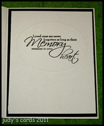
Heartfelt Sympathy Inside

Since I am in non-stamping land, and have run out of pre-stamped cards, I thought I would post the inside of the sympathy card I posted yesterday. (Heartfelt Sympathy)

You always see what everyone puts on the front of a card, but the inside can be another work of art often times not shown. Usually (unless I forget) I take a picture of the front and inside of any card I send, at least that way I don’t send the same sentiments over and over to the same person. This particular card has not been sent yet, but I know eventually it will be.

For the inside of this card I embossed a white piece of card stock cut to size with a Nestie oval, then stamped a sentiment from the CDS set Words of Sympathy with onyx black Versafine. The next layer is black with the white card base.

I hope you have a Happy Easter! Thanks for stopping by,  and I love reading your comments.

Friday, April 22, 2011

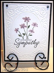
Heartfelt Sympathy

I have another sympathy card to show today. I guess I’m on a sympathy kick because I knew I had to return to my non-stamping land. At least I had these last few cards done before I left my toys. I won’t be returning to them until after Easter.

I used a Cuttlebug embossing folder from the Heritage collection to emboss the top white layer. Then I stamped the sentiment and flowers from my SU set Close as a Memory. First I stamped the sentiment using onyx black Versamark, and created a mask. The flower stamp was inked up using SU markers, and stamped above the masked sentiment. The next layer is black cut to size with a paper cutter, with a white base card. For a finishing touch a black brad was placed on each corner.

Thanks for looking and I love getting comments.

Thursday, April 21, 2011

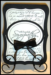
Shaped Sympathy

Today’s card is not for any contests. I decided to work on some sympathy cards. I guess you could say that is a challenge on it’s own.

I have been wanting to make a shaped card with my Nesties Labels eight die, so this was the day to try it out. I cut a piece of black cardstock, so that I could fold it in half and the die would fit on it, I placed the die just above the fold, and cut the two layers at once. The next layer of white was cut and embossed with the next size smaller die. Before removing the die, I stamped the SU background stamp French Script with onyx black Versafine, and ran a black metallic pen around the inside of the die. The next layer is just a piece of black cut with a Nestie oval. The top layer of white  was stamped with a stamp from the CDS set called Words of Sympathy. The black ribbon was wrapped around a bow easy for four loops on each side, then tied off with a black mini brad stuck through the center and through the two oval layers.

Thanks for stopping by and I’d love to hear your comments.

Wednesday, April 20, 2011

Mudpies Jellybeans

Today’s card is for the sketch challenge PTT#12  at Party Time Tuesdays, using a House Mouse stamp so I can also enter it in the House Mouse & Friends Monday challenge #93.
clip_image002

I used a House Mouse stamp called Mudpies Jellybeans, stamped on white with onyx black Versafine, and colored with Prismacolored pencils & goo gone. The jellybeans also have Crystal Lacquer on them, and a corner rounder punch was used on the corners. The image is layered on a square cut piece of blue.
clip_image004

Instead of using ribbon or a strip of paper for the red on the sketch, I chose to use a MS birds on the wire border punch, and punched the birds the same solid blue. The blue polka dot dp is from a DCWV pastel matstack, the circle was cut and embossed with a Nesties circle die, I ran a white gel pen around the inside of the die before removing. The scalloped circle is the same solid blue as the other layers, cut with a a Nestie scalloped circle die, and the white gel pen marked around the inside before removing. The sliver layer on the left of the circle hardly shows, it is from a DCWV stack called Nana’s nursery baby boy, it and the white layer beneath it were just cut to size with a paper cutter. The background dp is from a DCWV fall stack, layered on white with four flower brads at each corner. The base card is the same solid blue as the others.
I think I am really beginning to like not adding sentiments to the front of the card, it gives it a virtually limitless use.
Thanks for looking and I love hearing your comments.

Tuesday, April 19, 2011

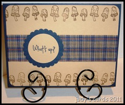
Mushrooms Up!

Today’s card isn’t for any challenges, it’s just something I was goofing around with.

I had the Hero Arts stamp set Woodland Creatures, and it had never seen ink, so I inked up two of the stamps. I used an old SCS sketch #SC29 and came up with this card. The sentiment was stamped with chipped sapphire distress ink on a beige color, then punched with a circle punch. The next layer is the same dark blue as the base card and was punched with a scallop circle punch. The next layer is plaid ribbon, I snatched from my Mother’s stash.
The next layer is the same beige as the sentiment, stamped using one of the mushroom stamps from the set in vintage photo distress ink. I used a corner rounder punch on the corners.

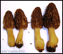
This is my first year looking for Morel mushrooms, I have been traipsing through the woods just about every day the past couple of weeks looking for them. Yesterday was opening day of turkey season here, you can only hunt until noon. So with no turkey luck, my DH and I started combing the woods for mushrooms. I have never seen any, only pictures, my DH has seen them, but I found the first one (Yeah!!). I found two, called my DH over and he found two more, here is a picture of our find (my two is on the right, the bigger ones).

Thanks for looking and I’d love to hear your comments.

Monday, April 18, 2011

Shower Bunny

Today’s card uses the SCS sketch #328 for a challenge over at Party Time Tuesdays PTT #11 (April Showers).

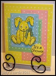
All of the paper except the white card base is from a DCWV pastel stack. Each polka dot dp has the corresponding solid color with it (except the bunny & the sentiment). The bunny from the SU set New Little Someone was stamped on yellow polka dot dp with onyx black Versafine, then again on the solid green for the bow, and cut out. It was then paper pieced back together. I also stamped the feet on solid yellow for the pads. Before I put the head back on, I used my sewing machine with black thread to stitch over the stitched lines on his belly. I colored over the green ribbon with a clear glitter pen to give it some shimmer. Googly eyes were added after the card was put together. Since I needed four layers, I went with the four different colors in the stack, and this may be dumb, but placed the layers in alphabetical order. Starting with the polka dot blue/solid blue, green polka dot/ green solid, pink polka dot/pink solid and finally the same yellow polka dot as the rabbit/solid yellow. The sentiment is from a CDS set called Designer Label Celebrations, stamped with onyx black Versafine on the solid yellow, then punched with a  circle punch. The bunny and the sentiment were popped with foam dots.

Thanks for looking and I’d love to hear your comments.

Sunday, April 17, 2011

Spoonful Hopper


This card will be entered in the House Mouse & Friends Monday Challenge #93.

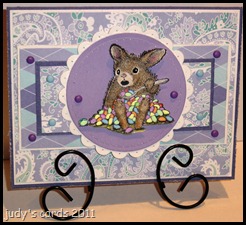
I thought the cute little HMHH stamp Spoonful of Sugar would be cute. The image was stamped on white card stock with onyx black Versafine, colored with Prismacolored pencils & goo gone, then cut out. The jelly beans were colored first with metallic gel pens and a waterbrush, but then I colored over them with different colored SoufflĂ©’ pens. I used a black glaze pen on the eyes, and a silver metallic pen for the spoon. The cut out image was popped with foam dots. The next layer is purple, the image was stamped first, and some of it colored in, then it was cut and embossed with a Nestie circle die. I paper pierced around the inside of the embossing. The next layer is white cut and embossed with a Nestie scalloped circle, each scallop was paper pierced once. The next layer is from my scrap pile (Making Memories Meg Paisley), with a darker purple layer under it. The next layer also from my scrap pile (Making Memories Meg Argyle) has a white layer behind it, and then I repeat the Paisley layer with a white layer and the darker purple for a base card. I added two different colored brads on three of the layers, and I almost forgot I used the Tim Holtz distress tool on the base card and the white layer under the argyle dp. I used an old sketch from SCS SC304
I also intentionally left off the sentiment, as my Easter cards are already done, and I don’t have enough of this paper to make the amount of cards I send out. It may be a silly rule, but for multiple cards I mail, I make them all the same, that way if somebody has something to say about it, I don’t have to worry which one they are talking about.

Thanks for looking, and I love reading your comments.

Saturday, April 16, 2011

Creative Vision DT 5 Blog Hop

Welcome to this month's Special Edition
Creative Vision's Design Team 5 Blog Hop.


There will be random prizes awarded to bloggers who post comments.
Be sure to become a Creative Vision blog follower, if you are not already, in order to be eligible for those prizes. Following the hop Laura, owner of Creative Vision, will give away a few SHOPPING SPREES! YIPPEE!

Today we will hop hop hop our way to each member's blog as they showcase
their collective talent with our hop theme -

Anything But A Card


Here is what I created for today's hop...
I was so excited about being a Guest Designer today, I have three projects to show you. First up stamped with the (old) Creative Vision stamp set Gone Hunting (a new one was just released).  I used a plain white candle and stamped the images with different color distress inks and onyx black Versafine on white tissue paper, for a hunter’s camo combination, then added it to my candle using a heat gun. Here is a list of the colors I used: live 2 hunt/peeled paint, big game hunter/frayed burlap, big old buck/vintage photo, deer/forest moss, camo king/crushed olive & brushed corduroy, camp/pine needles, deer/tea dye, deer prints/walnut stain and private property was stamped with onyx black Versafine. The only stamp I didn’t use was turkey, I ran out of room. I won’t bore you with more pictures around the candle, I think you get the idea.


Next I stamped a tile, using two different stamp sets from Clear Vision, Redneck (for the sentiments), and the foot prints from the (old) Gone Hunting set. The sentiments were stamped with Jet Black Stazon, and the footprints with Timber Brown Stazon. I glued green felt to the bottom, and then sprayed a clear matte finish over the stamped area. I will use this tile in my kitchen for a hot plate along with some others that I have stamped. If you think this is weird, I have been hunting for a long time, just about every one of my t-shirts has something to do with hunting (and I have a lot of t-shirts) I have all hunting themed ornaments on my Christmas tree, and several years ago I stamped deer, bear, moose and other hunting and some fishing related items all over my bathroom wall, including leaves in fall colors on the ceiling. The bathroom was done before I ever thought about stamping cards.

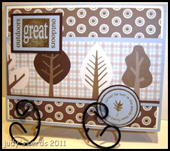
For my last project,  as a Guest Designer I was allowed to make whatever I wanted, so I also made a card, using the Clear Vision Redneck stamp set. The dp is from a DCWV Fall Stack. The sentiments were stamped on light blue with Frayed Burlap Distress ink, layered onto a dark brown. The dp (trees) was cut to size and layered on light blue, the next layer is the background circle dp, layered on white, with a light blue base card.

Thanks for stopping by, hope you enjoyed my projects.

Visit Creative Vision's Company Blog for a list of winner's tomorrow.


PLUS the Bunny Hop games winner's will be revealed as well.

Thanks for visiting now On with the hop, next up is...

Laura
followed by the rest of the design team members
D'Anne

Jenn 
Molly
Joan
Silke
GUEST DESIGNER - Judy (that is me and you are here)

Friday, April 15, 2011

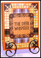
Deer Whisperer

Today’s card is another entry for challenge #2 at the Creative Clear Stamps Blog to use ribbon, you still have a little time to play along. Hopefully you have checked out their blog, you may win prizes with the Bunny Hop Game (link on right) and a blog hop on 4/16.

For this card I chose the Creative Clear Stamps set Redneck. This set and the Gone Hunting sets are right up my alley!

You might be a redneck if…....no bows were added to my entries because the only bows I associate with hunting are compound, recurve & crossbow.Smile

I chose an old SCS sketch SC255 and changed it up a tad. The colors in the picture are a little off, the base card is a bright orange, the next layer is a dark brown, it came out of my scrap pile  and had been embossed with the Cuttlebug Swiss Dots ef, it turned out to be the same size as the dp, but I liked how it showed off the punched corners on the dp. The polka dot dp was punched on each corner with a MS corner punch, I don’t know the name. I used the same solid bright orange for the layer beneath the plaid dp, and used a corner rounder punch on the plaid dp. Both pieces of dp are from a DCWV Fall Stack. The ribbon is also plaid and wrapped around the bottom four layers. The next layer is dark brown just cut to size for the top layer and also punched with a corner rounder punch. The top layer was cut to size, punched with a MS border punch and stamped with Onyx Black Versafine. I attached these two layers over the ribbon and placed four orange brads on each corner.

Thanks for stopping by and I really do love reading your comments.

Thursday, April 14, 2011

Kite Boy

Here is another entry for challenge #5 at Use It Tuesday, to use ribbon or twine, something that ties.

This is a brand new stamp set (to me)  from Crafty Secrets called Little Boy, I won this stamp set in a blog hop. The boy, kite, flowers and grass were stamped with this set, isn’t it just darling? I stamped the little boy on  white cardstock, colored with Prismacolored pencils and goo gone, then cut him out. The kite was stamped on some dp from my scrap pile, the sticks colored with SU markers, the kite string is black embroidery thread wrapped around and glued to a piece of a wooden q-tip stick, and the kite tail is something I picked up from my Mother’s stash, (not quite sure what it is, but I think it will unravel) with green ribbons tied around it. I finally found some sky dp in my stash for the background, and the green was a solid piece of cardstock stamped with the grass stamp in peeled paint distress ink. I stamped the flowers with onyx black Versafine, then colored the leaves with a SU marker, stamped the flowers again on white, cut them out and glued them onto the background, with an added touch of yellow and orange stickles. I wanted something else for the sky, so I dug out an old SU set called In The Sky, I think I have had this forever, I know I have never used it, because I had to mount it first. The sun was stamped on a bright yellow cardstock, with onyx black Versafine, then spritzed with a spiced marmalade and copper  pearl spray, I mixed up.  The sentiment is from another Crafty Secrets set called Fishing Buds, it was stamped on the same green with Versamark and embossed with detail white ep, then attached with two flower brads, dipped in Versamark and embossed with detail white ep, and a dab of stickles in the center. The scene is layered onto a piece of solid yellowish-orange, with a dark blue base card.

Creative Clear Stamps Blog
Check out the Creative Clear Stamps Blog, they have a Bunny Hop Game going on (I have a link top right), and you may win prizes. On Saturday 4/16 there will be a blog hop. I’m so excited, as I will be one of the guest participants, the theme for the Creative Clear Stamps is non-card projects. As a guest I am allowed to make cards, I have three projects to show, only one is a card.

 Recipe for Pearl Spray

You will need a mini mister, drop in a small scoop of perfect pearls, an entire dropper full of your favorite color distress inker, finish filling mini mister with water. I add a small bead to help mix it up, by shaking, as the perfect pearls settles to the bottom. When spritzing, make sure you have the mister pointed in the right direction!! I luckily haven't sprayed myself in the face yet, but it could easily be done, and even though I think I have it pointed in the right direction, I either spray to the right or left of what I want to spray, so you want to make sure you are spraying on something easily wiped up, not something the spray will stain.

Thanks for looking, and I love reading your comments.

Wednesday, April 13, 2011

Berry Full

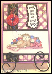
Here is another card for challenge #5 at Use It Tuesday. Siobhan had asked me to make a card using ribbon/twine something that ties, as a guest designer for winning challenge #3. My first card Old Corset is showcased on the challenge page.  I wanted to make another card, since I had used the sentiments on the Old Corset card before, making sure before even beginning this one was totally unused items.
 
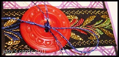
For this card I used a House Mouse Stamp called Berry Full Mudpie, that I have had for years and it’s never seen ink. It was colored with Prismacolored pencils & goo gone, cut to size, Milled Lavender Distress ink was sponged around the edges, then it was layered on black. The ribbon is brand new to me, but I’m sure it has been around for a while, I raided my Mother’s stash of ribbons the other week when I was at her house, I only walked away with two boxes full, and it hardly made a dent. I guess it’s considered ribbon, it’s so fancy with the green, red & blue metallic threads. Here is a close-up.
 
I don’t sew, as you can probably tell from the cards I have done with a sewing machine, so unless it’s in the package with a name on it I just call it whatever suits me. I chose a brand new piece of unused dp from my stash, it came from a DCWV Flower Shower Spring Stack, it’s layered on black with a purple base card. Another something I have never done before is use a button on a card, I do know how to sew buttons on that’s a piece of cake compared to a sewing machine. This button was snatched from my MIL’s button bag. The blue metallic cord was also something I snatched at my Mother’s, so that is also something I have never used, and it matched the blue in the ribbon perfectly. I have three gold brads in the top right corner, that doesn’t show up too well, instead of putting them in a straight row, I offset the middle one using a SU Mat pack template. I guess the dp is creating an optical illusion, they don’t look equally spaced. I have used the gold brads before. Now we are down to the sentiment, it’s from The Rubbernecker Stamp Company’s Laundry Days collection called Those Days Text, I don’t believe I have ever used this either, but my sense of humor tends to make me use something like this, so I’m not positive on this stamp. I originally stamped it on black with Versamark and embossed with jeweled gold ep, but when I took the picture, you couldn’t tell what it said, so I removed it, stamped on white with Onyx Black Versafine, cut it out using a pair of SU mountain deckle scissors, which I may have never used, as a matter of fact I haven’t even touched them in years, other than packing and unpacking, when moving my craft stuff from my other house. The edges was sponged with Milled Lavender Distress Ink, then it was layered onto black also cut with the same scissors.

Tuesday, April 12, 2011

Old Corset

As a winner of challenge #3 at Use It Tuesday, Siobhan contacted me about a guest designer spot for challenge #4, but I was unable to have one finished before the deadline, since I was in my non-stamping land,  so she graciously let me work on challenge #5, that will go live today at Use It Tuesday. Today's  challenge is to use ribbon, twine something that ties. This card was actually finished on April 1st.

When I returned to my stamping land I found I had lost my mojo, so I quickly checked out some challenge blogs and started with a simple sketch, after I had finished a few cards, I was almost positive that my mojo had returned. On April 1st, I had a break in trying to create cards fast, for challenges that was coming to an end, and was working on a piece for my Easter cards. Since I received the message from Siobhan at Use It Tuesday, I had been trying to think about what I would create, and with a lost mojo was getting nowhere fast. But in the Use It Tuesday tradition, I was creating cards with stamps I had never used…..ok there was a couple of images I had stamped before, but hadn’t ever used them for anything, but I hadn’t come up with anything for ribbon or twine, something that tied. All of a sudden, it was like a lightning bolt in my head……I thought of the corset for the challenge, and the Easter card got put to the side.

I have had this Cuttlebug corset die for a few years now, and the only time it was used, was to cut a sample for my punch/die notebook. Sometimes I wonder why I buy these things, then never use them, it must have been some great idea……..that got lost in the shuffle. For this one I’m glad using the corset did get lost, it resurfaced at the perfect time!
I started with some red cardstock, cut the corset out, then sat there looking at it, I wanted to stamp something on it, I have two lace background stamps, but the images were just too big, so I settled for a SU set Beyond the Basics (little roses that I have never used), they were stamped with Fired Brick Distress ink. I had in mind to run 1/8” ribbon through the holes, so I decided to add eyelets, from  a collection I bought years ago, and the only time it has ever been opened, was to see if there was some unusual color that matched something I was working on, so I’m positive I haven’t used these red eyelets. I wanted to run black ribbon, but wouldn’t you know it, with tons of ribbon, I didn’t have any 1/8” black, so I settled for the red. My first idea was to stamp inside the corset, but it would be way too much trouble to unlace the ribbon to see it. I sponged Vintage Photo Distress ink around all of the edges. My next idea was to use a Spellbinders Impressibilities – Flourish. I’ve never used this one before before, the instructions said it works best with 65# paper, so I dug some out, (not a big selection) and came up with this yellowish color, after I ran it through the Cuttlebug I sponged Antique Linen distress over the embossed side. Next I cut a layer of black, it started out with a white base card, but just didn’t look right, I could have sponged the Fired Brick on it, but changed to a red base card. This is the first time I have made my own card this size, the others I have made were store bought white. Now it’s time for the sentiment. I thought the sentiments from the GKD set You know you’re old when were perfect…….then it hit me, I have used those sentiments before. Oh well, I am hoping all the other firsts will compensate. I stamped the two sentiments together on red cut out with a Quick Kutz Nameplate die, using Vintage Photo Distress Ink, then cut the black layer, added two red brads and 1/4” black ribbon.

Check out the Bunny Hop Blog Game link on the right for a chance to win prizes, and there will be a blog hop at the  Creative Clear Stamp Blog on 4/16, also they are having their second challenge to use ribbon on a card.

Thanks for stopping by, I would love to hear your comments.

Monday, April 11, 2011

Buggin’ Butterfly

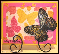
This is a card I did on March 31, for the Spotted Canary Spring Challenge over at SCS. I didn’t post it that day, as I was running out of time for the challenge.  It took me over an hour to make this card, and the worst part is the butterfly was already done. Making cards is so time consuming.

I thought I would make one last ditch effort for the Spotted Canary Spring Challenge. I used a butterfly previously done with my own version of the Faux Cloisonné Technique. I stamped on a magazine page with Versamark, but used black ep in place of gold. Instead of cutting the dp (from a DCWV Spring Stack) with the Nesties Labels 8, I cut the bright pink to make a frame, and placed it over top of the dp. A MS butterfly punch was used to punch the little butterflies around the frame from a piece of the scrap dp. The sentiment is from a CDS set called Bugs and Kisses, it was stamped with onyx black Versafine. The base card is a bright yellow.
 
Thanks for looking and any comments.

Sunday, April 10, 2011

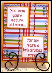
Certificate Renewal

Today’s card is another try at the Creative Clear Stamps blog challenge #2.

This time I chose to use Creative Clear Stamps sentiments You are old when and Your age requires for my images. I stamped the sentiments on white cardstock with Fired Brick Distress Ink, used a 1-7/8 square punch to punch them out, then lightly sponged more Fired Brick around the edges. The sentiments were layered on  a solid yellowish orange paper semi-matching the stripes on the dp. The ribbon, if you can call it that….it’s more a ribbon/lace combo, red checked ribbon down the center with lacey scallops trimmed in red, anyways I recently snatched this roll and quite a few other rolls of ribbons and some lace from my Mother’s stash. She was hoarding them for crafts, some she has probably had for twenty years, and have been wanting to use this red checked one on something every since I snatched it. The striped dp is from a DCWV Summer stack, layered on red with a base card the same yellowish color as the layers under the sentiment. If you have read very many of my posts, where a sewing machine has been involved, you will know that a sewing machine is not my friend. Well, I decided to try the sewing machine again, I threaded it with some red thread, and started with a straight stitch down each side of the red checked ribbon, then I went for the edges of the dp and red layer with a zig-zag stitch. I think I wound up having to rethread the needle a couple times. My sewing machine might have come to the conclusion it was about to be tossed out a window, and decided to behave accordingly. I added three blue brads to the opposite corners for some extra oomph!

I think this one turned out better than the card I submitted yesterday, but they still seem to be lacking something. I think I have gotten used to using more than one dp, so these are kind of boring.

Thanks for stopping by, and I love reading your comments.

Saturday, April 9, 2011

Redneck Marriage

Today’s card is for the 2nd challenge (ribbon themed) at the Creative Clear Stamps Blog.

I chose to use the Creative Clear Stamp set Redneck. I looked up some past sketches at SCS and came up with SC30. The sentiment We interrupt this marriage was stamped with Walnut Stain Distress Ink on a rust colored solid paper, trimmed to size, and punched with a MS corner punch on the ends to give it a fancy tag look, it was layered onto solid green trimmed up and a corner rounder punch used on the corners. Two copper brads were placed in the holes left from the corner punch on each end. The sentiment to bring you Deer season was also stamped with Walnut Stain Distress ink on rust colored solid paper, with the corners rounded, and a piece of solid green cut for the layer.  I placed a rifle brad above the sentiment and a deer brad below. The deer ribbon is wrapped around the background layers. The plaid background dp is from a DCWV Fall stack, layered on the same solid green as used for layering the sentiments. The base card is the same solid rust color as the sentiments were stamped on.
There was this great idea in my little pea brain, but it just didn’t turn out as well as I had hoped it would. I guess I’ll just have to try again. I’m thinking, I should have reversed the ribbon and sentiments, as the ribbon looks offset, I chose the ribbon mainly for the deer.

Thanks for stopping by, and I really do love reading your comments.

Friday, April 8, 2011

Crafty Bouquet

Today’s card is for the Crafty Secrets challenge at SCS, using sketch #SK040211 from Paper Craft Planet.

I chose the Crafty Secrets stamp set Bouquets of Joy to work with. The main image was stamped on white card stock, colored with Prismacolored pencils & goo gone, then cut and embossed with Nesties Labels Two. After I embossed, I cut off the embossed part, then cut a layer of purple to take it’s place. For the next couple of layers, I dug into my hoarded dp. The first piece is from Making Memories Meg Argyle, bought as single sheets, cut and embossed with the same Nestie die, and the embossed part cut off afterwards, then layered onto the purple. The background dp is also from Making Memories called Meg Paisley. I also had this paper in pink & green, since pink is my least favorite color started using it first, but I do believe the pink & green is a better looking combo. The background dp was layered onto white with a purple base card. The sentiment from the same Crafty Secrets set was stamped in Dusty Concord Distress Ink on purple paper, then punched with a SU small oval punch. The card was rather blah looking, so I decided to use an unopened roll of ribbon in a teal color, and also used a SU horizontal slot punch, that I don’t think I have ever used (except to make an example in my punch notebook) to run the ribbon through. The card still looked rather blah, so I dug into a stash of flower petals, from some artificial flowers I bought and ripped apart for the blossoms and stuck a yellow brad in the center. After the card was assembled, I added yellow Stickles to the centers of the flowers in the bouquet and on top of the yellow brad. I also used a purple metallic pen on the dress dots, and a black glaze pen for the shoes.

Thanks for looking, and I do love reading the comments.

Thursday, April 7, 2011

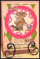
Fancy Funds

I had some House Mouse stamps laid out already, so I decided to do yet another card for the House Mouse & Friends Monday Challenge #92.

This started out as, what I thought would be a really cute card…………but, now that it is finished, I think it should have been a bigger card, I tried to cram to much into a small card.
I chose the House Mouse Happy Hopper stamp Fancy Pants, stamped on white card stock with jet black Stazon, then colored with Prismacolored pencils & goo gone. I used a black glaze pen with a dot from a white gel pen for the eye, and the pearls are colored with a white gel pen, then a clear glitter pen. The lipstick was added with a SU marker. When I was trying to figure out how I wanted to cut the image out, a circle came to mind, then I thought of a circle medallion that I hadn’t used after making. Since the circle medallion was pink, I chose some dp that I have used before from my scrap pile, both of which were bought as single sheets. So I have the pink circle medallion, layered onto the image, which was layered onto a pink & green paisley dp, that was layered onto white, then layered onto the pink & green argyle dp, also layered onto white, with a lt. pink card base. I paired this Happy Hopper with another MFT set called Tote-ally Fantastic, for the sentiment and purses. The sentiment “Girls Just Wanna Have Funds, and the purses were stamped on white with onyx black Versafine. The purses were then colored with Prismacolored Pencils & Goo Gone, and cut out. For the sentiment, I cut a piece of white cardstock to the width of a SU word window punch, stamped the sentiment, then placed each end up through the bottom of the punch and clipped off the ends. I placed a white mini brad with each purse to make them look like they are hanging (I hope).

To see how I made the circle medallion please see this post Flopsey Be Mine.

Thanks for looking, and I love hearing your comments.

Wednesday, April 6, 2011

Farm Kisses


Today’s card is for the Stamp TV sketch challenge STVSKSP20.
clip_image002

I  chose the GKD set Funny Farm, stamped the farm scene on white paper with Onyx Black Versafine, then colored with SU markers. The image is layered on dark blue, the under layer of green was punched with a MS border punch, then I have a layer of dp from a DCWV Spring Matstack, again layered on green, with a dark blue base card. After attaching the layers, I used the SU mat pack template and pierced holes down both sides of the image and stitched with embroidery thread for cross-stitches. Added three red brads on the bottom left and the sentiment from the same set was stamped on white with Onyx Black Versafine, then punched with a SU word window punch.

Thanks for looking, I’d love to hear your comments.

Tuesday, April 5, 2011

Gone Hunting

Today’s project is another card for the brand new challenge at Paper Crafting with Creative Vision blog the theme is monochromatic.
clip_image001

I chose the Clear Vision stamp set Gone Hunting. With the three images I picked out, an old sketch I did at Stamp TV came to mind. Since camo paper isn’t exactly monochromatic, I went with some shades of green to match the dp I picked out from a DCWV Earth Coordinating matstack, that I have had for years. This is one of the very first pack of dp’s I ever purchased.

The images were stamped on a layer of solid green with Forest Moss Distress Ink, then trimmed with a paper cutter. The next layer is dp , a semi-leaf pattern, that I trimmed so much you can’t tell what the pattern is, layered on the same solid green, with a green plaid background, layered on the same solid green, with a darker green (matching the dark stripes in the plaid dp) card base. I distressed all the edges of the dp with a Tim Holtz distressing tool. The lace is Flexi Lace Hem Tape in a leaf color, with three matching green brads top right.

Now you are probably thinking…..why lace on this manly card? Well….it doesn’t have to be a manly card, I have been hunting going on thirty-nine years, and would love to get a card like this. I am very pleased with it (patting myself on the shoulder…..I hope I don’t break my arm). Just today my husband and I was out walking in the woods, looking for turkey sign and mushrooms, then we went trout fishing. The trout fishing was more like we took our poles for a walk, I didn’t catch a thing, he caught two, some of my fingers might be longer than the fish he caught, but it was great to have nice weather and to be out in the woods.

Thanks for stopping by, and I’d love to hear your comments.

Monday, April 4, 2011

Seed Shooter

Here is another card for the House Mouse & Friends challenge #92.

I chose to use a House Mouse Happy Hopper called Seed Shooter, it was stamped on white with Jet Black Stazon, colored with Prismacolored pencils & goo gone, then cut out with a Nesties Label Six die, I went around the inside of the die with a red metallic Gelly Roll pen, before removing the paper. I did not emboss this one, as a part of the image would have been in the way, just like I didn’t complete the line on the left side. The dp is from a DCWV Summer Stack, I thought the watermelon slices went perfectly with the image, layered onto a dark red, then repeated for the next layers, the base card is green. I paired this stamp up with two different watermelon images from an old SU set called Country Angel, they were stamped on white, colored with Prismacolored pencils & goo gone, and cut out. I used two circle punches, different sizes, to punch the dark red layer for the watermelon cutouts. The sentiment is from what seems to be my most used sentiment set lately, SU’s Teeny Tiny Wishes, stamped on the dark red with Onyx Black Versafine, and punched with a SU Word Window punch. I re-stamped the top half of the image onto the other layers, so the shooting seed could still be seen, then went over it with a black glaze pen, also touched up the rabbit’s eye, and the seeds in the watermelon.

Thanks for stopping by, and I’d love to hear your comments.

Sunday, April 3, 2011

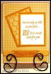
Birthdays Suck

Today’s card is for a brand new challenge at the Creative Clear Stamps blog. I also used the sketch challenge #SK040211 at the Paper Craft Planet Blog.

The Creative Clear Stamps blog challenge is to create a monochromatic card, you get two entries if you use their stamps. For this card I chose one of their sentiment stamps Feeling Old, it was stamped on white card stock with Wild Honey Distress Ink, cut and embossed with a Nesties rectangle die, then the Wild Honey Distress was sponged around the edges. I picked out solid colored paper that matched and used it for the layers, instead of using a Nestie, I just trimmed it up to fit, it doesn’t really show up, but the Distress Ink was sponged around the edges of the two solid rectangles…….I forgot to do it on the birthday labelSad smile. Both the flower and checked dp is from my scrap pile and most likely from some DCWV stack. The checked dp is layered onto a piece of white, just peeking around the edges. The base card is the same color as the layers, I guess you could call it a mustard color. The birthday sentiment is an unknown stamp, it was stamped on that same mustard paper with Wild Honey Distress Ink, cut and embossed with a Spellbinders Ribbon Tag Trio die, then the polka dotted ribbon was run through and wrapped around to the back of the layers.

Thanks for stopping by, I’d love to hear your comments.

Saturday, April 2, 2011

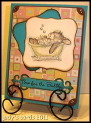
Bubbly Time

Today’s card is for sketch challenge #SK040211 at the Paper Craft Planet Blog.

I just couldn’t seem to get a good picture of it, I took like twenty pictures, moving around the room for better lighting. The bubbles are really sparkly in real life. I used another House Mouse stamp, this time a Happy Hoppers called Relaxing Bubbles. It was stamped on white cardstock with jet black Stazon, then colored with Prismacolored pencils & goo gone. The blue outline is a blue chalk from a Pebbles Pearlescent Chalks – Shimmers collection. The image and turquoise layer was then cut and embossed with Nesties Labels One and sponged around the edges with Vintage Photo Distress Ink. The dp is from a DCWV The Spring Matstack, layered on brown. The corners of the dp was punched with a ticket corner punch, and the corners on the brown with a corner rounder punch. The base card is the same turquoise as the other pieces. The sentiment is from a MFT set Time For the Bubbly, stamped on turquoise with Vintage Photo Distress Ink, the cut and embossed with a Spellbinder Fancy Label die. After the card was all together, I added three different Stickles to the bubbles (frosted lace, crystal & stardust), and the bling on the corners.

Thanks for looking, and I’d love to hear your comments.

Friday, April 1, 2011

Twinkle Toes

Today’s card is for the House Mouse & Friends Monday Challenge #92.
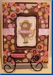
I chose the House Mouse stamp called Twinkle Toes Amanda for my main image.  I had fun doing the pastel embossing technique yesterday, so I thought I’d give it another whirl. This isn’t really  the pastel embossing technique, because I forgot you are supposed to use a solid image, I tried embossing on black, with a different image but there was too much open space, so I switched to this image stamped on two different pieces of white cardstock with jet black Stazon, used the blender pen with my SU Stampin Pastels and colored in the images. I added some pink Pebbles Pearlescent Chalk from the Shimmer collection on the tutu of the image that was cut out. So my top layer is a cut-out image of Amanda popped up with foam dots on a layer of white, also stamped and colored with chalk cut and embossed with Mega Nesties curved rectangles, a pink Gelly Roll Stardust pen was used on the inside of the die before removing. Next layer is brown cut & embossed with the next size Nestie, with a white gel pen run around the inside of the die before removing. My next layer is some dp I picked out after I colored the mouse, which was no big deal, I just looked for something with pink and brown. I ran across this piece from a DCWV 8x8 Extreme Paper Stack. The hard part was matching the solid colors to the dp. Since pink is my least favorite color, I really had to dig to find something that matched. The dp reminded me of the Cuttlebug embossing folder Bloom Dots, so I decided what the heck, I embossed the dp using the Bloom Dots folder. Under the dp is a brown layer same as the brown Nestie layer, The base card is white. For the sketch I needed to add two something's on opposite corners, I took it a littler further by adding photo corners on each corner, I used the SU photo corner punch, and made the bigger ones pink the smaller ones out of the dp, then added three brads to each corner matching the yellowish color in the dp. I have to look hard at this card to see the other colors that are in the dp, when I just glance at it I just see the dark brown and lots of pink. I added the white & brown Nestie layers, so I could figure out placement for my flowers. I used the SU Mat pack template to place the flowers outside the brown layer. For flowers, I went to my stash, mostly purple, yellow, red & white. I did have a little jar of pink ones, but they weren’t the right color, so I grabbed two jars of white. My flower collection consists of artificial flowers,  that I bought and ripped apart, anybody would think I had a Adams Family thing going, but I threw the stems away, just kept the blossoms to use on cards. Each flower has three layers plus a brad. I used white flowers and colored them with Victorian Velvet Distress ink. The center petal was inked the most to make it darker and is actually put on upside down, it makes it curl inward. The second petal is probably hard to see, it wasn’t inked as much, and for the outside petal I tried to just run the ink around the outside edges, but it doesn’t look white anymore. The card looked like it needed something else, so I came up with the Darice adhesive backed ribbon from my stash, I was able to lift the sides of the brown Nestie layer enough to place a piece under on each side and wrap around to the back of the big brown piece. Now I’m ready to add the layers to the base card, I run my ATG tape all the way around and was getting ready to put it in place, when I realized…….DAH you haven’t added the sentiment!! Now what? I can’t lay it down the tape will stick, I added the stupid flowers, which cut off room for a Spellbinders label. So I fell back on my SU Teeny Tiny Wishes set again…….it’s great for small spaces. The Victorian Velvet didn’t show up good enough to suit me on the pink, so I stamped the sentiment with Walnut Stain Distress ink, and punched with the SU word window punch. It looked lost, so I tried the SU small oval punch on a scrap piece of paper, it not only fit in the space, but the punched out sentiment fit on it perfectly, so I punched a piece of matching brown, attached the pink sentiment, punched two holes for brown brads. I decided to pop up the sentiment, so I went ahead and placed the taped layers onto the base card, and popped the sentiment with foam dots.

Thanks for stopping by, I’d love to hear your comments.