This card is for sketch challenge #SC337 at SCS.
 The sentiment is from a Cloud 9 Design Clear Stamp set called Simple Thoughts – Memories. Stamped with Onyx Black Versafine on a yellowish orange cardstock, cut and embossed with a Nesties rectangle die. I used a clear glitter pen around the embossed edges. The layer behind is dark red cut with a Nestie scalloped rectangle die.
The flower strip was punched with an MS border punch in a light blue, layered on top of the same yellowish orange and then the red again. I added some gemstones to the centers of the flowers.
The dp is from my scrap bin, and is most likely from a DCWV stack, layered onto the same yellowish orange with a dark red card base. Three light blue snaps are at the top right.
I almost forgot to post today, as I have signed up for a craft show in a couple of weeks, and have been throwing some things together for it.
Thanks for stopping by, and please feel free to leave me a comment, I love reading them.
Happy Stamping!
judy
The sentiment is from a Cloud 9 Design Clear Stamp set called Simple Thoughts – Memories. Stamped with Onyx Black Versafine on a yellowish orange cardstock, cut and embossed with a Nesties rectangle die. I used a clear glitter pen around the embossed edges. The layer behind is dark red cut with a Nestie scalloped rectangle die.
The flower strip was punched with an MS border punch in a light blue, layered on top of the same yellowish orange and then the red again. I added some gemstones to the centers of the flowers.
The dp is from my scrap bin, and is most likely from a DCWV stack, layered onto the same yellowish orange with a dark red card base. Three light blue snaps are at the top right.
I almost forgot to post today, as I have signed up for a craft show in a couple of weeks, and have been throwing some things together for it.
Thanks for stopping by, and please feel free to leave me a comment, I love reading them.
Happy Stamping!
judy
This card is for Use It Tuesday challenge #9 to use unused dies punches or cutouts.
 I almost laughed when I read what this challenge was. I have a lot of punches and dies and use them all of the time. Luckily I had just bought a new MS punch around the page set, and a new set of Sizzix Sizzlets dies that I haven’t used, and after this card I still haven’t used them. I got to thinking about what to do, and low and behold I did have an unused punch and an unused stamp set that had never seen ink, and they went together like peanut butter and jelly.
The top white square was punched around the edges with an EK Success Card Suits Edger punch, the corners trimmed off. The joker was then stamped with Memento Tuxedo Black Ink. I then layered this piece onto a piece of red cardstock cut to size. Using a pencil I marked where the spades and clubs were then took a black SU marker and colored circles on the red, so that they would appear to be black.
The bottom white piece was cut to size punched across the top and bottom with the same Card Suit Edger punch, then the width was trimmed. The card suits stamp was colored with SU markers and stamped above and below Jackpot, which was stamped with Peeled Paint Distress Ink, and I stamped it crooked. I punched some extra card suits in the corresponding colors and glued them in place along the left and right edge. Amazingly the punch and the card suit stamps were in the same order. The white piece then layered onto another piece of red cut to size and the corners punched with a corner rounder punch.
The main image, sentiment and the card suits stamped above and below Jackpot are from an Inkadinkado set I bought a while ago, called Games.
The two red layers were then placed on a piece of black cut to size with a white card base. I also added some extra red suits on the black, and black suits out on the edge of the bottom piece of red.
Thanks for stopping by, please feel free to leave a comment, I love reading them.
Happy Stamping!
judy
I almost laughed when I read what this challenge was. I have a lot of punches and dies and use them all of the time. Luckily I had just bought a new MS punch around the page set, and a new set of Sizzix Sizzlets dies that I haven’t used, and after this card I still haven’t used them. I got to thinking about what to do, and low and behold I did have an unused punch and an unused stamp set that had never seen ink, and they went together like peanut butter and jelly.
The top white square was punched around the edges with an EK Success Card Suits Edger punch, the corners trimmed off. The joker was then stamped with Memento Tuxedo Black Ink. I then layered this piece onto a piece of red cardstock cut to size. Using a pencil I marked where the spades and clubs were then took a black SU marker and colored circles on the red, so that they would appear to be black.
The bottom white piece was cut to size punched across the top and bottom with the same Card Suit Edger punch, then the width was trimmed. The card suits stamp was colored with SU markers and stamped above and below Jackpot, which was stamped with Peeled Paint Distress Ink, and I stamped it crooked. I punched some extra card suits in the corresponding colors and glued them in place along the left and right edge. Amazingly the punch and the card suit stamps were in the same order. The white piece then layered onto another piece of red cut to size and the corners punched with a corner rounder punch.
The main image, sentiment and the card suits stamped above and below Jackpot are from an Inkadinkado set I bought a while ago, called Games.
The two red layers were then placed on a piece of black cut to size with a white card base. I also added some extra red suits on the black, and black suits out on the edge of the bottom piece of red.
Thanks for stopping by, please feel free to leave a comment, I love reading them.
Happy Stamping!
judy
Today’s card is for the Friday Mashup challenge to do a card with a summer theme or do a card with polka dots or mash it up and do a summer card with polka dots.
 When I thought about the polka dots the first stamp I thought of was a Rubbernecker stamp Ethel in Bikini. She is wearing a polka dot bikini, and bikini’s are summertime to me.
Ethel was stamped on glossy paper with Memento Tuxedo Black ink, then colored with a Alcohol Ink Fillable Pen, filled with Blending Solution and various Alcohol Inks, then cut out.
The Sun is from an old retired SU set called Sensational Scenery, stamped with Mustard Seed Distress Ink and also cut out.
The next layer was white cut with a Nestie Label Four die, I ran a blue Gelly Roll Stardust Pen around the inside of the die before removing, Stippled Tumbled Glass in the center, then added some sand at the bottom.
The next layer is the same blue as the base card, cut out with a Nestie Label Eight die, and a white gel pen run around the inside of the die before removing.
I chose a yellow ribbon with white polka dots, ran it across the same blue as the base card, and punched the top and bottom with a MS punch around the page border punch called Cherish. Stamped the sentiment from a MFT set called Twisted Sentiments with Memento Tuxedo Black Ink. This is layered of a piece of white using the same border punch on top and bottom. Then I added two flip flop brads.
The next layer is blue with white polka dots from a DCWV stack that I have lost the cover for. I punched the corners with the MS punch around the page corner punch (Cherish). Layered onto white using the same corner punch, then layered onto the base card.
It has been a while since I have been able to play with my toys. This is my busy time, being outside cutting grass & weed eating. Since my Mother bought the house across the road in stamping land, we have two houses here to take care of, and three in non-stamping land (my Mothers, Mother-In-Law’s and mine), plus a garden. I also cut grass & weed eat at the farm that we hunt.
It’s a good thing I like cutting grass, I’m beginning to hate weed eating though. I spent five hours weed eating the other day, I had an hour for lunch, and didn’t get it finished, but let me tell you, I was about finished. I don’t think I could have pulled the cord to start the weed eater to many more times.
I was here in stamping land last week, but didn’t have time to do any stamping. My DH decided he wanted me to put a flowerbed in out back, so we hauled in two ton of topsoil. We can only carry one ton on our trailer at a time. By the time I shoveled it off of our trailer onto my cart, then shoveled it off again, I’m sure it turned into four ton. All two ton wasn’t put in the flowerbed, I spread some around in different places in the yard. The soil in the yard has been pretty sad since building the house, we still don’t have grass in some places, but it’s getting better. I also bought a bunch of flowers and planted them along with some we dug up in non-stamping land. Then I had him get me two scoops of mulch and I spread it. I ran out of mulch, money and time to get it finished.
This trip we brought down probably a ton of old sheep and steer manure, which I spread around yesterday. It looked like it was going to be a piece of cake to spread it, it was so old it mostly looked like dirt, but then it rained on it the night we got here, and made it a little difficult to shovel, but that is done. So finally I’m getting to play today.
Thanks for stopping by, I really enjoy getting comments.
Happy Stamping!
judy
When I thought about the polka dots the first stamp I thought of was a Rubbernecker stamp Ethel in Bikini. She is wearing a polka dot bikini, and bikini’s are summertime to me.
Ethel was stamped on glossy paper with Memento Tuxedo Black ink, then colored with a Alcohol Ink Fillable Pen, filled with Blending Solution and various Alcohol Inks, then cut out.
The Sun is from an old retired SU set called Sensational Scenery, stamped with Mustard Seed Distress Ink and also cut out.
The next layer was white cut with a Nestie Label Four die, I ran a blue Gelly Roll Stardust Pen around the inside of the die before removing, Stippled Tumbled Glass in the center, then added some sand at the bottom.
The next layer is the same blue as the base card, cut out with a Nestie Label Eight die, and a white gel pen run around the inside of the die before removing.
I chose a yellow ribbon with white polka dots, ran it across the same blue as the base card, and punched the top and bottom with a MS punch around the page border punch called Cherish. Stamped the sentiment from a MFT set called Twisted Sentiments with Memento Tuxedo Black Ink. This is layered of a piece of white using the same border punch on top and bottom. Then I added two flip flop brads.
The next layer is blue with white polka dots from a DCWV stack that I have lost the cover for. I punched the corners with the MS punch around the page corner punch (Cherish). Layered onto white using the same corner punch, then layered onto the base card.
It has been a while since I have been able to play with my toys. This is my busy time, being outside cutting grass & weed eating. Since my Mother bought the house across the road in stamping land, we have two houses here to take care of, and three in non-stamping land (my Mothers, Mother-In-Law’s and mine), plus a garden. I also cut grass & weed eat at the farm that we hunt.
It’s a good thing I like cutting grass, I’m beginning to hate weed eating though. I spent five hours weed eating the other day, I had an hour for lunch, and didn’t get it finished, but let me tell you, I was about finished. I don’t think I could have pulled the cord to start the weed eater to many more times.
I was here in stamping land last week, but didn’t have time to do any stamping. My DH decided he wanted me to put a flowerbed in out back, so we hauled in two ton of topsoil. We can only carry one ton on our trailer at a time. By the time I shoveled it off of our trailer onto my cart, then shoveled it off again, I’m sure it turned into four ton. All two ton wasn’t put in the flowerbed, I spread some around in different places in the yard. The soil in the yard has been pretty sad since building the house, we still don’t have grass in some places, but it’s getting better. I also bought a bunch of flowers and planted them along with some we dug up in non-stamping land. Then I had him get me two scoops of mulch and I spread it. I ran out of mulch, money and time to get it finished.
This trip we brought down probably a ton of old sheep and steer manure, which I spread around yesterday. It looked like it was going to be a piece of cake to spread it, it was so old it mostly looked like dirt, but then it rained on it the night we got here, and made it a little difficult to shovel, but that is done. So finally I’m getting to play today.
Thanks for stopping by, I really enjoy getting comments.
Happy Stamping!
judy
I hope you are enjoying your Memorial Day.
This is another card I slapped together before leaving for non-stamping land. Sadly for me it is the last card I have to show until I can return to my stamps.
 The image was a pre-stamped and colored piece I had done for another card and wound up not using. The image is from a MFT set called Owls of the Season by Stephanie Fizer. The owls, and limb stamped with Onyx Black Versafine, the leaves stamped with Peeled Paint Distress Ink. The owls were colored with Prismacolored pencils. The image was then cut out with a Nestie circle die, and before the die was removed sponged with Tumbled Glass Distress Ink. The next layer of yellow was cut with a Nestie scalloped circle die, each scallop pierced.
The sentiment is from a CDS set called Thoughtful Notes, stamped with Onyx Black Versafine on a piece of yellow cut with a Quick Kutz Label die.
The background is using pieces of scrap paper, something I saw on a video by Gina K at Stamp TV. I cut my scrap pieces to size, layered onto a piece of yellow cut to size. Cross-stitched between the two alternating dp papers, and a zig-zag stitch around the edge, all of it done by hand. I have given up on my sewing machine, it would have taken me two to three times longer to sew on this card using it. The base card is a light turquoise blue.
Thanks for stopping by, and I love getting comments.
Happy Stamping!
judy
The image was a pre-stamped and colored piece I had done for another card and wound up not using. The image is from a MFT set called Owls of the Season by Stephanie Fizer. The owls, and limb stamped with Onyx Black Versafine, the leaves stamped with Peeled Paint Distress Ink. The owls were colored with Prismacolored pencils. The image was then cut out with a Nestie circle die, and before the die was removed sponged with Tumbled Glass Distress Ink. The next layer of yellow was cut with a Nestie scalloped circle die, each scallop pierced.
The sentiment is from a CDS set called Thoughtful Notes, stamped with Onyx Black Versafine on a piece of yellow cut with a Quick Kutz Label die.
The background is using pieces of scrap paper, something I saw on a video by Gina K at Stamp TV. I cut my scrap pieces to size, layered onto a piece of yellow cut to size. Cross-stitched between the two alternating dp papers, and a zig-zag stitch around the edge, all of it done by hand. I have given up on my sewing machine, it would have taken me two to three times longer to sew on this card using it. The base card is a light turquoise blue.
Thanks for stopping by, and I love getting comments.
Happy Stamping!
judy
This is another pre-stamped colored image, I had lying around, so I slapped it on a card. I just realized I can enter it in the challenge at Clearly I Stamp for CIC28.
 The image is from a CDS set called Something to Crow About, stamped on white cardstock with Onyx Black Versafine, then watercolored using cheap metallic gel pens and a water brush. The metallic gel pens, give the image lots of shimmer. Cut out with a scalloped circle Nestie, then each scallop paper pierced. The next layer of orange was cut with a circle Nestie, and also paper pierced.
The sentiment from the same set, stamped with Soot Black Distress Ink, was set up just like the main image, but paper pierced a little more. The dp layer is from a DCWV Fall Stack, layered onto a piece of orange cut to size, with a dark brown base card. The ribbon is wrapped around and behind the dp/orange layer and a small button brad is holding the bow, made with a bow easy in place.
Thanks for stopping by, and I really enjoy getting comments.
Happy Stamping!
judy
The image is from a CDS set called Something to Crow About, stamped on white cardstock with Onyx Black Versafine, then watercolored using cheap metallic gel pens and a water brush. The metallic gel pens, give the image lots of shimmer. Cut out with a scalloped circle Nestie, then each scallop paper pierced. The next layer of orange was cut with a circle Nestie, and also paper pierced.
The sentiment from the same set, stamped with Soot Black Distress Ink, was set up just like the main image, but paper pierced a little more. The dp layer is from a DCWV Fall Stack, layered onto a piece of orange cut to size, with a dark brown base card. The ribbon is wrapped around and behind the dp/orange layer and a small button brad is holding the bow, made with a bow easy in place.
Thanks for stopping by, and I really enjoy getting comments.
Happy Stamping!
judy
Today’s card isn’t for any challenges, it just one of the cards I threw together before returning to non-stamping land.
 Yes, it’s another acrylic distress card, this time I used the Cuttlebug Textile folder with an Adirondack Acrylic Dabber in Gold with Walnut Stain Distress Ink. I do love this technique, and I’m still trying new colors together. I even did snowflakes with a Silver Dabber and Dusty Concord Distress……but don’t be distressed, I didn’t make anything with it yet.
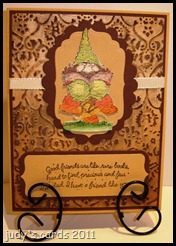
Since I was pressed for time, I didn’t want to stamp & color, so I looked through some pre-stamped colored images and found this one. The image is from a SU set called Knobbly Gnomes. I don’t remember what ink I used to stamp it with, but I can tell you it was stamped on watercolor paper and colored with Twinkling H2o’s.
I cut the image out and picked out some cardstock to finish the card. The layer behind the image (lt. brown) was cut and embossed with a Nestie Label Four die. The next layer cut with a Nestie Scalloped Oval (dk. brown), a piece of grosgrain ribbon runs behind the top three layers, and wraps behind the next two layers. Next is the acrylic distress layer, backed with a dark brown layer, and the base card is the same lt. brown as the sentiment layer and the Labels Four layer.
The sentiment is from the same stamp set, stamped with Walnut Stain Distress Ink. Since the sentiment is so long, it didn’t fit on anything I had punch wise. So I tried using an EK Success punch Journal Plate, cutting a piece of paper to size, and running it up through the bottom to snip off the edge. Then layered it onto a piece of dk. brown cut to size and the corner snipped with a corner rounder punch.
Thanks for stopping by, and I really enjoy getting comments.
Happy Stamping!
judy
Yes, it’s another acrylic distress card, this time I used the Cuttlebug Textile folder with an Adirondack Acrylic Dabber in Gold with Walnut Stain Distress Ink. I do love this technique, and I’m still trying new colors together. I even did snowflakes with a Silver Dabber and Dusty Concord Distress……but don’t be distressed, I didn’t make anything with it yet.
Since I was pressed for time, I didn’t want to stamp & color, so I looked through some pre-stamped colored images and found this one. The image is from a SU set called Knobbly Gnomes. I don’t remember what ink I used to stamp it with, but I can tell you it was stamped on watercolor paper and colored with Twinkling H2o’s.
I cut the image out and picked out some cardstock to finish the card. The layer behind the image (lt. brown) was cut and embossed with a Nestie Label Four die. The next layer cut with a Nestie Scalloped Oval (dk. brown), a piece of grosgrain ribbon runs behind the top three layers, and wraps behind the next two layers. Next is the acrylic distress layer, backed with a dark brown layer, and the base card is the same lt. brown as the sentiment layer and the Labels Four layer.
The sentiment is from the same stamp set, stamped with Walnut Stain Distress Ink. Since the sentiment is so long, it didn’t fit on anything I had punch wise. So I tried using an EK Success punch Journal Plate, cutting a piece of paper to size, and running it up through the bottom to snip off the edge. Then layered it onto a piece of dk. brown cut to size and the corner snipped with a corner rounder punch.
Thanks for stopping by, and I really enjoy getting comments.
Happy Stamping!
judy
Another Football Frenzy card for challenge #96 at House Mouse & Friends.
 This was actually the first image I stamped to go with the acrylic distress background on yesterday’s card, but right in the middle of making yesterday’s card a new idea popped into my head and I switched images.
The main image for today’s card is a HM stamp called Chewable Aspirin. It was stamped on white cardstock with Memento Tuxedo Black ink, colored with Prismacolored pencils, then cut out. I added stickles to the ice cube and drips. The aspirin bottle cotton is a combination of two MS flocking powders (swan & pewter). The eyes were colored with a black glaze pen, and one dotted with a white gel pen, then laid aside to dry.
I started looking for sentiments to go with this image, and that is when the switcheroo of images came about, and when yesterday’s card came about.
The sentiment is from a SU set called Always In My Thoughts, stamped on white with Memento Tuxedo Black ink, then punched out with a circle punch. I decided to specify even more, so I chose the SU set Alphabits, stamped on white with Memento Tuxedo Black, then punched each letter out with a 1/4” hole punch. For this Faux Sympathy card I used Steeler colors (black, gold & white).
The footballs are from a CDS set call Accessory Fun, stamped with Memento Tuxedo Black and sponged with Vintage Photo Distress, cut out, and placed in each corner.
My Raven fan husband loved this card, it even got a chuckle out of him. I am back in non-stamping land now, and I am having withdrawal. I can’t wait to get back to my stamps.
Thanks for stopping by, and I really enjoy the comments.
Happy Stamping!
judy
This was actually the first image I stamped to go with the acrylic distress background on yesterday’s card, but right in the middle of making yesterday’s card a new idea popped into my head and I switched images.
The main image for today’s card is a HM stamp called Chewable Aspirin. It was stamped on white cardstock with Memento Tuxedo Black ink, colored with Prismacolored pencils, then cut out. I added stickles to the ice cube and drips. The aspirin bottle cotton is a combination of two MS flocking powders (swan & pewter). The eyes were colored with a black glaze pen, and one dotted with a white gel pen, then laid aside to dry.
I started looking for sentiments to go with this image, and that is when the switcheroo of images came about, and when yesterday’s card came about.
The sentiment is from a SU set called Always In My Thoughts, stamped on white with Memento Tuxedo Black ink, then punched out with a circle punch. I decided to specify even more, so I chose the SU set Alphabits, stamped on white with Memento Tuxedo Black, then punched each letter out with a 1/4” hole punch. For this Faux Sympathy card I used Steeler colors (black, gold & white).
The footballs are from a CDS set call Accessory Fun, stamped with Memento Tuxedo Black and sponged with Vintage Photo Distress, cut out, and placed in each corner.
My Raven fan husband loved this card, it even got a chuckle out of him. I am back in non-stamping land now, and I am having withdrawal. I can’t wait to get back to my stamps.
Thanks for stopping by, and I really enjoy the comments.
Happy Stamping!
judy
Are you ready for some football? Challenge #96 at House Mouse & Friends is a football frenzy challenge.
 When I went to check on what the challenge was today, I had a great surprise….I won the last challenge! After that shock the next one was that the challenge is a football frenzy, I was lost, in more ways than one. I don’t have any HM football stamps, I don’t really like football, oh I’ll sit and watch a game with my husband every now and then, but I don’t have the slightest idea what is going on half the time. As far as a favorite team, I picked the Steelers just because my hubby doesn’t like them…..he is a Ravens fan. I have always said football is just a bunch of over paid and overgrown men running around jumping on top each other, I sure can’t see sitting around yelling at the TV when a game is on, I won’t mention any names, but his initials are husband
 . I do like the Super Bowl…..for the commercials and the half-time show. So for my card I sort of went with the green & yellow, but threw in the black & gold too.
Yes, I did yet another acrylic distress technique card, but I did try something new with it. All along I have been using the Adirondack Acrylic Dabbers, I have a whole rack of the little acrylic paint bottles like Folk Art and Apple Barrel, now call me stupid, but I was wondering if they would work too. DAH! I guess acrylic paint is acrylic paint no matter what they say. I definitely won’t have to buy anymore paint for a while. So I picked out a bottle of Apple Barrel yellow, that I thought would match the Packer color and painted my paper with a paintbrush, that I had embossed with a Cuttlebug folder from the Heritage Collection.
I know they sell the dabber tops, I have four brand new ones, that I have had for a while, I guess I’m saving them for a rainy day. Anyway, I used the heat gun to speed up drying, then sanded the paper and sponged with Peeled Paint Distress, and wiped with a damp paper towel. I am happy to say it worked like a charm. I looked through my HM stamps to see what image I could use and came up with a couple. I even made a second card, because half way through the project, another idea hit me, and I switched the original image I had for this card to this image.
I will be leaving here tomorrow and returning to non-stamping land, and won’t be able to make any new cards for a while, so the past two nights I have been up half the night trying to crank some extra cards out.
Ok, back to this card. The base card is black, the next layer is gold cut to size (the Steelers lost, so their colors in under the Packer colors) . I chose the HM stamp Mudpie Tells 02 for this card. He was stamped on white with Memento Tuxedo Black, colored with Prismacolored pencils & Goo Gone, then cut out. A black Glaze pen was used on his eye.
All three white circles were punched, then sponged around the edges with Peeled Paint Distress Ink. In my warped little brain, I chose circles for spotlighting. Doesn’t Mudpie look like he wants to giggle? Hence the sentiment from an SU set called Warm Words stamped with Peeled Paint. The letters on the big circle are brads I have had forever, and never use. The numbers were punched.
Thanks for stopping by, I really enjoy getting comments.
Happy Stamping!
judy
. I do like the Super Bowl…..for the commercials and the half-time show. So for my card I sort of went with the green & yellow, but threw in the black & gold too.
Yes, I did yet another acrylic distress technique card, but I did try something new with it. All along I have been using the Adirondack Acrylic Dabbers, I have a whole rack of the little acrylic paint bottles like Folk Art and Apple Barrel, now call me stupid, but I was wondering if they would work too. DAH! I guess acrylic paint is acrylic paint no matter what they say. I definitely won’t have to buy anymore paint for a while. So I picked out a bottle of Apple Barrel yellow, that I thought would match the Packer color and painted my paper with a paintbrush, that I had embossed with a Cuttlebug folder from the Heritage Collection.
I know they sell the dabber tops, I have four brand new ones, that I have had for a while, I guess I’m saving them for a rainy day. Anyway, I used the heat gun to speed up drying, then sanded the paper and sponged with Peeled Paint Distress, and wiped with a damp paper towel. I am happy to say it worked like a charm. I looked through my HM stamps to see what image I could use and came up with a couple. I even made a second card, because half way through the project, another idea hit me, and I switched the original image I had for this card to this image.
I will be leaving here tomorrow and returning to non-stamping land, and won’t be able to make any new cards for a while, so the past two nights I have been up half the night trying to crank some extra cards out.
Ok, back to this card. The base card is black, the next layer is gold cut to size (the Steelers lost, so their colors in under the Packer colors) . I chose the HM stamp Mudpie Tells 02 for this card. He was stamped on white with Memento Tuxedo Black, colored with Prismacolored pencils & Goo Gone, then cut out. A black Glaze pen was used on his eye.
All three white circles were punched, then sponged around the edges with Peeled Paint Distress Ink. In my warped little brain, I chose circles for spotlighting. Doesn’t Mudpie look like he wants to giggle? Hence the sentiment from an SU set called Warm Words stamped with Peeled Paint. The letters on the big circle are brads I have had forever, and never use. The numbers were punched.
Thanks for stopping by, I really enjoy getting comments.
Happy Stamping!
judy
Today’s card is another entry for the Speedy TV challenge #56, to do a tone on tone card with the main image popped.
 I created this card a couple of days ago, trying out some new techniques. I love the Acrylic Distress Technique, and started out with a color I haven’t used for it yet (Aged Mahogany Distress). The embossing folder used is a Cuttlebug from the Heritage Collection, and the Adirondack Dabber is Pearl.
The base card is just a piece of plain cardstock matching the Distress ink. The next layer up is plain white cut to size. Then the Acrylic Distress layer. The scalloped oval was white, cut with a Nestie scalloped oval die, and sponged with Aged Mahogany. The white oval was cut and embossed with a Nestie oval die.
Since the image had to be popped, I chose something easy to cut out, a SU set called A New Little Someone. I tried something new (to me) water coloring with Distress Ink. Which you can definitely see I need practice at. The image was stamped on white with Memento Tuxedo Black ink. I dabbed the ink pad on a plastic mat and spritzed some water in it, then using a water brush colored the image with Aged Mahogany, repeating these steps for Wild Honey and Tattered Rose. Cut the image out, took a needle and black thread, and stitched the seam up the middle.
The sentiment is from the SU set Teeny Tiny Wishes. Stamped with Versamark on white and heat embossed with detail black ep, then sponged with Aged Mahogany. I was going to use Hello Baby, but thought the card too dark for a baby card, so I changed to a get well card. While writing this post, I just had the weirdest thought……..what colors do the Goth dressers use for baby cards? Can you see a baby card done in black? Maybe this could have been a Goth baby card. I can’t think about things like this now, I’ll have to think about it tomorrow.
After the card was assembled I added Stickles for the eyes, and to the bow.
Thanks for stopping by, and getting comments makes my day. If you should have an answer for the Goth baby cards please by all means leave me a comment, maybe we could start something new.
Happy Stamping!
judy
I created this card a couple of days ago, trying out some new techniques. I love the Acrylic Distress Technique, and started out with a color I haven’t used for it yet (Aged Mahogany Distress). The embossing folder used is a Cuttlebug from the Heritage Collection, and the Adirondack Dabber is Pearl.
The base card is just a piece of plain cardstock matching the Distress ink. The next layer up is plain white cut to size. Then the Acrylic Distress layer. The scalloped oval was white, cut with a Nestie scalloped oval die, and sponged with Aged Mahogany. The white oval was cut and embossed with a Nestie oval die.
Since the image had to be popped, I chose something easy to cut out, a SU set called A New Little Someone. I tried something new (to me) water coloring with Distress Ink. Which you can definitely see I need practice at. The image was stamped on white with Memento Tuxedo Black ink. I dabbed the ink pad on a plastic mat and spritzed some water in it, then using a water brush colored the image with Aged Mahogany, repeating these steps for Wild Honey and Tattered Rose. Cut the image out, took a needle and black thread, and stitched the seam up the middle.
The sentiment is from the SU set Teeny Tiny Wishes. Stamped with Versamark on white and heat embossed with detail black ep, then sponged with Aged Mahogany. I was going to use Hello Baby, but thought the card too dark for a baby card, so I changed to a get well card. While writing this post, I just had the weirdest thought……..what colors do the Goth dressers use for baby cards? Can you see a baby card done in black? Maybe this could have been a Goth baby card. I can’t think about things like this now, I’ll have to think about it tomorrow.
After the card was assembled I added Stickles for the eyes, and to the bow.
Thanks for stopping by, and getting comments makes my day. If you should have an answer for the Goth baby cards please by all means leave me a comment, maybe we could start something new.
Happy Stamping!
judy
I have combined two challenges for today’s card, the first being a challenge at Speedy TV, the second is a sketch challenge from CPS.
 I already had another card made for week 56 at Speedy TV, which is tone on tone with the main image popped to post today, but when I saw the new sketch challenge #219 at CPS, I switched off and made a new card. It’s funny, but my other card has just about the same layout as the sketch challenge, and I hadn’t even looked to see what the CPS challenge was. I will probably post it tomorrow.
I have been playing around with the Acrylic Distress Technique, by trying out different colors, I just love it, as you can probably tell. Acrylic Distress is done by running your cardstock through an embossing folder, painting it with acrylic paint, after it dries sand the high spots, wipe off the dust and sponge a distress ink over the painted areas, then wipe with a damp cloth. The distress ink will not stick to the acrylic paint. If you missed some spots, or would like the raised spots to be darker, just repeat the steps.
For today’s card I chose the CDS set Dirt Rides. The 4 wheeler was stamped onto white cardstock using Versamark and heat embossing with detail black ep. Next it was colored with Prismacolored pencils and Goo Gone, afterwards I went over all of the green with a water brush dipped in perfect pearls to give it a shimmery look. It was then cut out, stickles added to the headlights and laid aside to dry.
The next two layers of white cardstock, were cut and embossed, one with a Nestie Oval die, the other with a Nestie Scalloped Oval die. A sentiment from the same stamp set was stamped with Versamark and heat embossed with detail black ep on the plain oval. The scalloped oval was sponged with Peeled Paint Distress Ink (my favorite color in the Distress line).
I used a white ribbon over a strip of white sponged with Peeled Paint behind the ovals. The ribbon wraps around the behind the next plain white layer.
Now we come to the Acrylic Distress. I chose a Cuttlebug frame embossing folder from the Heritage Collection, embossed with white cardstock, and trimmed off the outside for a different look. The acrylic paint is an Adirondack Dabber in Pearl, sponged with non other than Peeled Paint.
The white layer behind is just cut to size, with a corner rounder punch used on the corners. The base card is a green cardstock that matches the Peeled Paint.
Thanks for stopping by, I hope you enjoyed your visit, please feel free to leave a comment, they make my day.
Happy Stamping!
judy
I already had another card made for week 56 at Speedy TV, which is tone on tone with the main image popped to post today, but when I saw the new sketch challenge #219 at CPS, I switched off and made a new card. It’s funny, but my other card has just about the same layout as the sketch challenge, and I hadn’t even looked to see what the CPS challenge was. I will probably post it tomorrow.
I have been playing around with the Acrylic Distress Technique, by trying out different colors, I just love it, as you can probably tell. Acrylic Distress is done by running your cardstock through an embossing folder, painting it with acrylic paint, after it dries sand the high spots, wipe off the dust and sponge a distress ink over the painted areas, then wipe with a damp cloth. The distress ink will not stick to the acrylic paint. If you missed some spots, or would like the raised spots to be darker, just repeat the steps.
For today’s card I chose the CDS set Dirt Rides. The 4 wheeler was stamped onto white cardstock using Versamark and heat embossing with detail black ep. Next it was colored with Prismacolored pencils and Goo Gone, afterwards I went over all of the green with a water brush dipped in perfect pearls to give it a shimmery look. It was then cut out, stickles added to the headlights and laid aside to dry.
The next two layers of white cardstock, were cut and embossed, one with a Nestie Oval die, the other with a Nestie Scalloped Oval die. A sentiment from the same stamp set was stamped with Versamark and heat embossed with detail black ep on the plain oval. The scalloped oval was sponged with Peeled Paint Distress Ink (my favorite color in the Distress line).
I used a white ribbon over a strip of white sponged with Peeled Paint behind the ovals. The ribbon wraps around the behind the next plain white layer.
Now we come to the Acrylic Distress. I chose a Cuttlebug frame embossing folder from the Heritage Collection, embossed with white cardstock, and trimmed off the outside for a different look. The acrylic paint is an Adirondack Dabber in Pearl, sponged with non other than Peeled Paint.
The white layer behind is just cut to size, with a corner rounder punch used on the corners. The base card is a green cardstock that matches the Peeled Paint.
Thanks for stopping by, I hope you enjoyed your visit, please feel free to leave a comment, they make my day.
Happy Stamping!
judy
This card is for challenge #7 at The Friday Mashup. The challenge is to: create a project with a feminine theme, or create a card using ribbon or pearls…..or mash it up and create a feminine project with ribbon & pearls.
 As you can see, I chose all of the above. Since I am a tomboy, pink is my least favorite color, and also the color I associate with feminine stuff, like shopping, so my first choice of stamps for this project was the MFT set Tot-ally Fantastic. The sentiment is from the same set, and while I was making this card earlier today the Cyndi Lauper song “Girls just wanna have fun” popped into my head, and has stayed there all day. I think this also had to do with me picking the true (bright) colors (pun intended). I will admit I was a Cyndi Lauper fan, am I showing my age? I’d be willing to bet I’m not the only one making cards that was a Lauper fan.
The base card is a hot pink, the next layer is black, just cut to size. For the next layer the Faux Mother of Pearl Technique was done. I used a piece of saran wrap dipped into Lumiere’ and dabbed onto a piece of photo paper. After the Lumiere’ dried Spun Sugar Distress Ink was sponged over the whole piece. Then it was cut to size to layer over the black.
The same hot pink and black was cut to size to layer the main image. The pink was placed on the Faux Mother of Pearl, then a piece of hot pink ribbon by Darice was run across it and wrapped around to the back of the black layer. Next the black layer and the image piece was placed atop the ribbon. I placed a hot pink pearl from Queen & Co. on top of the ribbon on each side of the image.
The image was stamped with Memento Tuxedo Black Ink. I used my Scor-buddy to make store front bricks and to etch the sidewalk, then colored with Prismacolored pencils and Goo Gone. Who’s That Girl is wearing a designer dress by judy’s cards. I wanted to paper piece the dress, but was too lazy to look for some dp to use, so I made my own, using a SU black marker, and just colored the dress to stamp off on another piece of white, then grabbed my old SU set called Itty Bitty Backgrounds and inked up one of the stamps with the Memento Tuxedo Black, then cut it out to give her a new designer dress. The belt and dog were colored with a black SU marker. For the shoes, bracelet, and parts of the other purses a black glaze pen was used. Her purse was colored with a white glaze pen, and the pink purse was a pink glaze pen. The purse on the bottom shelf was created the same as the dress. After putting the card all together, I used Crystal Lacquer for the store window, which just about screwed the whole card up, as the Crystal Lacquer started to smear the dried black Glaze pen. I was able to salvage, it and luckily before I got to the pink purse.
The sentiment was stamped with Memento Tuxedo Black on a strip of pink, then the ends were snipped by placing them through the bottom of a SU word window punch. I just used a strip of black cut to size for the layer behind, and added two small pink pearls (Crystal Stickers) to each end.
How true is that sentiment? It is oh so very true. If that were me in the picture, and I had funds, I’d definitely be passing that store window, in hopes the next one would be a stamping supply store. Oh, who am I fooling, I wouldn’t be wearing that dress either, it would be jeans & a t-shirt, and I ‘m, pretty sure I wouldn’t have a dog that could be caught in a mousetrap either.
As you can see, I chose all of the above. Since I am a tomboy, pink is my least favorite color, and also the color I associate with feminine stuff, like shopping, so my first choice of stamps for this project was the MFT set Tot-ally Fantastic. The sentiment is from the same set, and while I was making this card earlier today the Cyndi Lauper song “Girls just wanna have fun” popped into my head, and has stayed there all day. I think this also had to do with me picking the true (bright) colors (pun intended). I will admit I was a Cyndi Lauper fan, am I showing my age? I’d be willing to bet I’m not the only one making cards that was a Lauper fan.
The base card is a hot pink, the next layer is black, just cut to size. For the next layer the Faux Mother of Pearl Technique was done. I used a piece of saran wrap dipped into Lumiere’ and dabbed onto a piece of photo paper. After the Lumiere’ dried Spun Sugar Distress Ink was sponged over the whole piece. Then it was cut to size to layer over the black.
The same hot pink and black was cut to size to layer the main image. The pink was placed on the Faux Mother of Pearl, then a piece of hot pink ribbon by Darice was run across it and wrapped around to the back of the black layer. Next the black layer and the image piece was placed atop the ribbon. I placed a hot pink pearl from Queen & Co. on top of the ribbon on each side of the image.
The image was stamped with Memento Tuxedo Black Ink. I used my Scor-buddy to make store front bricks and to etch the sidewalk, then colored with Prismacolored pencils and Goo Gone. Who’s That Girl is wearing a designer dress by judy’s cards. I wanted to paper piece the dress, but was too lazy to look for some dp to use, so I made my own, using a SU black marker, and just colored the dress to stamp off on another piece of white, then grabbed my old SU set called Itty Bitty Backgrounds and inked up one of the stamps with the Memento Tuxedo Black, then cut it out to give her a new designer dress. The belt and dog were colored with a black SU marker. For the shoes, bracelet, and parts of the other purses a black glaze pen was used. Her purse was colored with a white glaze pen, and the pink purse was a pink glaze pen. The purse on the bottom shelf was created the same as the dress. After putting the card all together, I used Crystal Lacquer for the store window, which just about screwed the whole card up, as the Crystal Lacquer started to smear the dried black Glaze pen. I was able to salvage, it and luckily before I got to the pink purse.
The sentiment was stamped with Memento Tuxedo Black on a strip of pink, then the ends were snipped by placing them through the bottom of a SU word window punch. I just used a strip of black cut to size for the layer behind, and added two small pink pearls (Crystal Stickers) to each end.
How true is that sentiment? It is oh so very true. If that were me in the picture, and I had funds, I’d definitely be passing that store window, in hopes the next one would be a stamping supply store. Oh, who am I fooling, I wouldn’t be wearing that dress either, it would be jeans & a t-shirt, and I ‘m, pretty sure I wouldn’t have a dog that could be caught in a mousetrap either.  Thanks for stopping by, and your comments make my day.
Happy Stamping!
judy
Thanks for stopping by, and your comments make my day.
Happy Stamping!
judy
I have another entry for The Friday Mashup challenge #6 to do a manly monochromatic card.
 This time I chose a H&M stamp set designed & illustrated by Heather Rolin called Just For Dad. I just love the sentiments in this set.
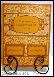
When I grow up, was stamped on mustard colored cardstock with Brushed Corduroy Distress Ink, punched with a Real Estate Sign punch by EK Success, and the edges sponged with Brushed Corduroy Distress Ink. I then used a MS corner punch (Iron Gate) , the same mustard color paper, sponged with the same ink and extended the edges. Connected it all together and added two matching colored brads through the next two layers.
The main image was attached over a layer of dp, which was layered onto a piece of solid, with eyelets of the same color placed on all four corners. All of the dp and the darker of the solid color paper on this card is from a DCWV matstack that I have lost the cover off of, but I think it was something like Earth Tones.
The background dp was layered onto a layer of the darker solid, and the base card is the same mustard color as the signs.
For eat, sleep, hunt & eat, sleep, fish a Quick Kutz Label die was used, the edges sponged and the sentiments stamped with Brushed Corduroy Distress Ink. They were then layered onto a piece of the darker cardstock.
My Dad took me hunting and fishing, he got a lot of good laughs out of the whole deal, and I have many happy memories of those days. Even after he gave them both up, I continued on. I lost my Father in 2004, and miss him terribly, but he will always be with me, especially so in the woods during hunting season, as I am trying hard to make him proud.
Thanks for stopping by, I really enjoy getting comments.
Happy Stamping!
judy
This time I chose a H&M stamp set designed & illustrated by Heather Rolin called Just For Dad. I just love the sentiments in this set.
When I grow up, was stamped on mustard colored cardstock with Brushed Corduroy Distress Ink, punched with a Real Estate Sign punch by EK Success, and the edges sponged with Brushed Corduroy Distress Ink. I then used a MS corner punch (Iron Gate) , the same mustard color paper, sponged with the same ink and extended the edges. Connected it all together and added two matching colored brads through the next two layers.
The main image was attached over a layer of dp, which was layered onto a piece of solid, with eyelets of the same color placed on all four corners. All of the dp and the darker of the solid color paper on this card is from a DCWV matstack that I have lost the cover off of, but I think it was something like Earth Tones.
The background dp was layered onto a layer of the darker solid, and the base card is the same mustard color as the signs.
For eat, sleep, hunt & eat, sleep, fish a Quick Kutz Label die was used, the edges sponged and the sentiments stamped with Brushed Corduroy Distress Ink. They were then layered onto a piece of the darker cardstock.
My Dad took me hunting and fishing, he got a lot of good laughs out of the whole deal, and I have many happy memories of those days. Even after he gave them both up, I continued on. I lost my Father in 2004, and miss him terribly, but he will always be with me, especially so in the woods during hunting season, as I am trying hard to make him proud.
Thanks for stopping by, I really enjoy getting comments.
Happy Stamping!
judy
Today’s card was inspired by two challenges I ran across. Challenge #6 at The Friday Mashup for a manly monochromatic card, and challenge #55 to do a card in monochromatic blues at Speedy TV that I just joined.
 The first thing I thought of when I read about the two challenges was a piece of dp in my scrap pile. This is my first entry to both challenges, and I’m sorry to say I don’t own any of the Mark’s Finest Paper Stamps for the Speedy TV challenge, so I chose to use a SU set called Totally Tool to go with the dp.
Since I already had the dp picked out, I sort of worked this card backwards. The base card is a light blue, with a dark blue layer between it and the dp. The dp is from a DCWV The Guy Stack, cut to layer over the dark blue. All four corners punched with a Southwest punch, and dark blue twine wrapped into each of the slots. In my stash, I had some little Card Charms tools, I picked up at Michaels on the clearance rack a while ago, so I chose the screwdriver. The handle on the screwdriver was actually a different color, but since the challenge was for monochromatic blues, I painted the handle blue, and tied it to the twine with another piece of twine
.
For the main image I chose the screwdriver and sentiment combined, stamped with Distress Embossing Ink and embossed with Faded Jeans Distress Powder, on the same blue as the base card, cut and embossed with a Nesties Label Six die, then sponged Faded Jeans Distress Ink around the edges.
Thanks for stopping by, and I really enjoy reading your comments.
Happy Stamping!
judy
The first thing I thought of when I read about the two challenges was a piece of dp in my scrap pile. This is my first entry to both challenges, and I’m sorry to say I don’t own any of the Mark’s Finest Paper Stamps for the Speedy TV challenge, so I chose to use a SU set called Totally Tool to go with the dp.
Since I already had the dp picked out, I sort of worked this card backwards. The base card is a light blue, with a dark blue layer between it and the dp. The dp is from a DCWV The Guy Stack, cut to layer over the dark blue. All four corners punched with a Southwest punch, and dark blue twine wrapped into each of the slots. In my stash, I had some little Card Charms tools, I picked up at Michaels on the clearance rack a while ago, so I chose the screwdriver. The handle on the screwdriver was actually a different color, but since the challenge was for monochromatic blues, I painted the handle blue, and tied it to the twine with another piece of twine
.
For the main image I chose the screwdriver and sentiment combined, stamped with Distress Embossing Ink and embossed with Faded Jeans Distress Powder, on the same blue as the base card, cut and embossed with a Nesties Label Six die, then sponged Faded Jeans Distress Ink around the edges.
Thanks for stopping by, and I really enjoy reading your comments.
Happy Stamping!
judy
Sometimes I think I just try to hard to come up with a card for a challenge. This one fell right into place and will be submitted for challenge #7 at Use It Tuesday to add bling. I also used sketch #SC332 from SCS.
 Maybe the fact that it has been dumping the rain down made me chose an image from an old SU set called Send A Celebration, that I have never used. After choosing that stamp, I thought of some dp I had in my scrap pile and a card started to develop.
The image was stamped on white cardstock with Versamark, embossed with detail gold embossing powder, cut and embossed with a Nesties rectangle die. Then I started coloring in the raindrops with a Sakura clear glitter pen, and also ran it around the outside embossed area of the rectangle. Next I painted the flowers with stickles. I had a bottle of Scribbles (iridescent white mist) 3D paint in with my stickles, so I figured what the heck, I painted the envelope. This piece was then set aside to dry, because I know me…..sooner or later I ‘d lay something on it or stick my hand in the wet stickles. I did have to pick it up to get a measurement for the next layer, and very carefully did so, without messing anything up, then put it back out of harms way.
The turquoise layer was just cut to size. Then I started working on my next layer. I chose yellow and a MS Punch Around the Page set called Cherish. The 3 1/4” x 3 1/4” square was too small, so I cut it in half and spread it apart, hoping I had some ribbon in my tons of ribbon stash that would cover the gap. I found some gold ribbon that was perfect, but…..I put it on with the wrong side out, because the back side had more bling than the correct side, and bling is what the challenge is about. Now back to the yellow punched layer….I decided to do what I think is called Faux Stitching, by using a Sky Star Sakura Gelly Roll pen (more bling) and connected all those little holes on the inside that were just begging to be sewn, and skipped some stitches on the outside holes.
The next layer is dp I had in my scrap pile from a DCWV Flower Shower Spring Stack, with a ticket punch used on each corner. For the next layer of turquoise I used a corner rounder punch. The base card is the same yellow as the punched layer.
By the time I had all the layers done, my image was dry, but……I had a white background, white umbrella and a painted white envelope, so I grabbed my Twinkling H2O’s for more bling and painted the umbrella and background. After the card was assembled Faux brads were created by punching a piece of scrap yellow with my Crop-A-Dial, gluing in place, then adding stickles. I then decided to add just a little more bling by coloring the rainbows and raindrops on the dp with the Sakura clear glitter pen, and wouldn’t you know it, I stuck my hand in the wet stickles on one of the Faux brads.
It is very hard to get a picture of the glitter & shimmer maybe this close-up will help a little. I believe if you click on the picture you can get a better view.
Maybe the fact that it has been dumping the rain down made me chose an image from an old SU set called Send A Celebration, that I have never used. After choosing that stamp, I thought of some dp I had in my scrap pile and a card started to develop.
The image was stamped on white cardstock with Versamark, embossed with detail gold embossing powder, cut and embossed with a Nesties rectangle die. Then I started coloring in the raindrops with a Sakura clear glitter pen, and also ran it around the outside embossed area of the rectangle. Next I painted the flowers with stickles. I had a bottle of Scribbles (iridescent white mist) 3D paint in with my stickles, so I figured what the heck, I painted the envelope. This piece was then set aside to dry, because I know me…..sooner or later I ‘d lay something on it or stick my hand in the wet stickles. I did have to pick it up to get a measurement for the next layer, and very carefully did so, without messing anything up, then put it back out of harms way.
The turquoise layer was just cut to size. Then I started working on my next layer. I chose yellow and a MS Punch Around the Page set called Cherish. The 3 1/4” x 3 1/4” square was too small, so I cut it in half and spread it apart, hoping I had some ribbon in my tons of ribbon stash that would cover the gap. I found some gold ribbon that was perfect, but…..I put it on with the wrong side out, because the back side had more bling than the correct side, and bling is what the challenge is about. Now back to the yellow punched layer….I decided to do what I think is called Faux Stitching, by using a Sky Star Sakura Gelly Roll pen (more bling) and connected all those little holes on the inside that were just begging to be sewn, and skipped some stitches on the outside holes.
The next layer is dp I had in my scrap pile from a DCWV Flower Shower Spring Stack, with a ticket punch used on each corner. For the next layer of turquoise I used a corner rounder punch. The base card is the same yellow as the punched layer.
By the time I had all the layers done, my image was dry, but……I had a white background, white umbrella and a painted white envelope, so I grabbed my Twinkling H2O’s for more bling and painted the umbrella and background. After the card was assembled Faux brads were created by punching a piece of scrap yellow with my Crop-A-Dial, gluing in place, then adding stickles. I then decided to add just a little more bling by coloring the rainbows and raindrops on the dp with the Sakura clear glitter pen, and wouldn’t you know it, I stuck my hand in the wet stickles on one of the Faux brads.
It is very hard to get a picture of the glitter & shimmer maybe this close-up will help a little. I believe if you click on the picture you can get a better view.
 Thanks for stopping by, and I’d love to hear your comments, they really make my day.
Happy Stamping!
judy
Thanks for stopping by, and I’d love to hear your comments, they really make my day.
Happy Stamping!
judy
Seems like I am stuck on using the Acrylic Distress and coloring with an Alcohol Ink Fillable Pen, but I just can’t help myself trying new combinations.
 This card was supposed to be for a challenge, but I changed my mind and just finished it like this.
The rose is from a retired SU set called Flower Garden. It was stamped with Memento Tuxedo Black on glossy cardstock, then colored with an Alcohol Ink Fillable Pen, filled with Blending Solution. I scrounged up enough palettes to have droppers of dried Alcohol Ink for each color I own, and whenever I’m ready to use them, just pull them out. The image was then cut out and embossed with a Nestie oval die. The next layer is just plain white cardstock cut out with a Nestie scalloped oval die and sponged with Chipped Sapphire Distress Ink.
Using the Acrylic Distress Technique, this time I chose a Cuttlebug folder from the Heritage Collection, ran a piece of white cardstock through it and painted with an Adirondack Acrylic Paint Dabber in Pearl. This may become my favorite Dabber as I like the shimmery effects, although I haven’t tried the gold or silver yet. After the paint dried, the raised embossing was sanded, wiped free of dust and sponged with Chipped Sapphire Distress Ink.
The next layer is just white, cut to size with a blue base card. I chose not to add a sentiment, but I think it still needs something, I just haven’t figured out what yet.
Thanks for stopping by, and I’d love to hear your comments.
Happy Stamping!
judy
This card was supposed to be for a challenge, but I changed my mind and just finished it like this.
The rose is from a retired SU set called Flower Garden. It was stamped with Memento Tuxedo Black on glossy cardstock, then colored with an Alcohol Ink Fillable Pen, filled with Blending Solution. I scrounged up enough palettes to have droppers of dried Alcohol Ink for each color I own, and whenever I’m ready to use them, just pull them out. The image was then cut out and embossed with a Nestie oval die. The next layer is just plain white cardstock cut out with a Nestie scalloped oval die and sponged with Chipped Sapphire Distress Ink.
Using the Acrylic Distress Technique, this time I chose a Cuttlebug folder from the Heritage Collection, ran a piece of white cardstock through it and painted with an Adirondack Acrylic Paint Dabber in Pearl. This may become my favorite Dabber as I like the shimmery effects, although I haven’t tried the gold or silver yet. After the paint dried, the raised embossing was sanded, wiped free of dust and sponged with Chipped Sapphire Distress Ink.
The next layer is just white, cut to size with a blue base card. I chose not to add a sentiment, but I think it still needs something, I just haven’t figured out what yet.
Thanks for stopping by, and I’d love to hear your comments.
Happy Stamping!
judy
Challenge #7 at Use It Tuesday is to add bling. I have had a lot of ideas but every time I think it’s a great idea, turns out it is a stamp I have already used.
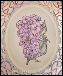
 I don’t believe I have ever used this stamp from a SU set called Flower Garden. It was stamped with Memento Tuxedo Black Ink on white cardstock, then cut and embossed with a Nestie oval die. Before removing the die I sponged Tumbled Glass Distress Ink around the image. Next I colored the image using cheap metallic ink pens with a watebrush to have shimmer. The next layer was also white, cut with a Nestie scalloped oval die, and also sponged with Tumbled Glass Distress Ink.
For the next layer, the Acrylic Distress Technique was used. The cardstock was white, it was run through the Cuttlebug with a Scrollwork embossing folder. I used an Adirondack Acrylic Paint Dabber in Pearl, sanded the raised areas, sponged Dusty Concord Distress Ink all around the frame, spritzed some water on a paper towel and wiped. The Pearl paint also has a shimmer to it. The base card is close to the Tumbled Glass color. After the card was assembled I added some yellow gems to the flower centers and clear ones to every other scallop.
I picked these little gems up at the Dollar Tree a while ago, they were with the fingernail stuff. I can’t imagine adding them to my fingernails, I almost went blind adding them to this card.
In the picture above, you can see some of the shimmer on the embossed part, but the shimmer on the flowers doesn’t show ,so here is a close-up of the shimmery flowers and the bling.
I don’t believe I have ever used this stamp from a SU set called Flower Garden. It was stamped with Memento Tuxedo Black Ink on white cardstock, then cut and embossed with a Nestie oval die. Before removing the die I sponged Tumbled Glass Distress Ink around the image. Next I colored the image using cheap metallic ink pens with a watebrush to have shimmer. The next layer was also white, cut with a Nestie scalloped oval die, and also sponged with Tumbled Glass Distress Ink.
For the next layer, the Acrylic Distress Technique was used. The cardstock was white, it was run through the Cuttlebug with a Scrollwork embossing folder. I used an Adirondack Acrylic Paint Dabber in Pearl, sanded the raised areas, sponged Dusty Concord Distress Ink all around the frame, spritzed some water on a paper towel and wiped. The Pearl paint also has a shimmer to it. The base card is close to the Tumbled Glass color. After the card was assembled I added some yellow gems to the flower centers and clear ones to every other scallop.
I picked these little gems up at the Dollar Tree a while ago, they were with the fingernail stuff. I can’t imagine adding them to my fingernails, I almost went blind adding them to this card.
In the picture above, you can see some of the shimmer on the embossed part, but the shimmer on the flowers doesn’t show ,so here is a close-up of the shimmery flowers and the bling.
 Thanks for stopping by, it really makes my day to read comments.
Happy Stamping!
judy
Thanks for stopping by, it really makes my day to read comments.
Happy Stamping!
judy
Today’s card is an entry for the House Mouse & Friends Monday challenge #95, and can also be entered at the Spotted Canary.
 The main image is a House Mouse stamp called Sweet Dreams. I stamped it on glossy paper with Memento Tuxedo Black ink, then colored with an Alcohol Ink Fillable Pen, filled with Blending Solution, and dried Alcohol Inks. After coloring, it was cut and embossed with a Nestie Curved Rectangle die, then I ran some Alcohol Ink around the embossed edge. The image was then layered onto a piece of purple cardstock embossed with the SU embossing folder Petals-A-Plenty, then layered onto a piece of yellow, with a dark purple card base. I attached three purple self stick gems instead of a sentiment.
Thanks for looking and please feel free to leave comments, I enjoy reading them.
Happy Stamping!
judy
The main image is a House Mouse stamp called Sweet Dreams. I stamped it on glossy paper with Memento Tuxedo Black ink, then colored with an Alcohol Ink Fillable Pen, filled with Blending Solution, and dried Alcohol Inks. After coloring, it was cut and embossed with a Nestie Curved Rectangle die, then I ran some Alcohol Ink around the embossed edge. The image was then layered onto a piece of purple cardstock embossed with the SU embossing folder Petals-A-Plenty, then layered onto a piece of yellow, with a dark purple card base. I attached three purple self stick gems instead of a sentiment.
Thanks for looking and please feel free to leave comments, I enjoy reading them.
Happy Stamping!
judy
Today’s card was made with two of the stamps I won at a Rubbernecker blog hop, from the generous Mr. Rubbernecker.
 The main image Ethel Nailing The Stud a new release from Rubbernecker last month, was stamped with Onyx Black Versafine on white cardstock, colored with Prismacolored pencils & Goo Gone, then cut out. Next I stamped the sentiment also a Rubbernecker new release from last month called Reward For Dog Text on white cardstock also with Onyx Black Versafine, then cut and embossed with a Nesties rectangle die.
With those done, I had to figure out what else I wanted. For the fence, I took a piece of white cardstock, grabbed my Scor-buddy and made some fence boards, then did the Acrylic Resist Technique. The cardstock was painted with an Adirondack Dabber (Snow Cap), sanded, Tea Dye Distress Ink sponged over it, wiped with a damp paper towel. I repeated the steps until I wound up with the way it looks now. A MS grass border punch finished up the bottom of the scene. For the background, a piece of white cardstock sponged with tumbled glass Distress Ink, then the tree from a Flourishes Forest of Trees stamp was inked with Peeled Paint Distress ink and stamped three times. The scene was then layered onto a piece of purple cut to size with a white card base.
After the card was put together, I added Crystal Effects to the glasses and Starry Night Stickles on the earring. The nail on the left side holding the sign up is a piece of cardstock colored with the same Prismacolored pencil that colored the other nails, and punched with a Crop-A-Dial.
I have been wanting to play with these stamps every since I received them, but being in two different houses really creates a problem. Especially when all my stamping stuff is at one house, I don’t want to carry everything back and forwards.
I’m back in my stamping land again. My DSL in non-stamping land was down with some kind of problem since Monday morning. I get back here with a different internet service, and this morning Blogger was down. I don’t know what is going on. Hopefully everything is ok now.
Thanks for stopping by, and I really enjoy reading the comments.
Happy Stamping!
judy
The main image Ethel Nailing The Stud a new release from Rubbernecker last month, was stamped with Onyx Black Versafine on white cardstock, colored with Prismacolored pencils & Goo Gone, then cut out. Next I stamped the sentiment also a Rubbernecker new release from last month called Reward For Dog Text on white cardstock also with Onyx Black Versafine, then cut and embossed with a Nesties rectangle die.
With those done, I had to figure out what else I wanted. For the fence, I took a piece of white cardstock, grabbed my Scor-buddy and made some fence boards, then did the Acrylic Resist Technique. The cardstock was painted with an Adirondack Dabber (Snow Cap), sanded, Tea Dye Distress Ink sponged over it, wiped with a damp paper towel. I repeated the steps until I wound up with the way it looks now. A MS grass border punch finished up the bottom of the scene. For the background, a piece of white cardstock sponged with tumbled glass Distress Ink, then the tree from a Flourishes Forest of Trees stamp was inked with Peeled Paint Distress ink and stamped three times. The scene was then layered onto a piece of purple cut to size with a white card base.
After the card was put together, I added Crystal Effects to the glasses and Starry Night Stickles on the earring. The nail on the left side holding the sign up is a piece of cardstock colored with the same Prismacolored pencil that colored the other nails, and punched with a Crop-A-Dial.
I have been wanting to play with these stamps every since I received them, but being in two different houses really creates a problem. Especially when all my stamping stuff is at one house, I don’t want to carry everything back and forwards.
I’m back in my stamping land again. My DSL in non-stamping land was down with some kind of problem since Monday morning. I get back here with a different internet service, and this morning Blogger was down. I don’t know what is going on. Hopefully everything is ok now.
Thanks for stopping by, and I really enjoy reading the comments.
Happy Stamping!
judy
Here is another altered item for the #3 challenge at Creative Vision, I finished after the challenge ended.
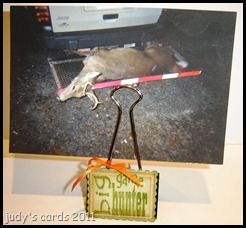 I used a stamp from the retired Gone Hunting set, inked up with peeled paint Distress Ink, stamped on white cardstock, sponged with old paper Distress Ink, cut and embossed with a Nestie rectangle die, then sponged around the edges with vintage photo Distress Ink. The next layer was also white cardstock, cut with a Nesties scalloped rectangle die, then sponged around the edges with peeled paint Distress Ink. The two layers were attached to a large binder clip. A ribbon tied into a bow around one side.
I am currently in non-stamping land and won’t have any new projects to show until I can return to my toys.
Thanks for stopping by and I really enjoy getting comments.
Happy Stamping!
judy
I used a stamp from the retired Gone Hunting set, inked up with peeled paint Distress Ink, stamped on white cardstock, sponged with old paper Distress Ink, cut and embossed with a Nestie rectangle die, then sponged around the edges with vintage photo Distress Ink. The next layer was also white cardstock, cut with a Nesties scalloped rectangle die, then sponged around the edges with peeled paint Distress Ink. The two layers were attached to a large binder clip. A ribbon tied into a bow around one side.
I am currently in non-stamping land and won’t have any new projects to show until I can return to my toys.
Thanks for stopping by and I really enjoy getting comments.
Happy Stamping!
judy
I was able to finish a couple more projects for the #3 challenge at Creative Vision for altered items, before heading back up the road to non-stamping land, unfortunately the challenge ended on Friday.
 This is a Wilton Favor Tin, with the lid decorated. For this item, I used a stamp from the Creative Vision Redneck set. It was stamped with Versamark on white cardstock, embossed with detail white ep. Next I sponged with peeled paint Distress Ink, punched out with a Marvy Uchida scallop punch, then sponged the edges with vintage photo Distress Ink. The scallops don’t show, I was just trying to get a circle that fit inside the lid. My Nesties weren’t the right size and I overlooked a couple of other plain circle punches, that may have fit.
The tin is filled with mini M&M’s, it’s the only candy I had on hand.
Thanks for stopping by and I’d love to hear your comments.
Happy Stamping
judy
This is a Wilton Favor Tin, with the lid decorated. For this item, I used a stamp from the Creative Vision Redneck set. It was stamped with Versamark on white cardstock, embossed with detail white ep. Next I sponged with peeled paint Distress Ink, punched out with a Marvy Uchida scallop punch, then sponged the edges with vintage photo Distress Ink. The scallops don’t show, I was just trying to get a circle that fit inside the lid. My Nesties weren’t the right size and I overlooked a couple of other plain circle punches, that may have fit.
The tin is filled with mini M&M’s, it’s the only candy I had on hand.
Thanks for stopping by and I’d love to hear your comments.
Happy Stamping
judy
Here is another card for the Crafty Secrets challenge at SCS to watercolor.
 I haven’t even touched my Twinkling H2O’s in years, so I drug them out first, then I grabbed a piece of watercolor paper and cut it with a Sizzix Circle Scallop Frame die which made two pieces, the scalloped circle the image is on and the red circle. The inside of the red circle is also scalloped, but you can barely tell that from the way I placed the scalloped image. The image was stamped with onyx black Versafine, and watercolored with Twinkling H2O’s (celestial sun, orange peel, hot cinnamon and olive vine). Around the outside of the duck I used iridescent blue. The entire outer ring was watercolored with hot cinnamon. I got this brilliant idea to punch holes in each scallop with my Crop-A-Dial, and figured why stop with just the center go for the outside ring too, and they can be laced together. Sometimes brilliant ideas turn out to be not so brilliant after all. I had to cut the black layer with a Nestie scalloped circle in order to hold the other pieces still enough to tie them together in the right spots. I like to use eyelets when running ribbon through the holes, it might just be me, but I think it keeps the paper from tearing easy, with the stress of pulling on the ribbon. The white eyelets are in every third hole, with yellow ribbon laced through and tied into a bow. My bows tend to come untied, so I dabbed some glue on the centers, then figured why not add some bling, the yellow gems are from a MFT Adornment pack. I think I still had challenge #6 from Use It Tuesday in my head to use fasteners, because I have eyelets, brads, mini brads, a button and faux brads on this card. I won’t enter it at Use It Tuesday though because I have used this image before. The dp and the piece of yellow behind it, is from an old DCWV matstack that I have lost the cover for, but I think it was brights. The base card is black. I used a ticket punch on the dp corners, a corner rounder punch on the yellow layer. I still had the punched holes from the red piece laying on the table, so I made faux brads, glued them in place, and later added a dot of Xmas red stickles to each one. The sentiment is from the same set stamped on a scrap of the yellow with onyx black Versafine, then punched with a SU word window punch, and a black mini brad on each side. I needed to fill in an empty spot, so I searched through my stash and came up with this heart button, it feels live velvet on a plastic button, two red brads are holding it in place.
I hope you enjoyed your visit, thanks for stopping by, I really enjoy getting comments. I will be leaving for non-stamping land this evening, I hope I can get back real soon.
Happy Stamping!
judy
I haven’t even touched my Twinkling H2O’s in years, so I drug them out first, then I grabbed a piece of watercolor paper and cut it with a Sizzix Circle Scallop Frame die which made two pieces, the scalloped circle the image is on and the red circle. The inside of the red circle is also scalloped, but you can barely tell that from the way I placed the scalloped image. The image was stamped with onyx black Versafine, and watercolored with Twinkling H2O’s (celestial sun, orange peel, hot cinnamon and olive vine). Around the outside of the duck I used iridescent blue. The entire outer ring was watercolored with hot cinnamon. I got this brilliant idea to punch holes in each scallop with my Crop-A-Dial, and figured why stop with just the center go for the outside ring too, and they can be laced together. Sometimes brilliant ideas turn out to be not so brilliant after all. I had to cut the black layer with a Nestie scalloped circle in order to hold the other pieces still enough to tie them together in the right spots. I like to use eyelets when running ribbon through the holes, it might just be me, but I think it keeps the paper from tearing easy, with the stress of pulling on the ribbon. The white eyelets are in every third hole, with yellow ribbon laced through and tied into a bow. My bows tend to come untied, so I dabbed some glue on the centers, then figured why not add some bling, the yellow gems are from a MFT Adornment pack. I think I still had challenge #6 from Use It Tuesday in my head to use fasteners, because I have eyelets, brads, mini brads, a button and faux brads on this card. I won’t enter it at Use It Tuesday though because I have used this image before. The dp and the piece of yellow behind it, is from an old DCWV matstack that I have lost the cover for, but I think it was brights. The base card is black. I used a ticket punch on the dp corners, a corner rounder punch on the yellow layer. I still had the punched holes from the red piece laying on the table, so I made faux brads, glued them in place, and later added a dot of Xmas red stickles to each one. The sentiment is from the same set stamped on a scrap of the yellow with onyx black Versafine, then punched with a SU word window punch, and a black mini brad on each side. I needed to fill in an empty spot, so I searched through my stash and came up with this heart button, it feels live velvet on a plastic button, two red brads are holding it in place.
I hope you enjoyed your visit, thanks for stopping by, I really enjoy getting comments. I will be leaving for non-stamping land this evening, I hope I can get back real soon.
Happy Stamping!
judy
This is my second post today, challenge #3 at Paper Crafting with Creative Vision is to do an altered item.
 I started this project a few days ago, and after stamping and stamping and stamping, (each time I smeared the words), I gave up. I guess I was just trying too hard to get it right. The sentiment is from a old Creative Vision stamp set called Gone Hunting.
This tile is small enough it could be a Christmas ornament, or you could add a magnet on the back. I kind of fibbed, I did get it stamped right one time, when I started, since I was thinking Christmas ornament, I stamped with Blazing Red Stazon….when I think of blazing red, I picture a fire engine. After I stamped it, the color looked pinkish to me, so I quickly wiped it off. I am, and always will be a tomboy, and pink is my least favorite color. I can’t stand the pink guns I have seen for girls, or the women’s hunting clothing with pink. To me pink is a girly girl color, those sissies that scream at the sight of a bug, not one to see out in the woods. So after that I tried and tried with olive green Stazon until I gave up.
I figured I’d work on it today, this time around I stamped with jet black Stazon, and got it right the first time. I wrapped some dark red with gold shimmer around it, glued in place with Aleene’s tacky glue, then tied a bow at the top.
I have been so busy this week getting the log home straightened up for this weekend. My DH is picking his Mother up at the Nursing Home in the morning and bringing her down for the day, some of his family will be gathered here tomorrow, and I won’t be able to play at all
I started this project a few days ago, and after stamping and stamping and stamping, (each time I smeared the words), I gave up. I guess I was just trying too hard to get it right. The sentiment is from a old Creative Vision stamp set called Gone Hunting.
This tile is small enough it could be a Christmas ornament, or you could add a magnet on the back. I kind of fibbed, I did get it stamped right one time, when I started, since I was thinking Christmas ornament, I stamped with Blazing Red Stazon….when I think of blazing red, I picture a fire engine. After I stamped it, the color looked pinkish to me, so I quickly wiped it off. I am, and always will be a tomboy, and pink is my least favorite color. I can’t stand the pink guns I have seen for girls, or the women’s hunting clothing with pink. To me pink is a girly girl color, those sissies that scream at the sight of a bug, not one to see out in the woods. So after that I tried and tried with olive green Stazon until I gave up.
I figured I’d work on it today, this time around I stamped with jet black Stazon, and got it right the first time. I wrapped some dark red with gold shimmer around it, glued in place with Aleene’s tacky glue, then tied a bow at the top.
I have been so busy this week getting the log home straightened up for this weekend. My DH is picking his Mother up at the Nursing Home in the morning and bringing her down for the day, some of his family will be gathered here tomorrow, and I won’t be able to play at all  . Since Tuesday the days have just flown by, I clean a little, play a little, then clean some more. I didn’t even realize until just a little bit ago, that today is the last day for this challenge, so I’ll have to post my other projects later. The sad news is I have to return to non-stamping land tomorrow evening , I have lots of grass to cut & weed eating to do. We wanted to get some more turkey hunting in, but unfortunate things kept popping up and preventing us from going. Spring turkey season is almost over here, and we have only been out two times.
Thanks for stopping by, and I love reading your comments.
Happy Stamping!
judy
. Since Tuesday the days have just flown by, I clean a little, play a little, then clean some more. I didn’t even realize until just a little bit ago, that today is the last day for this challenge, so I’ll have to post my other projects later. The sad news is I have to return to non-stamping land tomorrow evening , I have lots of grass to cut & weed eating to do. We wanted to get some more turkey hunting in, but unfortunate things kept popping up and preventing us from going. Spring turkey season is almost over here, and we have only been out two times.
Thanks for stopping by, and I love reading your comments.
Happy Stamping!
judy
For today’s card I combined two challenges, Crafty Secrets over at SCS to watercolor and Use It Tuesday challenge #6 to add fasteners.
 I won this stamp set from the generous Sandy Redburn, owner of Crafty Secrets, by leaving a comment at a blog hop. I used a couple of the other stamps in the set for challenge #5 at Use It Tuesday (Kite Boy), so I figured I try another card for the #6 challenge using four more unused stamps. The images aren’t actually water colored, I used an Alcohol Ink Refillable Pen on glossy paper which is supposed to give a water colored look. I tried this technique the other night, using an alcohol pen filled with plain old isopropyl alcohol 91%, I started with that pen tonight, but wound up filling another with the blending solution, to see if there was a difference, and yes there is. When applying the ink with plain alcohol, you can not go back and blend, whatever color you have on the paper that dries, stays that way, no matter how much you try and change it, but the blending solution will.
I stamped the four images from the Crafty Secrets set Little Boy with Versamark on glossy paper, applied detail black ep and heat embossed. The little boy was colored first using the alcohol filled pen. After I finished coloring him with the pen and the dried alcohol inks that I had in my palettes, Just for kicks and giggles, I gave the boy two different colored socks, I could just picture a little boy getting dressed and grabbing socks that didn’t match, my husband does it all the time, but at least they are white. It must be a guy thing, like using a remote control. Both of the little boys socks are in the brown range, but one is more a rust color, the card holder just about blocked it when I was taking pictures.I decided to try a pen with blending solution and colored the wagon next, then the dog, poor thing it must be a mutt, next was the frog. I went back over the boy with the blending solution pen and found out it would not change what I had already done, so I added some more ink.
For the background I cut a piece of white cardstock to size, then added dots of Aleene’s Quick Dry Tacky Glue, smeared with my finger, and let it dry. Next I sponged an assortment of Distress Inks, tumbled glass, broken china, stormy sky & wild honey (for the sun) over the white, and came up with a really weird color sky. I spritzed a little water on a paper towel and wiped the ink off of the clouds. A MS grass border punch was used for the three layers of grass, the front two rows were sponged with peeled paint Distress Ink. I grabbed a large button and used an Adirondack Acrylic Paint Dabber Sunshine Yellow and painted the button, then sprinkled some glitter on it (Making Memories Scrapbook Shimmer school bus) and let it dry. The button is attached to the card with a piece of yellow ribbon. The wagon was put in place and two black buttons sewn on for wheels, next the little boy was put into place, the top half of his body has foam dots attaching him. The puppy was stuck on top of the wagon and there are foam dots behind his head. I didn’t really know where to put the frog, and I already had it cut out, so I just stuck it in the grass. The dp is from a DCWV All About Boys stack, cut to size and the corners were punched with a corner punch that I don’t know the name of, layered on a bright green with an orange base card.
Thanks for stopping by, and I love reading your comments.
Happy Stamping!
judy
I won this stamp set from the generous Sandy Redburn, owner of Crafty Secrets, by leaving a comment at a blog hop. I used a couple of the other stamps in the set for challenge #5 at Use It Tuesday (Kite Boy), so I figured I try another card for the #6 challenge using four more unused stamps. The images aren’t actually water colored, I used an Alcohol Ink Refillable Pen on glossy paper which is supposed to give a water colored look. I tried this technique the other night, using an alcohol pen filled with plain old isopropyl alcohol 91%, I started with that pen tonight, but wound up filling another with the blending solution, to see if there was a difference, and yes there is. When applying the ink with plain alcohol, you can not go back and blend, whatever color you have on the paper that dries, stays that way, no matter how much you try and change it, but the blending solution will.
I stamped the four images from the Crafty Secrets set Little Boy with Versamark on glossy paper, applied detail black ep and heat embossed. The little boy was colored first using the alcohol filled pen. After I finished coloring him with the pen and the dried alcohol inks that I had in my palettes, Just for kicks and giggles, I gave the boy two different colored socks, I could just picture a little boy getting dressed and grabbing socks that didn’t match, my husband does it all the time, but at least they are white. It must be a guy thing, like using a remote control. Both of the little boys socks are in the brown range, but one is more a rust color, the card holder just about blocked it when I was taking pictures.I decided to try a pen with blending solution and colored the wagon next, then the dog, poor thing it must be a mutt, next was the frog. I went back over the boy with the blending solution pen and found out it would not change what I had already done, so I added some more ink.
For the background I cut a piece of white cardstock to size, then added dots of Aleene’s Quick Dry Tacky Glue, smeared with my finger, and let it dry. Next I sponged an assortment of Distress Inks, tumbled glass, broken china, stormy sky & wild honey (for the sun) over the white, and came up with a really weird color sky. I spritzed a little water on a paper towel and wiped the ink off of the clouds. A MS grass border punch was used for the three layers of grass, the front two rows were sponged with peeled paint Distress Ink. I grabbed a large button and used an Adirondack Acrylic Paint Dabber Sunshine Yellow and painted the button, then sprinkled some glitter on it (Making Memories Scrapbook Shimmer school bus) and let it dry. The button is attached to the card with a piece of yellow ribbon. The wagon was put in place and two black buttons sewn on for wheels, next the little boy was put into place, the top half of his body has foam dots attaching him. The puppy was stuck on top of the wagon and there are foam dots behind his head. I didn’t really know where to put the frog, and I already had it cut out, so I just stuck it in the grass. The dp is from a DCWV All About Boys stack, cut to size and the corners were punched with a corner punch that I don’t know the name of, layered on a bright green with an orange base card.
Thanks for stopping by, and I love reading your comments.
Happy Stamping!
judy
This is the second card I made using this stamp. For the first one see Humorous Girl.
Note** When I posted this earlier, I forgot to mention I used sketch challenge #216 from CPS.
 If you didn’t see yesterday’s post, I was looking for a sentiment to use on another card, and ran across this stamp from the Inkadinkado set Humorous Birthday. A light bulb went off in my head, as this was a perfect sentiment for a birthday card I needed for this month (yesterday’s post). While making that card, I started wondering if it would have been better for her soon-to-be 19 year old daughter, so right then and there I decided to make another card using the same stamp for a July birthday card.
The main image was stamped on a piece of white cardstock with onyx black Versafine, then sponged with Distress inks. I had previously tried to do this image on glossy paper with Versamark and detail black ep, but I didn’t have a steady enough hand, the words were too hard to read…..it smeared a little, so I tossed it in the trash, only to get it out, color the image of the girl with an Alcohol Ink Refillable Pen (filled with Isopropyl Alcohol 91%) and some dried Alcohol Inks, I had poured out in a palette, then cut the image out and attached it to the sponged layer. The next layer is white, cut to size and the edges sponged with barn door Distress ink. The pink circle was cut and embossed with a Nesties circle die, then a white gel pen run around the inside of the die before removing. The next layer of white was just cut with a Nesties scalloped circle die and a black pen run around the inside before removing the die, the edges also sponged with barn door Distress ink. The background paper (white) was stamped with a SU background stamp chicken wire, inked up with an Adirondack Acrylic Paint Dabber (pitch black), then sponged with Distress Inks, layered on top of a piece of plain white with a pink base card. The sentiment is an unknown stamp, inked up with onyx black Versafine, stamped on white, then sponged with Distress Inks. I finished my little banner, by punching the ends with a square punch.
There is a video on the Ranger website for this coloring technique, only the pen is filled with blending solution.
Thanks for stopping by, and I love getting comments.
Happy Stamping!
judy
If you didn’t see yesterday’s post, I was looking for a sentiment to use on another card, and ran across this stamp from the Inkadinkado set Humorous Birthday. A light bulb went off in my head, as this was a perfect sentiment for a birthday card I needed for this month (yesterday’s post). While making that card, I started wondering if it would have been better for her soon-to-be 19 year old daughter, so right then and there I decided to make another card using the same stamp for a July birthday card.
The main image was stamped on a piece of white cardstock with onyx black Versafine, then sponged with Distress inks. I had previously tried to do this image on glossy paper with Versamark and detail black ep, but I didn’t have a steady enough hand, the words were too hard to read…..it smeared a little, so I tossed it in the trash, only to get it out, color the image of the girl with an Alcohol Ink Refillable Pen (filled with Isopropyl Alcohol 91%) and some dried Alcohol Inks, I had poured out in a palette, then cut the image out and attached it to the sponged layer. The next layer is white, cut to size and the edges sponged with barn door Distress ink. The pink circle was cut and embossed with a Nesties circle die, then a white gel pen run around the inside of the die before removing. The next layer of white was just cut with a Nesties scalloped circle die and a black pen run around the inside before removing the die, the edges also sponged with barn door Distress ink. The background paper (white) was stamped with a SU background stamp chicken wire, inked up with an Adirondack Acrylic Paint Dabber (pitch black), then sponged with Distress Inks, layered on top of a piece of plain white with a pink base card. The sentiment is an unknown stamp, inked up with onyx black Versafine, stamped on white, then sponged with Distress Inks. I finished my little banner, by punching the ends with a square punch.
There is a video on the Ranger website for this coloring technique, only the pen is filled with blending solution.
Thanks for stopping by, and I love getting comments.
Happy Stamping!
judy
While searching for a sentiment to use the other day, I ran across this stamp, after reading it, I knew right away who I would use it for, and it just so happens she has a birthday this month.
 The stamp is from an Inkadinkado set called Humorous Birthday, it was stamped on white cardstock with Onyx Black Versafine, colored with Prismacolored pencils & Goo Gone. I used a black glaze pen on the sunglasses, cut and embossed with a Nesties Label Eight die, then sponged around the edges with Vintage Photo Distress Ink. The next layer is just a piece of brown cardstock trimmed to size. The next layer is another new (to me) technique I tried from Beate John’s blog, called Acrylic Distress.
For this technique you will need cardstock, an embossing folder, acrylic paint dabber, sanding block, distress ink.
I cut a piece of white cardstock to fit a Cuttlebug embossing folder, (Textile), then ran the cardstock through the Cuttlebug. The entire piece was painted with an Adirondack Dabber (Snow Cap) Note: white on white is really hard to see, then I used a heat gun to make sure it was dry. Next I used a Tim Holtz sanding block, and ran it over the embossed areas, to take off some of the paint on the raised areas. Wipe the excess dust off the cardstock with a dry paper towel, then using a sponging tool, Vintage Photo Distress Ink was applied. On the video Beate uses a cotton rag, I used a paper towel spritzed with water and wiped the inked areas. The ink came right off of the painted areas, and left the white showing, the areas that were sanded stayed brown. It wasn’t dark enough to suit me, so I repeated the sanding and sponging. The second time around for wiping with a spritzed paper towel, I didn’t wipe as much off, as I liked this look. Next I cut and embossed with a larger Nesties Labels Eight die, then sponged the edges with Vintage Photo, The next layer is white cut to size, with a brown base card. The button is from the recipients Grandmother’s button bag, sewed on with, I guess you call it crochet thread…..I don’t crochet so I’m not sure, but I know this is the type stuff my Mother used to crochet doilies with. It’s a brownish color with a strand of gold metallic thread intertwined.
Tomorrow I will have another card using this same stamp, but a different design. While making this card, it occurred to me that perhaps the sentiment would fit her soon-to-be 19 year old daughter better, her birthday is in July. So what the heck, now I have another card instead of waiting until the last minute.
Thanks for looking and I love getting comments.
The stamp is from an Inkadinkado set called Humorous Birthday, it was stamped on white cardstock with Onyx Black Versafine, colored with Prismacolored pencils & Goo Gone. I used a black glaze pen on the sunglasses, cut and embossed with a Nesties Label Eight die, then sponged around the edges with Vintage Photo Distress Ink. The next layer is just a piece of brown cardstock trimmed to size. The next layer is another new (to me) technique I tried from Beate John’s blog, called Acrylic Distress.
For this technique you will need cardstock, an embossing folder, acrylic paint dabber, sanding block, distress ink.
I cut a piece of white cardstock to fit a Cuttlebug embossing folder, (Textile), then ran the cardstock through the Cuttlebug. The entire piece was painted with an Adirondack Dabber (Snow Cap) Note: white on white is really hard to see, then I used a heat gun to make sure it was dry. Next I used a Tim Holtz sanding block, and ran it over the embossed areas, to take off some of the paint on the raised areas. Wipe the excess dust off the cardstock with a dry paper towel, then using a sponging tool, Vintage Photo Distress Ink was applied. On the video Beate uses a cotton rag, I used a paper towel spritzed with water and wiped the inked areas. The ink came right off of the painted areas, and left the white showing, the areas that were sanded stayed brown. It wasn’t dark enough to suit me, so I repeated the sanding and sponging. The second time around for wiping with a spritzed paper towel, I didn’t wipe as much off, as I liked this look. Next I cut and embossed with a larger Nesties Labels Eight die, then sponged the edges with Vintage Photo, The next layer is white cut to size, with a brown base card. The button is from the recipients Grandmother’s button bag, sewed on with, I guess you call it crochet thread…..I don’t crochet so I’m not sure, but I know this is the type stuff my Mother used to crochet doilies with. It’s a brownish color with a strand of gold metallic thread intertwined.
Tomorrow I will have another card using this same stamp, but a different design. While making this card, it occurred to me that perhaps the sentiment would fit her soon-to-be 19 year old daughter better, her birthday is in July. So what the heck, now I have another card instead of waiting until the last minute.
Thanks for looking and I love getting comments.
Today’s card is another entry for challenge #94 at HM&F, and I can also enter it for challenge #6 at Use It Tuesday.
 When I checked out my House Mouse stamps for something I could use for this challenge, I ran across The Graduate stamp. I know the mouse isn’t moving in any way, shape or form, but to get somewhere today you must be well educated!! So I am taking that road (pun intended) for this card, I think that most graduates dream is to make something out of themselves, and an education is getting them there.
The Graduate was stamped with onyx black Versafine on white cardstock, colored with Prismacolored pencils & Goo Gone. I used a black glaze pen and a white gel pen for the eyes. For the tassel I used a Krylon 18 kt. gold leafing pen. Cut and embossed with a Nesties oval die, and before the die was removed stormy sky & peeled paint Distress Ink was sponged around the image, leaving the outer ring white.
I combined a couple of techniques for the building portion. I saw a video on the Ranger website about the alcohol ink fillable pen. I had thought about getting some of these before, but didn’t want to buy one for each color alcohol ink I have, and after seeing this video, I just had to have one. I used two palettes and put a couple drops of different colored ink in each well, to have an assortment to start out with, and let it dry. (I need more palettes to have all the colors I have handy.) I also read somewhere else, that you can use plain old alcohol the higher the percentage the better. So I filled my pen with Isopropyl Alcohol 91%. You have to use glossy paper, plain old cardstock does not work, I have not tried it on watercolor paper yet. I stamped the building image from the MFT set Going Places with Versamark and embossed with detail black ep. I tried stamping with some jet black Archival ink, that didn’t work, I didn’t bother with the onyx black Versafine, because that never wants to dry on glossy paper for me, I don’t like SU black because it looks purple instead of black, the only one that I had but didn’t try was jet black Stazon. Each building was colored with a different color alcohol ink.
The next technique I gave a try is the distressed glue technique from Beate John’s blog. When I watched this video, I thought it would be interesting to try it for clouds. I think with a little practice, it will be perfect. I used Aleene’s Quick Dry Tacky Glue, and dabbed the spots, then sort of smeared it a little with my finger, after it dried I sponged stormy sky Distress Ink over it, then wiped with a paper towel spritzed with a little water. The background paper is from a DCWV The Tradewinds matstack, sponged with vintage photo Distress Ink, layered onto white with the edges sponged with the vintage photo, and the base card is maroon. The sentiment is from the same MFT set, stamped on white with onyx black Versafine, and cut to fit the label frame. Two silver brads hold the label frame in place.
For the Use It Tuesday challenge, the MFT building stamp had never seen ink, and I had never used the label frames before, the dp is from a brand new stack, and I used two new (to me) techiniques.
Thanks for looking and I love reading your comments.
When I checked out my House Mouse stamps for something I could use for this challenge, I ran across The Graduate stamp. I know the mouse isn’t moving in any way, shape or form, but to get somewhere today you must be well educated!! So I am taking that road (pun intended) for this card, I think that most graduates dream is to make something out of themselves, and an education is getting them there.
The Graduate was stamped with onyx black Versafine on white cardstock, colored with Prismacolored pencils & Goo Gone. I used a black glaze pen and a white gel pen for the eyes. For the tassel I used a Krylon 18 kt. gold leafing pen. Cut and embossed with a Nesties oval die, and before the die was removed stormy sky & peeled paint Distress Ink was sponged around the image, leaving the outer ring white.
I combined a couple of techniques for the building portion. I saw a video on the Ranger website about the alcohol ink fillable pen. I had thought about getting some of these before, but didn’t want to buy one for each color alcohol ink I have, and after seeing this video, I just had to have one. I used two palettes and put a couple drops of different colored ink in each well, to have an assortment to start out with, and let it dry. (I need more palettes to have all the colors I have handy.) I also read somewhere else, that you can use plain old alcohol the higher the percentage the better. So I filled my pen with Isopropyl Alcohol 91%. You have to use glossy paper, plain old cardstock does not work, I have not tried it on watercolor paper yet. I stamped the building image from the MFT set Going Places with Versamark and embossed with detail black ep. I tried stamping with some jet black Archival ink, that didn’t work, I didn’t bother with the onyx black Versafine, because that never wants to dry on glossy paper for me, I don’t like SU black because it looks purple instead of black, the only one that I had but didn’t try was jet black Stazon. Each building was colored with a different color alcohol ink.
The next technique I gave a try is the distressed glue technique from Beate John’s blog. When I watched this video, I thought it would be interesting to try it for clouds. I think with a little practice, it will be perfect. I used Aleene’s Quick Dry Tacky Glue, and dabbed the spots, then sort of smeared it a little with my finger, after it dried I sponged stormy sky Distress Ink over it, then wiped with a paper towel spritzed with a little water. The background paper is from a DCWV The Tradewinds matstack, sponged with vintage photo Distress Ink, layered onto white with the edges sponged with the vintage photo, and the base card is maroon. The sentiment is from the same MFT set, stamped on white with onyx black Versafine, and cut to fit the label frame. Two silver brads hold the label frame in place.
For the Use It Tuesday challenge, the MFT building stamp had never seen ink, and I had never used the label frames before, the dp is from a brand new stack, and I used two new (to me) techiniques.
Thanks for looking and I love reading your comments.
Here is a card for Challenge #6 at Use It Tuesday, to use brads, eyelets, grommets, buttons, etc..
 When I found out what the challenge was, I thought of this stamp I bought years ago and have never used. I don’t know the company name, but the label says Ballet Dancing Doll 2003 limited edition, RS. I think I picked it up at A.C. Moore, but I’m not positive.
 Anyway, what made me think of this stamp is the movable arms & legs. The card doesn’t really look that great to me, I think I rushed through it too fast, trying too many different things at once, but I am pleased with parts of it.
I stamped the ballerina on white cardstock several times trying different things that didn’t work. Finally settling on onyx black Versafine. The skin and the blue parts were done with Prismacolored pencils & goo gone. For all of the yellow, green leaves, lips & fingernails, I used SU markers. While coloring the flowers in her hair, I thought of something I saw on the blog of Kittie Caracciolo. Of course I had to try it, I colored some scrap paper with the SU marker, then punched out holes with a 1/4” and 1/8” hole punch, glued the smaller hole in the center of the larger hole, and placed them on a mouse pad and pressed down with a dry embossing tool, then glued them in place over the stamped flowers. A dot of yellow stickles was added afterwards. For the smaller flowers, I grabbed my Crop-A-Dial and punched some more pieces.
Anyway, what made me think of this stamp is the movable arms & legs. The card doesn’t really look that great to me, I think I rushed through it too fast, trying too many different things at once, but I am pleased with parts of it.
I stamped the ballerina on white cardstock several times trying different things that didn’t work. Finally settling on onyx black Versafine. The skin and the blue parts were done with Prismacolored pencils & goo gone. For all of the yellow, green leaves, lips & fingernails, I used SU markers. While coloring the flowers in her hair, I thought of something I saw on the blog of Kittie Caracciolo. Of course I had to try it, I colored some scrap paper with the SU marker, then punched out holes with a 1/4” and 1/8” hole punch, glued the smaller hole in the center of the larger hole, and placed them on a mouse pad and pressed down with a dry embossing tool, then glued them in place over the stamped flowers. A dot of yellow stickles was added afterwards. For the smaller flowers, I grabbed my Crop-A-Dial and punched some more pieces.
 You would think the leg and arm on the right side of the stamp would go on the right and the same for the left side, well let me tell you, I have had these arms and legs off and on so many times, it’s a wonder I didn’t have to stamp them over, trying to figure out how they were supposed to be. The arms are attached with yellow brads, the legs with blue brads.
Can you tell I know absolutely nothing about ballet??
The yellow background is another something new (to me) I tried, Cuttlebug wax paper resist. Gina K has a video over at Stamp TV. Along with a sewing machine, my next item I avoid using is an iron. If I can’t wash & wear, I don’t buy, I learned that lesson a long time ago…..after melting something I was trying to iron. Anyway, I cut a piece of wax paper the size of a Cuttlebug folder, (Divine Swirls), ran it through the Cuttlebug, then placed it between two pieces of white cardstock, and ironed, next I sponged rusty hinge Distress Ink over it and wiped with a paper towel.
Having made it this far, I was at a loss at how to finish it, so I just winged it, I punched the left and right edges of the yellow with a MS punch around the page border punch (swirling lace). added a layer of white, using the same border punch, then sponged the edges with stormy sky Distress Ink. Next I have just a plain layer of black with a white base card. Next I added a punched black strip across the top. I didn’t think the four brads holding the body parts together was sufficient, so I cut another strip of black, and used the corner punch to the punch around the page set to make a tag, grabbed the Rubbernecker sentiment Flaunt It Text, stamped with Versamark, and embossed with detail white ep, added an orange mini brad to each side. Then using the Crop-A-Dial punched three holes for eyelets and added three orange eyelets.
The arms and legs are moveable, but can’t really show that in a picture, so here is another picture with them in a different position.
You would think the leg and arm on the right side of the stamp would go on the right and the same for the left side, well let me tell you, I have had these arms and legs off and on so many times, it’s a wonder I didn’t have to stamp them over, trying to figure out how they were supposed to be. The arms are attached with yellow brads, the legs with blue brads.
Can you tell I know absolutely nothing about ballet??
The yellow background is another something new (to me) I tried, Cuttlebug wax paper resist. Gina K has a video over at Stamp TV. Along with a sewing machine, my next item I avoid using is an iron. If I can’t wash & wear, I don’t buy, I learned that lesson a long time ago…..after melting something I was trying to iron. Anyway, I cut a piece of wax paper the size of a Cuttlebug folder, (Divine Swirls), ran it through the Cuttlebug, then placed it between two pieces of white cardstock, and ironed, next I sponged rusty hinge Distress Ink over it and wiped with a paper towel.
Having made it this far, I was at a loss at how to finish it, so I just winged it, I punched the left and right edges of the yellow with a MS punch around the page border punch (swirling lace). added a layer of white, using the same border punch, then sponged the edges with stormy sky Distress Ink. Next I have just a plain layer of black with a white base card. Next I added a punched black strip across the top. I didn’t think the four brads holding the body parts together was sufficient, so I cut another strip of black, and used the corner punch to the punch around the page set to make a tag, grabbed the Rubbernecker sentiment Flaunt It Text, stamped with Versamark, and embossed with detail white ep, added an orange mini brad to each side. Then using the Crop-A-Dial punched three holes for eyelets and added three orange eyelets.
The arms and legs are moveable, but can’t really show that in a picture, so here is another picture with them in a different position.
 Thanks for stopping by, and I love reading your comments.


