Sunday, January 30, 2011

More SU cards

Since I started doing challenges at CDS, Stamp TV and MFT I have been neglecting my SU sets. So today, I sat down and made myself use them. I picked out some previously made cards from sketch challenges, then picked a stamp set. For the first card I chose the retired SU set Wisecracks. As it turns out the sketch card I picked to use is the current sketch challenge, and the paper I picked out of my scrap pile could be used in the current color challenge. But I’ll just go with the sketch.

 I stamped the main image on white cardstock with onyx black versafine, stamped the head on an extra piece and colored with prismacolored pencils and goo gone and then cut the extra head out. The main image was cut out and embossed with a rectangle nestie. The red layer was cut and embossed with a scalloped rectangle nestie. The black layer is just a scrap piece that was the perfect size. Instead of a ribbon, a MS border punch was used on both sides of the red and white polka dot dp. A sizzix bookplate die was used for the black tag frame and a piece of white was cut to fit, and stamped with the sentiment from a SU set Teeny Tiny Wishes. I haven’t bought any SU sets since December of 2009, I don’t know if this set is retired or not. A red brad was used to attach the tag. There is a red layer under the striped dp, and the base card is black. I don’t think her wrinkly forehead is her worst problem, since adding the googly eyes, she really needs eye tuck!!

This is another card I made today using a past sketch from Stamp TV.

I spotted the dp in the scrap pile and chose the SU set A Flower For All Seasons. As I stated above, I haven’t bought any SU sets since December of 2009 and don’t know if this one is retired. The main image and sentiment was stamped with onyx black versafine and most of it was just colored with gel pens, since the image is small. The watering can was watercolored with a gel pen. The main image was then cut out and embossed with a nesaties labels four die as was the darker green behind it. A green gel pen was run around the edge of the white layer, and a clear glitter pen around the edge of the green layer before the nesties were removed.
  
Thanks for stopping by and I would love to hear your comments.

Please Vote on Birthday Card

I haven’t been using my SU sets lately, so I thought I’d get one out and make a card, by casing this recent card I made.

I started looking at dp, and decided why get something new out, when I should be using up some of my scraps, so while digging through my scrap dp, I came up with the flowered piece, it must be a single sheet, bought at either Joann’s or Michaels, on the back it had the name Paper Pizazz Garden Scattered Flowers. Then I decided that I was going to make a birthday card, using the same stamp, dp and the maroon color, as this card, that was made back in 2009, and wanted to see if it would be improved. 


Using the retired SU set Nice & Easy Notes, I started by stamping the image on white cardstock, watercoloring with gel pens, then I cut the image out with a scalloped circle nestie. Each scallop was pierced using the SU template for piercing. The maroon layer behind was cut with a nestie circle, and one of the ribbon tag trio dies, also as a base layer for the dp. I attached the dp to the maroon layer. The tag was cut in half and placed equally on each backside of the circle layers. I passed a matching ribbon through the tag holes, attached the circles to the dp layers and ran the ribbon around to the back of the dp layers. Then it was all attached to a white card base, and diamond gemstones attached to the ribbon tags on each side of the circles. Here is my new card:


Which Nice & Easy birthday card do you like the best? Please leave a comment and help me decide. Thanks for stopping by.

Saturday, January 29, 2011

Old Bra

This week’s color challenge at Stamp TV:


I had an idea in my little pea brain, and decided to try it out. I don’t know if it has ever been done before, but I’m sure if I thought of it, somebody else did too. Here is my card, I was undecided as to what exactly to do, so I just went with the color sketch.


I cut my base cardstock 5”x10” and scored in half, then used a MS punch around the page set, I don’t remember the name of. Then I threaded 1/8” ribbon through the holes all the way around and tied a bow at the top. The black layer is 4”x4” double pierced all the way around, stamped with versamark and embossed with detail white ep. The bra was stamped on red with versamark and embossed with detail black ep, then stamped over top with a stamp from the SU set Itty Bitty Backgrounds in onyx black versafine, cut out and glued to the black layer, and a white flower brad attached. The brad was a different color, I dipped it in versamark and embossed with detail white ep. Thanks for stopping by and I’d love to hear your comments.

Kitten Chalk

This week’s color challenge:

Here is my third card for this week’s color challenge at Stamp TV.

I used the kitten from the GKD set Purrr-fectly Delightful by Theresa Momber as my main image, stamped in versamark, embossed with detail black ep, and I couldn’t resist adding green eyes. The sentiment from same set was stamped in barn door red distress ink, then the image was cut out and embossed with one of the nestie label six dies. The red layer behind it was cut and embossed with a nestie oval die. The black layer was run through the cuttlebug with a cuttlebug embossing folder called scrollwork. There is a white layer behind this and the base card is red. There are four red mini brads at each corner of the black and white layer. The silk flowers are attached with white mini brads. The flowers came from an artificial stem, I tore it apart just for the flowers. The first time I took pictures of this card, while editing the scrolls on the black did not show up at all, so I took the card back to my stamp room, to figure out what to do. Since the card was put together embossing was out of the question. I finally decided on using my versamark pen, and adding white chalk to the raised parts. I used white pearlescent chalk from Pebbles, the shimmer collection. I had to brighten the photo while editing, now the red isn’t as dark, and the chalk looks more gray than white. Thanks for stopping by and for leaving any comments.

Friday, January 28, 2011

Life Sentiment

This week’s color challenge at Stamp TV:

This is my second card for this week’s color challenge at Stamp TV.

I used a sentiment from the GKD set Life is Good by Theresa Momber for my main image. It was stamped with versamark and embossed with detail black ep, then cut out an embossed with an oval nestie, and I ran a black ink pen around the edge before removing the nestie. The next layer is black also cut out with an oval nestie. The red layer was run through the cuttlebug with a cuttlebug embossing folder from the Heritage collection, then attached to the black layer behind it. I used four white mini brads in the corners and two black brads down the side in the center. The card base is white. The ribbon was made on the bow easy, and a black brad placed through the bow, red & black layers. Thanks for stopping by and leaving any comments.

Crimped Train

This week’s new color challenge at Stamp TV is:


Here is my card using the GKD stamp set Life is Good by Theresa Momber. I chose to do split negative using the train.


The white and black cardstock was cut to 3”X3” using a stamp-a-majig, the image was stamped in the same place on both copies with versamark, then the white piece was embossed with detail black, the black piece embossed with detail white. The two pieces were then cut in half, and put back together using one white piece and one black piece, on a red layer. The black layer was run through a paper crimper. The card base is red and the sentiment is from the GKD set Purrr-fectly Delightful also by Theresa Momber. Stamped in onyx black versafine on a piece of white cardstock cut out with a SU punch. The little trains are from a MS border punch, punched in black and white, and trimmed up with scissors. The smoke from the train was cut from another train image and popped on a foam dot.Thanks for stopping by and leaving any comments.

Thursday, January 27, 2011

Seashore Shaker

Since we had snow yesterday, I decided to make a warm card. The idea started forming in my head to make a shaker card with sand, for this week’s MFT sketch challenge.

Using the same technique you would use if you are making a glass ornament, so I tried it, and this is what I came up with.


Starting out, I stamped the image from the MFT set By the Seashore on a transparency film for plain copiers, I found that onyx black versafine does not work for this, I even tried heat setting it. So I used jet black stazon instead. I turned the transparency over colored with bic markers, flipped it back to the side I stamped on, dabbed white craft ink over the colored image, then embossed with detail white ep. Next I cut it and a white piece for the background with circle nesties. From there I chose my sizzix circle scallop frame and cut three pieces of cardboard from a cereal box, glued the three pieces of outside ring together, making sure all the scallops lined up. I guess you are wondering why? It's my way of making room for the shaker material to have space to move. While waiting for them to dry, I tried stippling for the first time. The background was stippled with tumbled glass, faded jeans, pumice stone and antique linen distress inks. I’ll be doing more of this, too bad it’s hidden behind the frame, it turned out looking good. My cardboard layers were dry enough to add the transparency too, so I attached it, and then had to wait for that to dry. Now I need dp, I chose a piece from the DCWV CafĂ© Mediterranean, and cut it to size. Then I chose my layer color, a light brown. The base card is a lt. blue with a (depending on the lighting) a real light green tint to it. Ok, it’s beginning to shape up, but rather blah looking. The colors look great together, but it needed something else, so I grabbed a MS corner punch (I don’t remember the name), since this particular punch has two little holes, I popped gold mini brads into those holes. Now it’s really shaping up. I chose a ribbon to match the blue color, tied a triple bow with the bow easy. The name may be a bow easy, but sometimes it’s a bow not-so-easy. I must be doing something wrong, I get it all done, take it off, and it pulls apart, when trying to fancy it up. My answer….put a brad through it, and the cardstock and it stays there. By this time, because I’m too impatient, I am fiddling with the transparency/cardboard rings again. I took a piece of the brown layer color ran it through the cuttlebug with the sizzix die and realized there was enough room to stamp the seashell images from the stamp set, they are stamped with antique linen and pumice stone distress ink. The antique linen just barely shows. Time to glue the brown stamped ring to the transparency/cardboard ring, making sure to line up everything,  and when that dried, attached the background. I left an open space at the top, before completely sealing it, and dropped a small scoop of sand (What’s a beach without sand?), stamped four more seashells in pumice stone on the brown paper, cut out and dropped them in with the sand. Perhaps I shouldn’t have put so many seashells in with the sand, or wiped the embossing buddy over them, a dryer sheet, something to take the static out, they seem to stay together instead of separating. There you have my version of a shaker card. It’s finished, time for pictures, while editing the pictures, I realized I hadn’t put a sentiment on it, so I take it back to my room, decide to use “life is a beach” from one of the MFT twisted sets. First I embossed it on transparency with antique linen distress ep for the bottom right corner, decided it looked good, why not emboss it on the dp itself. I am my own worst critic.  I should have left it with no sentiment!!! I stamped it with versamark, embossed with antique linen distress ep, it was way too light, you couldn’t tell what it said,so..... I tried distressing the distress powder with pumice stone distress ink, using my finger. The only thing distressed is me, the ink didn’t attach to the ep, but did get on the dp. Now my beautiful card (I thought so) isn’t so beautiful anymore. I won’t bother to show what it looks like now. They say “you learn something new every day”. I could have done without today’s lesson. Thanks for looking and any comments.

Wednesday, January 26, 2011

Flopsey Be Mine

Another card as I promised for the MFT challenge this week, here is the sketch we have to work with.


This card was made with the MFT set Valentine Flopsey. The card base is cream colored, the next layer a dark blue. The dp is from My Mind’s Eye Home Photo mat pack. The corners were punched with a ticket punch and silver brads placed at each corner. Next would be the ribbon, a dark blue with silver trim, the bow made with a bow easy. After removing it from the bow easy, I pierced it with a big needle and stuck the brad through it and the cardstock to hold it in place. The next layer would be the white circle the image is stamped on. Flopsey was stamped with onyx black versafine ink and colored with prismacolored pencils on a circle cut out with my nesties. For his eyes a black glaze pen was used.

 Now for the nitty gritty.  I saw this somewhere on the web, not sure where right now, so I will just jot down what I remember on how to do it. First you need a circle cut out of scrap paper, I used my nesties to cut my circle, the one I used on this card is from the standard circle large set, the next to the biggest one in that set. Once you have the circle cut out, place it on a flat surface and fold in half, then score it, open it back up and turn it ¼ turn and fold it in half again, score it, repeat this until you have eight pieces of pie. This is my template, I know the biggest two circles in this nestie set works.

Once you have your template, cut out the paper you want to use. Place the template directly over the cardstock, make sure it covers completely, do not let it move, fold the template in half, mark the edge with a pencil, (this is where the pencil marks on my template came from) repeat until you have your eight pieces of pie on the cardstock you want to work with. You will need a corner punch with the guard removed, I used an ek success punch. As far as I know it has to be one with a V-guard, not one with an L-guard, I have both types, but to look at the ones with a L-guard they don’t look like they would work. I guess I really should try sometime. Pick up the cardstock you marked with a pencil, with the pencil lines so you can see them, place the punch upside down, so you can see where you are punching. Punch between the lines. When you are done, if you are lucky the center will fall out, if not, just take a pair of scissors and snip the connecting parts, and there you have your frame.

I'm not even sure what this technique is called, but when I did this card for a challenge at Stamp TV it was called a heart medallion in the comments.

Thanks for stopping by and any comments.

Owls

This is the new sketch at MFT for this week.

For today’s card I used a set I have had for a while that has never seen ink. I had in mind something I wanted to do, started out with this set, changed sets, then back to this set again. The first time around my image wound up being too big for the bow, we are supposed to add, oh well :(, I changed to a Flopsey image, had the card all together, was about to photograph it, when this new idea popped into my head. It could have waited, but I had picked this dp out in particular for my first thought, and I can add my other image to something else. So here is my card using MFT sets Owls of the Season and the sentiment is from MFT Twisted Two.


First I cut a piece of white card stock with the scalloped circle nestie, it was not embossed as the sentiment needed the space, then the light green layer was cut with a circle nestie. The sentiment was stamped in onyx black versafine, then spun sugar distress ink was lightly sponged all over the white (which isn’t showing up in the picture). The tree branch from this set wouldn’t work, so I used my Quickkutz branches die for the limb. The two owls were stamped on a scrap piece of white, colored with prismacolored pencils & goo gone, then cut out. The owls were then stamped on the scalloped circle so they would have legs, glued the branch and owls in place, and added googly eyes to both owls. Sometimes the black dots are stuck in place and don’t move like they should, these were like that, so I placed them to look like they were looking at each other. The dp is from a DCWV Nana’s Nursery stack, it was chosen for the rabbits in the background. The dp is layered on a light green, the same as the green circle and the base card is pink. The green ribbon was tied into a bow using the bow easy. Stay tuned for another card since I have it partially done already, using the Flopsey I took off of this one. Thanks for stopping by and leaving any messages.

Tuesday, January 25, 2011

Cabin Moon

I finished another card for the sketch challenge for this week over at Stamp TV.

I wanted to use the cabin on the card I did right before this one (green eyes), but changed off at the last minute, so I did finish one using the cabin from the GKD set Life is Good by Theresa Momber. I used this cabin in a card I made this week for the Stamp TV color challenge too (life bear). I don’t think I have ever created a card using the black magic technique, but when I did the life bear card for the color challenge, I embossed the cabin on brown cardstock with white ep, and colored some of it with prismacolored pencils, then covered the roof with snow. I don’t know if life bear is considered black magic, since it’s not on black, so I figured I would give it a whirl.

The cabin was stamped on black cardstock with versamark and embossed with detail white ep, then colored with prismacolored pencils. I even colored the roof dark green, which you can’t see at all, because I decided to mask a moon with perfect pearls, and also added them to the rooftop. I colored over the moon with a blue pencil for some clouds. The windows were dotted with a white gel pen, then a yellow glaze pen. The cabin layer was then inserted into holes punched with a corner punch, on white cardstock run through an argyle cuttlebug folder, (making sure the direction of the cuttlebug folder matched the direction of the dp) and sponged with peeled paint, then layered on a piece of blue cardstock. The dp is from a DCWV high school matstack, layered onto white with a black base card. The sentiment is from a GKD set Purrr-fectly Delightful by Theresa Momber, stamped with versamark on the same blue that is layered under the cabin and embossed with detail white ep, then punched with a SU word window punch. I punched a scrap piece of the argyle sponged with peeled paint with a SU small oval punch. Thanks for stopping by and leaving any comments.

Green Eyes

This week’s sketch challenge over at Stamp TV.


For today’s card one of the kittens, and a sentiment from the GKD set Purrr-fectly Delightful by Theresa Momber was used.


I decided not to continue with my watercoloring with gel pens on this one. I started out with intentions to use the cabin from the Life is Good set, but sort of lost my inspiration for that, after picking this dp out of my single page stash, bought at either Joanne’s or Michaels, when I saw the name on the edge – Deja Views – Cat’s Life Collection – Small Polka Dots. So a new idea was born. The kitten was stamped on white with onyx black versafine, colored with prismacolored pencils and goo gone, given green eyes with a stardust pen, then cut out with a rectangle nestie, masked and sponged with weathered wood distress before removing the nestie. The gray layer behind it was also cut out with a nestie and the edges distressed. The sentiment was stamped on a transparency film with versamark and embossed with detail black ep. The frame for the sentiment was cut from a sizzix bookplate die. I glued the frame to the transparency, then cut the transparency to fit. Then I planned on using a white brad, wouldn’t you know it, I didn’t have any, so I took a silver one, dipped it in versamark and embossed with white ep. The white under the ribbon is punched with a MS border punch. The layer under the dp is the same gray as under the kitten and the base card is a yellow like the kitten. Thanks for stopping by and leaving any comments.

Monday, January 24, 2011

Flower Hi


This card is for this weeks Stamp TV sketch challenge. I used the flowers again, from the GKD set Purrr-fectly Delightful by Theresa Momber. It was stamped on white, three times, for three separate images with onyx black versafine. I am still on a watercoloring with gel pen kick, something I saw somewhere the other day, and that is how all three images were colored. Click on the picture below for a close-up of the shimmer from the gel pens. The first image was cut out with a scalloped rectangle nestie, then layered onto a piece of rust colored paper cut out with a rectangle nestie, and the edge embossed. The second image stamped was cut apart for the two front blossoms, and popped onto the original image. For the third image stamped only the centers of the two front blossoms were cut out, and popped onto the already popped layer of flowers. I tried to give it a different look also by bending some of the petals. The dp is from a K&Company Hannah Paper Pad. The tag was cut out with a cuttlebug tiny tag die stamped with sentiment from same stamp set in onyx black versafine, and attached with a cream colored eyelet. I don’t know the first thing about sewing, but I think the decorative strip is some kind of tape for sewing, almost feels like material, just a little stiffer, it was in a box of ribbons and lace I bought, so I used it. The dp is layered onto the same rust colored paper I used for the rectangle layer, and the base card is a cream color.

I am using cheap gel pens with a waterbrush. I have been using onyx black versafine and have had no problems with it running. Since the ink dries very fast, I have just been putting a little color, then using the waterbrush, working back and forwards between the two. I even had one ink pen that wouldn’t write, so I took it apart and dipped the pen in what ink was left. Thanks for stopping by and leaving any comments.

Charlie Love


Here is another card for the “Love is Sweet” challenge at Clear Dollar Stamps. I used a combination of four CDS stamps: Charlie Fenced in (horse peeking over fence), Picket Fence, Fun at the Farm (girl horse), and Woodland Critters (Foxy!). First I stamped Charlie fenced in, then masked him and stamped the picket fence, the girl horse was stamped separate, all stamped with onyx black versafine. I used the new to me technique of watercoloring with metallic gel pens on both horses. Before I cut an image out after watercoloring with gel pens, I spray it with hairspray to keep the shimmer in place. Click on the picture below to see how the girl horse shimmers. I haven’t mastered the art of distress paint yet, still trying. I used picket fence distress paint on the picket fence, I know it’s not supposed to be used this way, but thought I would try it anyways, I used a small brush and applied it to each of the boards on the fence, (it did crackle a little) after it dried I sponged with weathered wood distress ink. The sky was sponged with tumbled glass. The grass in the foreground was punched with a MS border punch. The light blue layer was cut diagonally then placed at each corner. A piece of light green was run through the cuttlebug with a heart block embossing folder, then sponged with peeled paint distress ink. The base card is dark green. I don’t know what the wealth and love things are, they are something I bought off a clearance rack at Walmart a while ago, (love those clearance racks!!) but thought they fit, they are attached with mini brads. The red hearts were stamped with versamark and embossed with detail white ep. I needed a dollar sign for her thought, and didn’t have one so I freehanded it using a versamark pen. Three red brads adorn two corners.


See how she shimmers, click on her and get a better view.
I have been using cheap gel pens, I have a couple brand new sets, still in the boxes, the kind where you get regular gels and metallic gels all in one box maybe twenty to thirty pens, the metallic ones give off the shimmer. I have some stardust pens too, but they are more costly, so I save them for touching up other things, they may work a lot better, but I am happy with the results using my cheap pens. It is time consuming, but the results are nice. Just mark a little color, grab your waterbrush and pull the color. Make sure when you stamp your image to use an ink that doesn't react with water. I use onyx black versafine. If I'm in a hurry, I will heat set it first, but so far, I have had no problems with the versafine smearing with water. I do have problems, and have to heat set it, when coloring with prismacolored pencils and goo gone. Try your pen out on a piece of scrap paper to see if it works. Then color away. Like I mentioned above, I learned after the very first image I cut out, after watercoloring with metallic gel pens, some of the shiimmer seems to come off from handling, so I spray mine with hairspray. Thanks for stopping by and leaving any comments.

Sunday, January 23, 2011

Prince Charming


Here is another card for the MFT sketch challenge this week. I chose the MFT set Prince Charming, stamped the dragon, flames, and knight on white paper. Then I tried something new, water coloring with gel pens. I love it!! It is very time consuming, cause you can only work a small area at a time. You have to use a base ink that will not run with water. I used onyx black versafine and had no problems. You can use watercolor paper, but I didn’t on this card, I used some scrap paper, it’s not photo paper, but has a kind of slick finish, and it’s not thick paper. I don’t know if all gel pens work, but all the ones I picked up out of my pen holder did. I have lots of different brand cheap gel pens, the metallic ones really add shimmer.  I started with the dragon, and when I was finished, I was so pleased with it, I thought it was the best water coloring I had ever done. It really shimmered great!! When I was cutting it out, it seemed like I had more of the shimmer on my hand than was left on the dragon. So when I finished coloring the flames, the knight, and the extra shield, before I cut them out, I sprayed hairspray on them, it worked like a charm. All the dp’s are from DCWV, the stripes and dark flowers are from the CafĂ© Mediterranean matstack, and the white flowers are from the Citrus matstack. I used a dark green card base layered with cream. The big circle was stamped with a Clear Dollar Stamp from the set Designer Label Celebrations, in onyx black versafine, water colored with gel pens, then cut with a nestie circle die. The small circle was stamped with part of a stamp (You’re Hot) from the Prince Charming set, in barn door distress ink, also sponged around the edges, the rest was sponged with wild honey distress ink, then attached with a red brad. Prince charming was stamped with versamark, and embossed with faded jeans distress ep. The ribbon is run through holes punched with a MS border punch. The extra shield was added with a foam dot to pop it, a corner rounder punch was used on some of the corner, and I added a googly eye to the dragon.

This card was very hard to take a photo of, I must have taken 20 pictures before I found one that suited me, they kept coming out too dark, the colors were all way off, etc. At first I had it where I usually take them, that was too dark, then I put it beside a window, so outside light would come in on it, that was too dark, I wound up taking it outside, placing it on the picnic table with direct sunlight showing on it, before it came out looking anything like it does in real life. The close-up was taken indoors, see the difference in the colors? The shimmer shows up though, click on it for a larger view.


To water color with gel pens, you will need to have the caps off your gel pens, and a waterbrush or brush with water. Stamp your image, remember to use ink that won't interact with water. I don't know if all gel pens work, mine did, I just marked a little color, then brushed with the waterbrush, and repeated. I tested my pen on scrap paper first. I think the ink dries too fast to color a big area. Thanks for stopping by and any comments that you leave.

Saturday, January 22, 2011

Life Bear

I have another card for the color challenge at Stamp TV to use chocolate brown, turquoise sea & white. I switched back to the GKD set Life is Good by Theresa Momber for main image and sentiment. I already had the brown piece cut out with nesties label twelve, leftover from some other card that I changed colors on, so I stamped the cabin in versamark and embossed with detail white ep. I colored the trees, roof, door, chimney and sidewalk with prismacolored pencils, then used a snow writer to add the snow and dumped glamouor dust on top to give it bling. A clear glitter pen was used around the edge. The white layer behind is just a square of white, the corners cut with a corner rounder punch. The sentiment was stamped on white with versamark and embossed with walnut stain distress ep, after it was cut out with a quickcutz name plate die, and layered on brown from the same die. Brown eyelets were placed in the holes from the die with a crop-a-dial, and the polka dotted ribbon inserted. The dp is from a DCWV Citrus matstack. The card base is turquoise. As an added touch, I used my spellbinders cabin and bear die, to cut the bear, and used the smoke for the chimney, the bear was sponged with walnut stain distress ink and has a touch of white gel pen across it's back so that it doesn't blend in with the brown nestie shape, and the smoke is sponged with weathered wood distress ink. Thanks for stopping by and any comments.

Old Keys

Here is another card for the color challenge at Stamp TV to use chocolate brown, turquoise sea & white. This time I chose to use the GKD set You Know You’re Old When… I felt like doing some paper piecing, so I stamped the senior driver twice, once on turquoise and once on white, with versamark and embossed with walnut stain distress ep. On the turquoise, I then cut the car out. The bumper, headlights and hubcaps were colored with a silver metallic pen, also added a clear glitter pen to the headlights. On the white, I used SU markers, and the glasses have a dab of Sepia Accents on each lense. The white was then cut and embossed with a nesties rectangle die, and the turquoise car attached. Since I already had the brown & white dp picked out from a DCWV spring glitter stack, and had decided on a brown base card, I used turquoise for the layer behind the white, also run through the cuttlebug with a nestie scalloped rectangle die. Since there was a car in the main image, I decided to use my spellbinders license plate 1 blank die with some more turquoise, too bad the sentiment wasn’t something that would be on a license plate J Stamped You know in versamark and embossed with detail white ep, stamped getting lucky with versamark and embossed with walnut stain distress ep, then added the four screw head brads. Was trying to figure out what else I could add, when I thought of the spellbinders key die, so I cut out a key in brown, then decided to add another key. When I was thinking about a keyring, I thought about that wire thing, I don’t even know what they are called. I bought a box of goodies on the clearance rack at Hobby Lobby back around Thanksgiving, and some of them were in it, along with brads and other metal embellishments. I think it makes the perfect keyring. Thanks for stopping by.

Friday, January 21, 2011

Timber Riley

Just finished my first ever Riley sketch challenge card for RILEY0111. I used a brown card base layered with orange, then a plaid dp. My circle was cut out with circle nesties and the edge embossed. All the dp is from a DCWV fall stack and (trees) fall glitter matstack. I used Timber Riley as my main image, colored with prismacolored pencils and SU markers. The sentiment is from a Creative Vision set Redneck, you can’t see it too well because of the card holder but it says “rather be lost in the woods than found at home. I paper pierced all four corners of the plaid and one corner of the image square. The strip of dp with the leaves and acorns is attached with four orange mini brads. The sentiment is popped with a glue dot. I love my MS170 Stihl chainsaw hence the orange saw, and other than stamping the sentiment fits me too. Maybe I’ll just give this card to myself :) Thanks for stopping by.

Cattails

This is for the color challenge at Stamp TV to use chocolate brown, turquoise sea & white. I chose for my main image the cattail stamp from the GKD set Life is Good by Theresa Momber. It was stamped with walnut stain distress ink on white, then ran through the cuttlebug with a nestie circle to cut and emboss, then the edges sponged with tumbled glass distress ink. The brown circle was also cut out with a nestie circle die, but not embossed. The brown decorations around it is from a MS corner punch. The sentiment from the same stamp set was stamped on turquoise with versamark and embossed with walnut stain distress ep, and cut out with a spellbinder fancy label die, and attached with white mini brads. For the white background the script cuttlebug folder was used, then sponged with tumbled glass distress ink. Two more pieces of brown were added at top left and bottom right corners. The base card is turquoise. Thanks for stopping by.

Get Snow

This card is for the MFT sketch challenge this week. I started working on it yesterday evening,  and chose the MFT stamp set Rain or Shine because it seemed fitting, it was supposed to snow here last night.  The main image was stamped twice with onyx black versafine, once on white paper, the second on bright yellow with white polka dots. The yellow polka dot image was cut apart for the raincoat and boots. Since the boots had polka dots stamped on top of the polka dot dp, I colored those black with a SU marker, then stamped the umbrella on bright yellow with onyx black versafine, so the yellow would show through in the polka dots of the umbrella. I must be on a polka dot kick for this card. The skin on the white part was colored with prismacolored pencils and goo gone, then the rain coat and boot were attached. I left the dog off, so the image would take up less space. The dark blue layer was punched with a MS snowflake border punch, two dies from the spellbinders create a flake one set was used for the larger snowflakes. Also for the larger snowflakes, I used a white gel pen on the larger of the two, and sponged stormy sky distress ink, then used a clear glitter pen on the smaller one, put together with a silver mini brad. The light blue behind the image was run through the cuttlebug with a spellbinders snowflake impressabilities , then sponged with stormy sky distress ink. The small white snowflakes were punched with the same MS border punch used on the blue layer. For the sentiment, I stamped versamark on a transparency film, embossed with detail black and cut out with one of the spellbinders ribbon tags trio dies, then ran the yellow polka dot ribbon through the loops and attached with white mini brads. Thanks for stopping by.


Thursday, January 20, 2011

Hearts Galore

It snowed here last night, so my DH decided not to head up the road today (Yeah!!!) I had the whole day to play, but didn’t get much accomplished. First I had to decide what to do, then I decided on this. I just used this dp on another card recently, so I chose the MFT set Hearts Galore for my main image and sentiment. I switched up things today, I broke out my watercolor paper and pencils, that hasn’t been used in a very long time, kind of wished I had picked a bigger image. Stamped the image with onyx black versafine, and watercolored, then I stamped the balloons again to pop, watercolored, also added a layer of glossy accents on them, cut out the images and attached some black string. Since I needed to add ribbon for this challenge, I checked, and the image fit perfectly on a spellbinder ribbon tag die. The card started out being “BN” (before nesties), I used a circle and scalloped circle punch for the half circles, punched the corners of the base layer with a heart photo corner punch. I did have a different dp for the top half circle and the top heart, but changed up, when it seemed like the base layer of dp was getting covered up too much, and you couldn’t tell what it was, finally wound up using just one dp. I broke down and used my nestie hearts, as you can see. I’ve had this card put together and torn apart so many times today, thank goodness, I wasn’t using my ATG tape. The scalloped heart was green for a while, then changed to red, I had a different background for the ribbon tag image. No wonder it took all day. For the sentiment, I stamped in onyx black versafine on vellum, and used a heart punch, then attached to the top nestie heart. Then almost forgot to add my three heart brads. Turns out I was too late for the challenge, guess it took me too long :)

Seashore Miss

I don’t have much time left to play, I think we are going back to our other house tomorrow, they are calling for freezing rain, so maybe we won’t have to go. I made another MFT challenge card, since I was on a roll. This card is using the MFT By the Seashore set. I stamped the main image on white, with onyx black versafine, stamped the pants on bright yellow w/white polka dot paper, the shirt on yellow and white checked paper, and the hat was stamped on just plain bright yellow paper. The white background main image was colored with prismacolored pencils and goo gone. The sand and sky ws sponged with distress inks, old paper, antique linen, tumbled glass & broken china, then the gulls were stamped. The image was then cut out with nesties labels eleven, the dark blue layer was cut with a nesties labels four. The yellow pants, shirt and hat was cut out and attached to the main image, I used a flower brad on the hat. The background dp is some of my single sheet stash I picked up at either Joanne’s or Michaels, on sale. The circle of yellow and white checked (matches the shirt) and the scalloped dark blue circle was cut with circle nesties. I used a corner rounder punch on the dark blue base layer, and a ticket corner punch on the dp layer. The yellow ribbon is some self-adhesive ribbon I picked up on the clearance rack at Joanne’s. I don’t remember where I picked up the seashells, probably a clearance rack too. The sentiment is from the same set cut out with a cuttlebug tiny tag die, and attached with twine.

Birthday Trees

Since I already had the halves left over from a previous card, this idea popped into my head, for the Stamp TV challenge. I stamped the trees from the GKD set Life is Good by Theresa Momber, on white, with onyx black versafine, sponged peeled paint and tumbled glass, cut this layer and the pink layer with circle nesties. The sentiment is from the GKD set Purrr-fectly Delightful by Theresa Momber, stamped with onyx black versafine and cut out with a spellbinders fancy tag die, attached with white mini brads. Everything was put together, then I added glue and flower soft, from the pastel set (pink & green)

PunnyFarm

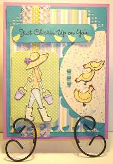
When you are having fun, why stop? I was flipping through some dp, and picked up a DCWV Nanna’s Nursery stack, and that was it, I created another card for the MFT challenge using the girl and chickens from the MFT set Punny Farm, and three pieces of dp from that stack. I figured the birds on the dp would pass for peeps, also thought of my MS border punch with peeps. The girl image was stamped on white, the pants and buckets were colored with prisamcolored pencils & goo gone. The image was stamped again on another dp for the hat & shirt, then cut out. The boots were stamped again on white, then stamped with a SU set Wonderful Weaves in certainly celery. When she was dressed, I stamped the green polka dot dp with the image again, so the buckets would have handles, and the hat would have a flower, that I stuck a brad in place for. I decided to use a corner punch at the top and the base teal layer, I had already punched the bottom of the striped dp with the MS peep border punch. I used a corner rounder punch on the green polka dot dp. The ribbon was the problem, I knew I had some yellow & white checked, like her shirt, and figured it would be perfect, but it was too narrow, and didn’t show up, so I just happened to have a piece of lavender lace, that was in a box of stuff I purchased recently, I really should make bigger cards, for all this decorating, The half circle dp looked bare, with just the brads, so I stamped some extra chickens and glued them on. The sentiment is from the same set, just trimmed up a piece of paper with a corner rounder, and punched some more peeps in a yellow that matches the stripes on the dp, with the MS punch.

Truffles

This is my first ever challenge card for MFT!!! This was rough, I think it took me hours to complete, of course cooking supper slowed it up. I chose the MFT truffle flopsey stamp set, stamped the bunny twice on white card stock with onyx black versafine, colored with prisma-colored pencils and goo gone, then cut out the bunny and the box of candy. The box of candy also was outlined with a SU marker, and the candy has crystal lacquer on each piece. I already had my dp ready to go, the time consuming part was figuring what size and how and if, all of it would fit on the card. To be honest, I chose this flopsey set first, then switched to another MFT set, decided it wouldn’t all fit using the paper I wanted to use, so I switched back to the flopsey. If I would make my mind up and stick to it, things would go a lot smoother, but toooo many ideas are flying around inside my little pea brain, and I just keep switching around. My brads are crooked, don’t know what happened there, I used the SU mat pack, and punched the holes with the thingy lined up, but they are sure enough crooked. I’m pretty sure I have everything that was needed for the challenge.

Crackle Kittie

For this card I stamped the kitten in the cup image from a GKD set purrr-fectly delightful by Theresa Momber, with onyx black versafine on yellow, colored with prisma-colored pencils and goo gone. For the eyes, I used a black glaze pen, white gel pen, blue soufflé pen and crystal lacquer. For the flowers on the saucer, I used red & yellow marvy wet looks embossing markers w/detail clear ep. After all this, I decided to apply crackle accents to the cup & saucer. The image was cut out and layered in red with nesties labels twelve, and some brads added in each corner, then attached to green layer, that has corner rounder punch on two corners and ticket punch on the other two corners. The sentiment is from a GKD set also by Theresa Momber called life is good, it was also stamped in onyx black versafine on yellow and layered with red that I cut out with a set of cuttlebug slider dies, and attached with some self adhesive yellow ribbon I had in my stash.

Purrr-Sweet

This was for a color challenge over at Stamp TV. I used alcohol inks for the background (pool, watermelon & butterscotch), cut the edges with a MS heart border punch, then cut the blue & red heart with my nesties. Stamped the sugar bowl from the Purrr-fectly Delightful stamp set with versamark and embossed with detail black ep, and cut out. Stamped sentiment from same set and punched it and layer with SU punches. Added some clear micro beads to look like sugar.

Old

Another card for the color challenge over at Stamp TV. This time I used the GKD set You Know You're Old When... This color challenge was rather difficult, but this thought hit me a little while ago. I punched the edges with an SU punch then stamped the sentiments with onyx black versafine, taped them together, ran a ribbon up through the punch holes, and added primas with brads.

Birthday Shaker


This card was for a color challenge over at Stamp TV. This is a shaker card. I stamped the flowers from the Purrr-fectly Delightful set, colored flowers with prisma-colored pencils and goo gone, then cut them out, punched out hearts with MS punch. For the jar, I used my sizzix jar die, and ran several pieces of thin cardboard thru to make it sit up high enough for the flowers and hearts to have room to move around in, and also cut a piece of plastic from a packaged, that something came in for the clear front. Stamped sentiment from same stamp set and punched with a SU punch. Attached bow . The yellow was run through the cuttlebugh with a textile embossing folder. I was lucky enough to have this card randomly drawn as the winner of that challenge.


Candy Hearts

I just couldn't pass this one up, once I ran across this dp in my stash. It will be another card for the "Love is Sweet" challenge at Clear Dollar Stamps. I used a CDS set called Candy Hearts, and stamped the hearts on the dp, then stamped love you and cut out with a nestie scalloped heart, popped it up with a foam dot. The white edge was punched with a MS heart border punch.

Billy and Maggie

This is another card for the Clear Dollar Stamps challenge "Love is Sweet". This idea popped into my head after making the other card with the rock wall in it that I posted. First I cut out a white piece of paper 4 x 5-1/4 no frills, had to see how everything would fit. Then I chose several CDS stamp sets to use: Billy and Maggie Fall Fun for the boy and girl, Dylan for the rock wall, Accessory Fun for the skateboard and Enchanting Carousel for the sentiment. I also used SU's: Lovely as a tree pine and the tree from Branch Out. I stamped the boy & girl, colored with prisma-colored pencils and goo gone, a black glaze pen and a white gel pen were used on their eyes, then they were cut out. From there I could tell where to position the rock wall, so I stamped it with onyx black versafine, colored with prisma-colored pencils and goo gone. Then masked the wall, and made a mask for the sun. Sponged distress inks: wild honey for the sun, tumbled glass for the sky, and peeled paint for the grass. Stamped the trees, my handsome hunter pad need re-inking. It is now ready for placing the characters. I popped Billy on his long in front of the rock wall with foam dots, then popped Maggie atop the rock wall. Punched a bunch of hearts with the MS heart punch, popped some, just glued others to the background, it is supposed to look like she is tossing them up in the air to fall on Billy. In trying to figure out what sentiment I wanted to add, I found that the word sweet from Enchanting Carousel fit perfectly onto the skateboard, so I stamped them, then sponged with mustard seed distress, cut out and popped it in place.

Moose Love

This is for the "Love is Sweet" challenge over at Clear Dollar Stamps. I used CDS sets Moose Friends and Moose for this card. I had a piece of heart dp in my stash, and decided to build around it. I stamped the male moose, then stamped the three females with onyx black versafine, then colored with prisma-colored pencils and goo gone. I was dotting the eyes with a black glaze pen, when I decided to add some lipstick to one of the females, which was a mistake, but an inspiration all in one. The mistake was that particular pen the ink seems to gob out of it, so the lipstick looked like a clown had put it on. The inspiration was competition, and how well can a moose put lipstick on anyway?? So, I added sparkly hoof polish to the clown face moose, and turned another female moose into a goth moose, which left just plain Jane the happy winner! I used my spellbinder decorative photo corners dies for the hearts in the corners, stamped the sentiment, punched out and attached. Went back with my lipstick and tried to make frowns.

Daisy Love

This is for the "Love is Sweet" challenge at Clear Dollar Stamps. I used the CDS sets Daisy & Dillon for the characters, colored with prisma-colored pencils and goo gone, for their eyes a black glaze pen and a white gel pen were used, then cut out. Stamped the rock wall, also colored with prisma-colored pencils and goo gone, the sky was sponged with distress inks tumbled glass & stormy sky. Then popped Daisy & Dylan sitting atop the wall. Cut the grass out with a MS border punch. Stamped the sentiment from a GKD set Purrr-fectly Delightful by Theresa Momber with versamark, embossed with detail white ep, and cut out the regular & scalloped heart with my nesties, popped the plain heart atop the scalloped heart. Colored around the edge of the plain heart with a clear glitter pen. Punched out some hearts with a MS heart punch and glued them on around Daisy.