Monday, February 28, 2011

Lace Hello

This card is for this week’s sketch challenge at CPS. I thought I had a good idea that turned into a bad idea, maybe that's what I get for thinking :)

For this card I chose two shadowed images the bear and moose from the Stampin Place. The sentiment is from a SU set Fundamental Phrases. All three were stamped on black cardstock with versamark and embossed with detail white ep, then punched out. Next I was going to punch another larger square for the layer behind the image squares, but I happened to have a scrap strip of black just laying there and liked that look, which I later changed to red. The good idea/bad idea was the lace. Lace isn’t something I have bought a lot of, and was thinking it would look nice as a backer, but didn’t really want it to be the color it was, so I was sitting there thinking…..if you can change the color of ribbon by running it across your ink pad…….why couldn’t you do lace the same way??? Well, let me tell you, this particular piece of lace was not that easy! I tried running it across the ink pad, I tried brayering the color on it, my fingers were getting blacker than the lace. I could not seem to get the ink to color the whole thing. I should have done it with stazon jet black, I have a re-inker for that, but noooo I was trying it with onxy black versafine. I started this project last night, and figured to let the lace sit all night to dry…….didn’t happen. Today when I went back to work on it, originally I had another Shadowed image of trees from the Stampin Place, in the middle but decided today the middle should be a sentiment. So thinking the lace was dry, I was throwing the stuff around changing things and found out that the lace was not dry. I had more black ink on my fingers and it was coming off on the red & black checked dp, luckily the most came off where it would be covered by the lace, but if you look closely you will see some spatter looking on the left side edge and above the bear.  The red & black checked dp is from my scrap pile, I chose it because it just looks like something to go with bear & moose, behind the dp is a black layer and the base card is red. Now I’m ready to put the card altogether. I placed some tape on the dp where I wanted the lace to be………..guess what? The lace would not stick, I tried a couple different types….no go. So I used two black mini brads in the end of the red strip to help hold it in place. Then I put all the rest of the card together, and distressed the edges of the red base card. The next step was to take pictures, I did this, then set down to write my description, I looked over at the card and realized I had put the lace on backwards, it’s a good thing the tape wasn’t holding that good, I took it apart and turned the lace over, then retook the pictures.

Hope you are having a better day. Thanks for stopping by and I’d love to hear your comments.

Sunday, February 27, 2011

DH's Birthday 2011

My DH’s birthday is coming up fast and I didn’t want to wait until the last minute to make him a card. For the past couple of years I have made cards with deer on them, so I switched off this year. I think I'll enter this one over at Party Time Tuesday's also.


He recently built this corner entertainment center for our living room.


  He sat down, figured out what he wanted to do and built it with no plans (other than his own). Our log cabin kit came with a mantle for a fireplace. I don’t know why since we don’t have a fireplace. But the mantle, a hand hewn log, like the rest of the house, laid down in the basement since the roof was put on, so it would be out of the weather. He cut the mantle for the top, it steps up to the corner, that way you can better see all the junk I have on top of it (birdhouses, pictures, candles, knick knacks). Then he bought the lumber to finish the rest of it. The picture has been brightened considerably, so you can see more of the detail. I took the picture right after he finished it and it was loaded down, it was very hard to take a picture of since there are windows on both sides of it. If he wasn’t in there right now, I’d turn all the lights on and try another, but then he would wonder what I was doing.

So for this card I decided to use the SU set Totally Tool. I don’t know if I cased anyone on this idea. I remember seeing pics of tool belts, but not sure about the pegboard. Anyway, as this idea was forming in my head, I stamped the the wrench’s first with versamark on white cardstock, embossed with detail silver ep, colored with prismacolored pencils. Next I stamped the saw, the screwdrivers and the hammer the same way, but I used detail black ep, colored with prismacolored pencils and then cut all of them out. For the pegboard, I had to decide what size I wanted to use, ran that through a Cuttlebug folder Swiss Dots, turned the piece over, so that the dots were away from me and pierced each and every hole with a paper piercing tool, then I decided that the paper should have been heavier for mounting the tools, so I cut a piece of cardboard, attached the brown pegboard piece to it, and had to pierce each and every one of those holes again. I was working my brain on overdrive, trying to figure out what I could use, that would look like those hooks for pegboard, and I came up with wire. The hammer, screwdrivers, and saw have wire to hold them on. For the wrenches I used brads. I had decided to use the Tim Holtz Bricked ef to represent the basement wall, and since pegboard doesn’t work up against a wall, I also used the Tim Holtz Woodgrain ef to make boards up the side, and sponged some walnut stain on them. The pegboard is attached to the boards with silver mini brads. The sentiment isn’t a birthday sentiment, but I can do that inside, thought he’d get a kick out of this one. As an afterthought, I stamped the measuring tape and colored the same as the rest of the tools.

This is his 2010 birthday card.

This is his 2009 birthday card, I cased this one.

Thanks for stopping by, and I’d love to hear your comments.

Saturday, February 26, 2011

Pieced Farm

There’s a blog hop Animal Kingdom challenge going on at Stamp TV to use any of the listed GKD animal sets. I chose Funny Farm and here is my card.


There were quite a few sets you could use on the list. I only had two of those sets. I don’t know about everybody else, but sometimes I have ideas fly through my head so fast, I can’t keep up with them, it’s almost like a roulette wheel, going round and round, and when it stops that number (idea)  is what I use, all the other numbers (ideas) are forgotten. I should have a tape recorder, if they still make them, and just speak my ideas out loud, then I could remember more of them. While blog hopping tonight there was a lot of beautiful cards, I don’t think anybody paper pieced the set I used, but when that idea popped it stuck. I think this is a first for me, when I paper piece, it is normal looking, that is also why I chose the sentiment Funny Farm from the same set. I started digging through my scrap pile to find some pieces with small print, I just made different card not long ago, using this sketch, and the same white, blue, dp (except for the pig), tag, and the ribbon for the Clearly Inspired Challenge sponsored by Clear Dollar Stamps. I really liked the way the colors went together. So rather than sitting half the night trying to decide what to do, I went with that.

The animals were stamped first with versamark, embossed with detail black ep, I used a white gel pen to fade out the dp colors around the eyes, the flowers and the spots on the cow, then I colored over some of those spots with different glaze pens. After all why would a cow have white spots, when it is purple with green designs anyway. The animals were laid to the side, while working on the rest of the card. Next I used a 4” square of purple, my MS fence border punch and my newly discovered technique of how to punch around a square using only a border punch. You can find my redneck tutorial here. I cut a square of blue instead of green for the grass, stamped some grass from a CDS set called Mini Silhouette Scapes with Dusty Concord distress ink. Then I proceeded to cut the background pieces. The darker of the two dp’s is a whole layer, the lighter of the two are cut and layered on white and placed on the two corners of the darker dp, this was attached to a layer of the same blue used for tag and square. I cut out the blue tag with a cuttlebug slider die, stamped with versamark, embossed with detail white ep, ran the ribbon through the tag and across the layers of dp to the back of the blue layer. The animals were attached to the blue square, which was attached to the fence square, and put in place over the ribbon/dp layers. The base card is white. I had to use more of the dp than was in my scrap pile, (except for the pig) the dp is from a DCWV Summer Dream matstack.

I don’t know what they are smoking on this farm, but I hope you enjoyed it. Thanks for stopping by, and I’d love to hear your comments.  

Aerobics Suck!

This week’s color challenge at Stamp TV is to use crème de menthe, red hot and lemon drop. Here is an entry.

I chose to use two of my Rubbernecker Stamps, Aerobics Suck! and Ethel in Leotard. The main image was stamped on white cardstock with onyx black versafine, colored with prismacolored pencils & goo gone, cut out, then I decided to give her varicose veins, (hope you can see them in the picture), and her glasses have a coating of All Night Media Liquid Embossing Sepia Glass Finish, so she was laid to the side to dry. The layer under her is a piece of yellow matching the cardbase, it was run through the Cuttlebug with the Perfectly Paisley ef, then cut and embossed with Nestie Labels Thirteen, and sponged with some distress inks (Tumbled Glass & Fired Brick). The artificial crème de menthe layer was also cut and embossed with the Nesties. The red layer was also run through the Cuttlebug with an ef from the Heritage Collection, the corners sponged with Fired Brick. The sentiment was stamped on artificial crème de menthe with onyx black versafine, then cut out with a Ribbon Tag Trio die, I used another die from that set and cut out a layer of yellow to put behind it. The yellow ribbon was run through the tags and attached to the back of the red layer. The lady was added with foam pop-dots.

Thanks for looking, and I’d love to hear your comments.

Friday, February 25, 2011

Bug Catcher

I want to play!! I have the house all to myself, and can play and play all day! It’s miserable looking outside....changing from rainy & foggy, to the sun peeking for a second, to cloudy & real windy, so what better thing to do than stamp???


This  card came about while flipping through  a DCWV The Spring Stack, when I spotted those bugs, out came the Crafty Secrets set Feeling Yucky. I decided to use this week’s sketch challenge over at CPS. I hope it’s ok to enter more than one card. I’m also going to enter it at Use It Tuesday for their challenge to use your hoarded pretty patterned paper…………bugs are not exactly my idea of pretty patterned paper, but the colors are pretty, and it fit so well with the image & sentiment. Those bigger bugs remind me of stink bugs……maybe this card will be stinkin’ cuteJ. Since anything goes this week at Party Time Tuesday’s I’ll go ahead and enter it there too. Maybe I need to get a life?

The main image and the bug in the jar was stamped with versamark on white cardstock, colored with SU markers (red crosses and blue dress) prismacolored pencils & goo gone (skin & hair), black glaze pen (eyes & shoes), black gel pen & waterbrush (bug in jar), then cut out. Before cutting out the bug in the jar, the crystal lacquer had to dry, that was applied to the jar. The sentiment was stamped on yellow with onyx black versafine and punched out with a circle punch. For a backer to the image I chose a green, then a layer of yellow. I wanted bigger circles for this card, and since bigger circles means less background showing…….and I wanted to show off those bugs, I pulled out my Circle Scissor and cut out one layer of the bug dp and a layer of yellow matching the basecard.  Looking back at it, I’m wishing I had cut the bigger circle out of the green instead of the yellow. Behind the circle layers is another layer of the bug dp, then a  layer of green. The corners of the layers were punched with a Southwest corner punch (had to look it up, couldn’t remember the name), and yellow Hippie Hemp (that’s the name on the package) was wrapped around the slits. The nurse is attached with pop dots. I cut around her hand with an exacto knife to insert the jar.

Who knows what I’ll come up with next, ya’ll come back ya hear!
Thanks for looking and I’d love to hear your comments.

Thursday, February 24, 2011

Cattail Birthday

Today’s card is for this week’s sketch challenge at Stamp TV, there is no shimmer, no glimmer, no razzle-dazzle, just a simple card following the sketch, with a little sewing.


This is my fourth attempt at using my Singer Pixie Plus sewing machine on a card. I must be getting better at this, the thread didn’t get tangled up, it only skipped one stitch,  and thank goodness that darn needle didn’t come unthreaded again.  Well, they say practice makes perfect………..I need a lot of practice!!

For this card I chose papers to match the thread that was on the sewing machine, so I wouldn’t have to go to all the trouble of changing it.  The base card is a rust (matching the thread) , next is a layer of dark brown, then a piece of plaid dp that came from a DCWV Fall Stack, with the matching rust color in it. I stamped the cattails from a GKD set called Life is Good by Theresa Momber using SU markers to color the stamp (chocolate chip, always artichoke and bordering blue) on white cardstock, cut down to size and layered on dark brown, attached them to the other layers, minus the base card and ran the sewing machine around each. Happy Birthday is also from a GKD set called Purrr-fectly Delightful by Theresa Momber colored with another SU marker (really rust) and stamped on white cardstock, then cut and embossed with a ribbon tag trio die, the ribbon was run through it and attached to the back of the layers, then they were added to the base card.

Thanks for stopping by and I ‘d love to hear your comments.

Wednesday, February 23, 2011

Lower Cholesterol

I ran across a new (to me) challenge site today called CPS (Card Positioning System) followed the sketch and made this card to enter for CPS #206. I’m going to enter it in the Use It Tuesday’s challenge USE002 also, because this is a lot prettier dp than the other card I submitted, and I can also submit it to Party Time Tuesday's PTT #4 cause it's anything goes this week.


The main image is an American Art Stamp called High Heels. You can’t clearly read the sentiment because of the card holder, it says : THE DOCTOR TOLD ME TO LOWER MY CHOLESTEROL…SO NO MORE HIGH HEELS! The image was stamped on white with onyx black versafine. I colored the skin with prismacolored pencils and goo gone, the rest of the image was colored with cheap gel pens and a waterbrush, sprayed hairspray on it, then cut it out with a nesties rectangle. I like this technique because it makes the image shimmer. I have a close-up picture below. I just wanted a little frame around it so I trimmed up a piece of the light blue cardstock just to peek out around it. The next layer is a piece of patterned paper, it may not show up in the picture, but it has very light squares on it, cut with a circle nestie, with a light blue layer cut with a scalloped circle nestie, then I used a different patterned paper for the next layer, backed by a piece of red. Both of the patterned paper is from a DCWV Spring Stack. After, I put the layers together,  I did the sewing with three different stitches, then attached the layers to the light blue base card.

I don’t know about the rest of you, but I do not have a lot of patience. I bought a Singer Pixie Plus sewing machine a couple of years ago, because I like the looks of some of those cards out there with sewing on them. I finally got it out of the box and managed to make a card back on the 3rd of this month. Since the third it has mainly been sitting in the floor of my craft room, because the needle came unthreaded, and I broke my needle threader trying to rethread it. I finally got it threaded, and the thread messed up and unthreaded it again, in the middle of making a card, so back in the floor it went until today. I figured I’d give it another try. I’m sure if someone out there had a video camera they could win prizes from America’s Funniest Video, videotaping me with the sewing machine. Because I had fooled around so much with it before, I had to change the thread and bobbin, so I would have thread to work with, had to drag out the book for this, maybe I should have paid more attention to sewing in school, I think I failed this part of home economics which I believe I did mention in another post.  I used three different stitches on this card, as you can see, I need plenty of practice!!  I have yet to figure out how it punches the holes, but skips putting thread in them, as I am sewing along. The good news is, it didn’t come unthreaded and the thread didn’t get all tangled up again. With a little practice, I might get this down somedayJ

As promised here is a close-up of the shimmer that using cheap gel pens and a waterbrush creates.


Thanks for looking, and I’d love to hear your comments.

Tuesday, February 22, 2011

Chunky Dunk

This card is for a challenge at Use It Tuesday We want you to cut into that piece of pretty, pretty patterned paper you have been hoarding and actually make something with it!


I have all kinds of patterned paper hoarded. I have used some out of different stacks, but it’s hard to remember which ones. I picked up a DCWV The Summer Scrapbook Kit in a Stack and flipped through it, I don’t think I have ever used any of this stack. When I saw the background dp for this card, I knew that I wanted to combine a couple different stamps, the sentiment is a brand new one (to me) from Creative Clear Stamps called Chunky Dunk, the main image is a Rubbernecker stamp called Ethel in swimsuit. Now I have itty bitty teeny weeny yellow polka dot bikini, going through my head, so I have to do some paper piecing. I know the background is not some pretty, pretty patterned paper, but I had to go with the flow. This card has a lot of hoarded items on it, not just paper. The white base card is from a brand new pack (I needed a bigger card) The blue layers, the striped layer and the background dp are all from same stack listed above, and as far as I know never used. The main image (Ethel in Bikini) was stamped on white cardstock with onyx black versafine, colored with prismacolored pencils and goo gone. The bikini was stamped again on yellow with white polka dots dp, along with the towel stamped on some polka dot dp from my scrap pile (I cheated here). I used a black marker to fill in the polka dots on the bikini (dah! I should have just stamped on yellow paper), and her earrings, a green marker for the flip flops. The image was masked and I stippled around her with distress inks (tumbled glass, pumice stone and old paper), cut out with a nesties labels six die, and sponged some more distress ink around the edge. Crystal lacquer was added to the glasses, after the card was all put together. Another hoarded item, is the green things on each corner of the main image, I don’t know what they are called, and evidently didn’t know how to mount them either, you can see the impression from my crop-a-dial on the first one I put in on the bottom right.  The sentiment was stamped in onyx black versafine on white and cut with a nestie labels twelve. I also added a piece of matching green ribbon.

Thanks for looking and I’d love to hear your comments.

Just Fuzzy

This card is for a challenge over at Party Time Tuesday’s, since it’s the last of the month anything goes.


To start with I grabbed a bunch of recent cards I have made to decide on what type of sketch I wanted use. Then I picked a piece of dp from a K&Company Hannah Paper Pad. I chose to use a CDS stamp called Fuzzy Ducky. When I picked out this stamp a song from many, many moons ago popped into my head, I only remember a line or two………..little black duck, swimming in the water, little black duck doing what he oughta. I decided to color the image with gel pens and a watercolor brush, after stamping it on white paper with onyx black versafine ink. I was concentrating so hard on how I wanted to put the card together, that I forgot about spraying hairspray on it, until I started cutting it out, and noticed the shimmers on my fingers. It’s not something that has to be done, but I started doing it for images, that are cut out, because I was having more shimmer on my fingers, than on the image by handling it while cutting it out. So after I had some of it cut, I added some more gel pen and watercolored it again, then sprayed hairspray on it, let it dry and finished cutting it out.  My base card is a light pink, then I have a layer of rust, the dp, a darker pink self adhesive ribbon from Darice, two layers cut with nesties labels three, light pink and rust. The sentiment is from a Crafty Secrets set called Feeling Yucky, (I love to mix and match my stamps) stamped on light pink with onyx black versafine.  I made my own label using a MS corner punch, and attached it with brads.

I took several pictures, even with editing the colors just didn't want to cooperate. The ribbon looks like it is two different colors, but it's a pink like under the main image, in most of the pictures it looked rust colored over top of the image. I also tried to get the shimmer to show in a close-up, it shimmers more in real life.


Thanks for looking, and I would love to hear your comments.

Monday, February 21, 2011

Thinking of June

This is my first ever entry to a challenge on Party Time Tuesday’s, it’s for sketch PTT #3. I hope I have it right.

 I used this sketch to make a card for my DH’s Aunt, she is 83 years old, and was still working until a couple of months ago, when she had a stroke.

For this card I chose a pink base card, layered with white, then dp from My Minds Eye Home Photo Mat Pink. I then placed a piece of lace across the center and over that a piece of pink Darice self adhesive ribbon. The main image is from a SU set called A Flower For All Seasons, stamped on white with onyx black versafine ink, colored with gel pens and a waterbrush. The sentiment is from a CDS set called Curved Sentiments, also stamped in onyx black versafine, the white was then cut and embossed with a nesties rectangle die, and layered on a piece of teal colored cardstock cut and embossed with a nestie scalloped rectangle die, then attached to the other layers. The butterflies were punched in red with a MS butterfly punch, the swirls of pink were cut with a Sizzix Sizzlet Scribble Swirl die, attached with glue and the flowers have a brad to hold them in place. The light pink flower is from an artificial stem I tore apart for the blossoms and the darker pink flower under it is a paper flower, from a Paper Flower embellishment jar by Portafolia.

Thanks for looking and I would love to hear your comments.

Bad Hunter

For this week’s sketch challenge STVSKSP14 at Stamp TV. I searched through all of my stamps to come up with something for this challenge. Instead of using three different image stamps, I chose to use just one after I ran across the sentiment which says Vegetarian: An old Indian word for Bad Hunter.


Usually, I’m just making cards for challenges, and later if I need one in a pinch, I’ll grab one of these. Today was different, when I thought of this image and sentiment, I knew right away, this was going to be a birthday card for one of our friends, just don’t want him to get mad. You guessed it, he came home empty handed during our deer seasons. I say seasons because we have several different seasons……there is early muzzleloader which lasted a week or two, rifle season was in for two weeks, the regular muzzleloader season another two weeks, and then rifle season comes back in for a couple more days. We also have a bow season, but I’m not counting that, he didn’t go out with his bow.

For this card I chose a deer image, one of the first individual stamps I ever bought, it’s been a few years ago, but I think I got it at A.C. Moore, it doesn't have a company name on it. I stamped it with saddle brown stazon ink on white cardstock, layered it on dark brown. Then I started working from the other direction, my base card is white, then I have a layer of the same dark brown I layered the deer with, and a layer of dp from a DCWV The Fall Stack. After assembling these I was able to put the deer images into place. The sentiment was a problem, it was too long for the spellbinders dies, and the cuttlebug label dies I have were way to big to fit. So I tried a MS corner punch out on a scrap piece of paper, and it worked just fine. I did not line the paper up like cutting a corner, I placed it straight in until the end of the longest point wouldn’t be cut off. My paper was about 1” wide.  The Vegetarian stamp was purchased from The Rubber Stamp Shack back in 2008. The sentiment was stamped on the paper with saddle brown stazon, then I cut the other end with the punch. Attached the sentiment, and added four brown brads.  After all the layers were attached, but before placing them on the base card, I started paper piercing, around the deer images and the sentiment.

Thanks for looking and I look forward to any comments you may leave.

Funny Friend

This card is for the release party challenge #3 Sketch for you. I chose the GKD set Funny Farm for my main image and sentiment.


I stamped the main image on a piece of brown mustard colored paper, and on white with onyx black versafine, I had the intention of coloring the white. The mustard colored paper was then cut and embossed with a nestie circle. On the piece of white that was stamped, I wound up just coloring the head, hair and hat, with prismacolored pencils & goo gone, then decided to stamp the overhauls on the striped dp and cut out, I stamped it again on the dp, with the stripes going in a different direction and cut the pocket out. I was going to leave the shirt the mustard color, but changed my mind on that too, so the shirt was stamped on the pale yellow, cut out and attached. That left the boots and the sign. So I stamped the boots on the pale yellow, cut them out, then attached. For the sign I stamped the sentiment in onyx black versafine on the white piece I had previously stamped the main image on, then cut out and attached. All of the dp is from the DCWV Flower Shower Spring Matstack. The base card and the layered circle is a pale yellow, everything else was layered with the brown mustard color. I grabbed some pale yellow adhesive backed ribbon I have had for a while, picked it up at Joann’s on the clearance rack. Pierced three holes on the bottom right for pale orange brads and picked out three flowers from a Paper Flower embellishment jar by Portafolia that I had picked up at a yard sale, pierced holes and attached the flowers with yellow brads. I also added some color with a prismacolored pencil under the girls feet, a flower brad for the hat, googly eyes, and a final touch was to add crystal lacquer on the boots.

Thanks for looking and I would love to hear your comments.   

Sunday, February 20, 2011

Kitten Thread

This card is for Theresa’s string it up release party challenge at Stamp TV. I chose the GKD set Purrr-fectly Delightful by Theresa Momber.


The main image was stamped on black cardstock with versamark and embossed using detail white ep. Instead of having a black cat with a white outline, I colored over the white with a dark gray prismacolored pencil, added some pink for nose, ears and paw, filled in the eyes with a white gel pen, used a green glaze pen over top of the white, then added a dot over the green with the white gel pen, and cut the kitten out. The blue layer was cut and embossed with a nesties rectangle die, then the white layer was cut with a scalloped rectangle nestie die. I had the idea of the kitten playing with a ball of thread, and just had to figure out how to do it. I punched a small circle then wrapped some of the gold metallic thread around it, and from there wrapped it around the two layers the kitten  is attached to. Those layers were added to the plaid dp from my scrap pile. Since the plaid paper was very thin, I mounted it to a piece of white the exact same size, so that it doesn’t show, but gives it some thickness, punched the corners with (I’m sorry, but I don’t remember the name of that punch), and wrapped gold metallic thread around the edges, and mounted onto a layer of white, then the base card is the same blue as the kitten is mounted on. For the sentiment, I used one from the same stamp set, stamped with onyx black versafine, and cut out with a spellbinders ribbon tag trio die, in place of ribbon, I again used the gold metallic thread to attach the sentiment to the card.

Thanks for looking and I would love to hear any of your comments.

Saturday, February 19, 2011

Funny Farm

Here is a card for Giovana’s release party color challenge at Stamp TV. I chose the GKD stamp set Funny Farm for the main image and sentiment.


The main image was stamped on white cardstock with onyx black versafine, then I paper pieced the barn, silo roof, tree tops and the striped field. I made a mask and stippled spun sugar,tumbled glass, and broken china for the sky, peeled paint and shabby shutters for the other two fields. It seemed a little bare, so I pulled out my CDS set Mini Silhouette Scapes and added the birds, and plants in the fields. This scene is layered on white. Next I chose some dp from a matstack I have lost the cover for, but I’m sure it’s DCWV. For a while I thought I had picked out yellow with white polka dots, must have strained my eyes cutting out those little things, turns out it’s yellow with white stars, oh well, it is also layered on white, with a green card base. The sentiment was stamped with onyx black versafine, after cutting out the yellow and green pieces with cuttlebug slider dies. I ran the ribbon through both and attached with a foam dot, pierced a hole on each corner of the main image and stuck four yellow brads in the holes. Thanks for looking and I’d love to hear your comments.

Wednesday, February 16, 2011

Sheep Herd

Here is another card for this week’s sketch challenge over at Stamp TV. I chose the GKD stamp set Funny Farm, for the main image and sentiment.

The black sheep was stamped with versamark on black cardstock, embossed with detail white ep, then cut out, and googly eyes added. The white sheep were stamped on white cardstock with versamark, embossed with detail black ep, then cut out. The green with white polka dot dp from DCWV Nana’s Nursery Stack, was cut and embossed with a nestie oval, and before the die was removed, I ran a black ink pen around the inside of the die. The white layer behind was cut with a nestie scallop oval, and the dots were made with a black ink pen. The next dp, from a My Mind’s Eye Home Photo Mat Blue stack, was cut to size and the corners punched with a ticket punch. The next layer is white, cut to size, and the corners punched with a corner rounder punch. The base card is green. The sentiment was stamped in versamark on black cardstock, then cut and embossed with a nestie circle die, before the die was removed I ran a white gel pen around the inside of the die. I placed four green dew drops on the four rounded corners of white. They may not be dew drops, I bought them at a yard sale and they weren’t in the original containers. Thanks for looking and I’d love to hear your comments.

Tuesday, February 15, 2011

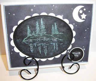
Chalkboard Trees

Today’s card is for this weeks sketch challenge over at Stamp TV. I chose a stamp from the GKD set Life is Good by Theresa Momber for the main image, and decided to try the chalkboard technique.

The image was stamped on black cardstock with craft white ink, then pounced with different color chalks to color the image, the trees and ground are two different colors of green, the water blue, the rocks silver, background of trees white, you can hardly tell the difference of colors in the picture but in real life you can. I used Pebbles Pearlescent chalks the Shimmer collection. I sprayed hairspray on it to hold the chalk in place, then cut it out and embossed it with a nestie oval die. The next layer is just white cardstock cut with a nestie scalloped oval die. The next layer is some, what I call twinkling stars dp from my scrap pile. As an added extra I punched white cardstock with the ek success moon & stars punch, added a little versamark and some of the white shimmer chalk (it doesn’t show up in the picture). The layer behind the dp was white, but I sponged it with chipped sapphire distress ink, the base card is white. The sentiment is from the GKD set Funny Farm, stamped on black cardstock with craft white ink and chalked with the white shimmer chalk, punched with a round punch, and layered on white also punched. Thanks for taking a peak, and I’d love to hear your comments.  

R Valentine 2011

This is the first time in our almost three years of marriage, in which my DH and I have been apart on Valentine’s Day. He will be back tomorrow, so I waited until the last minute and decided to use this sketch challenge SK021211 at Paper Craft Planet to make him a card. Nothing like it, being right there in black and white for him to see!!

I have had an urge to do a mainly white card lately, this was the perfect opportunity. The base card is black, the next layer was run through the cuttlebug with the heart block ef, the next layer is black, and the white layer was also run through the cuttlebug this time with the swiss dots ef. The next layer is black cut out with a scalloped oval nestie, the top layer is white, stamped with a sentiment from the SU
set Wonderful Words, then cut and embossed with a nestie oval. Thanks for looking and would love to hear your comments.

Monday, February 14, 2011

Moose Birthday

Happy Valentine’s Day ya’ll!!

I don’t think I was meant to stamp today, everything was going wrong. I decided to make a card for a sketch challenge SK021211 at Paper Craft Planet. I picked out the dp I wanted to use for the sketch, and wanted to do some sewing on it, first I had to thread the needle on the sewing machine, which I have been trying to do for the last three days, on the first day my needle threader fell apart, I think they should make the needles with much bigger holes. For the past two days, I spent time trying to get that stupid thread to go through the eye, until I would get frustrated, which didn’t take very long. I finally got the needle threaded, YEAH! I started to sew the center layer, and the dad gum card got stuck in one place, somehow the thread got wrapped around the foot. So guess what? You guessed it the thread broke and the needle is unthreaded again! So much for sewing on a card today, I tossed those pieces aside, the paper pieces that is, the sewing machine almost got tossed too.

Then I picked out some more dp put it together, chose the Clear Dollar Stamp set Moose Friends, and  stamped the image and sentiment on white cardstock, colored with prismacolored pencils and goo gone, stippled tumbled glass for the sky, cut out and embossed with a nesties oval. I decided to touch up the eyes with a black glaze pen, I screwed that up, so I covered the boo boo with mini brads, now the moose looks like it’s wearing sunglasses. The oval is layered on the same brown I used for the base card and the layer for the checked paper. Before attaching the oval, I decided to do some paper piercing, the checked piece was first, I went all the way around, everything was fine, but then I decided to do that dumb squiggly thing. It just looked like a piece of paper with a bunch of holes all over it, so I went dot to dot with a black pen. I should have left that squiggly part off completely. I then paper pierced the corners, which thankfully I didn’t mess up. Thanks for looking, I’d love to hear your comments.

Sunday, February 13, 2011

Alcohol Faux Bleach

I was reading a tutorial by Sherry Cheever over at SCS today on alcohol faux bleach, I also watched the video. I picked out colors I thought would match the color challenge at Stamp TV for this week, to try it out. Seems like I can’t go make a card anymore without using a color challenge or sketch challenge, whether it’s past or present, but for me that is better, as I used to case a lot of work, now it’s my own ideas making the sketches and color challenges work.

For today’s card I chose the flowers (again) in the GKD set Purrr-fectly Delightful by Theresa Momber. For this technique you are supposed to use glossy cardstock, stamp an image and emboss with clear ep. Dab your alcohol inks all over the paper and blend, the embossed image will be covered with color. Then you put a paper towel down to keep the paper from moving around, lay another piece of cardstock over top of the embossed glossy, use a craft iron on top (Sherry used a craft iron set on high, my craft iron doesn’t have any settings so I didn’t know if it would even work), the embossing comes off onto the blank cardstock, so that you have two images  (one with the alcohol inks and a plain one with the colored embossed image. I like to hoard my glossy cardstock, so I tried it out on some cheap photo paper I picked up at the Dollar Tree. First I cut the cheap photo paper and the extra piece of white paper the same size, I figured it would make it easier to work with. I stamped with versamark and embossed with detail clear ep. This works as long as you do not overheat it. You can tell when it starts overheating, as bubbles in the paper start appearing, so I quickly removed the heat gun, and the bubbles disappeared. I used caramel, butterscotch, denim and stonewashed alcohol inks, and the alcohol blending solution, applied with the alcohol ink applicator and felt to make the background colors. Then I laid the inked up image on a paper towel face up, and placed my other piece of white paper over top of the inked up paper. For this paper I did not use my good white cardstock either, I used some other paper that I don’t mind wasting, plus it isn’t as thick as the regular cardstock, I thought the iron might work better. I placed the iron on top of the two layers and ironed until the embossed image attached itself to the plain white paper. The image on the card is the cheap photo paper with alcohol inks, I threw my plain white piece in the trash, the embossed image was on it like it was supposed to be, but I also had some color spots on it too. The paper I was using, had a very slight gloss to it, and that may be what the problem was. I layered the alcohol inked up paper on white, then blue. I then poked holes right at the edge of the vase on both side and ran a piece of yellow hemp twine through. I cut a little tag out with a cuttlebug tiny tag die and stamped feel better on it in versamark, embossed with detail white ep, placed a yellow eyelet in the hole, and ran the twine through it and tied a bow, but decided I didn’t like it, so I left the card with no sentiment, and just tied the bow. Next it was added to the yellowish colored base card. Thanks for stopping by and I’d love to hear your comments.

Framed Train

The other cards I have been making since discovering how to punch around a square with just a border punch and no corner punch (see my redneck tutorial) have started with 3” squares. I decided to give a bigger square a try, this time I started with a 4” square, and gave another border punch a chance to shine. I wasn’t even sure if the train border punch would work at all, but it worked like a charm. I paid very careful attention to where I started punching on the two corners with the engines. You can’t use real heavy paper either, the punch would probably break trying to go through two layers at once, my punch has jammed up a couple times with what I am using. Anyways, I had a train frame to use, so I created a card for the Stamp TV color challenge. This week’s color challenge is to use moonlit fog, sweet mango and white, since I don’t have any GinaK paper I have to substitute, so I try very hard to get the colors as close as possible with what I have.

An idea started forming in my pea brain,  a train in the dark, with the sun coming up (I guess the train wouldn’t be white if it was in the dark now would it?) So I used the GKD set Life is Good by Theresa Momber. First I stamped the train on white cardstock with versamark and embossed with detail black ep, then cut it out. For the next layer, I cut a square of white, made a mask and stippled wild honey for the sun, the sky and mountains are a combination of stippling and sponging stormy sky and weathered wood. (I really need to work on my background sponging.) The next layer is blue the same as the base card, then I have my white train frame square over a layer of yellow. The sentiment is from the same stamp set stamped in stormy sky distress ink on a piece of white punched with a SU punch. My idea to begin with, was to have the sun corner at the top in the middle, but duh!… my train frame was too wide for the card, so I had to tilt it. Oh well, it looks ok. I’m just so tickled with myself for figuring out how to do the frame thing, the rest is no big deal. Thanks for stopping by and please feel free to leave me a comment, I’d love to hear what you think.

Saturday, February 12, 2011

Framed Critter

Since I figured out how to punch all the way around a square with just a border punch and no corner punch, I had to do it again, this time using the Clearly Inspired Challenge sketch CIC22, the same stamps, but a different border punch. I even opted to drag out some new dp, instead of using more of my scrap pile.

I had never done a tutorial, I gave that a try too, when I finished my first card using the border punch surround and same stamp set with a different sketch……I like to call it my redneck frame tutorial that you can view here.

For this card, since I already knew the mouse from the CDS set Get Well Critters would fit, I went ahead and used it again. First I went through some unused dp looking for what I wanted to use, and found this, it’s from a DCWV Summer Dream matstack, and I think it looks great together (am I prejudiced or what?). The mouse was stamped on white with onyx black versafine, colored with prismacolored pencils, the band-aid also had some bling added with a Sakura clear glitter pen,  then it was cut out with a square punch. The next layer is a scrap of the dp cut to fit, backed with a plain purple piece, cut to fit. The frame started out being a 3”x3” square, then punched with a ms border punch. I could never explain how to do this in writing, so I have a redneck frame tutorial with pictures located here. Behind the frame is a piece of ribbon with the sentiment from same  stamp set, stamped with versamark and embossed with detail white ep on a piece of plain purple cut out with a cuttlebug slider die. Then you have the dp layers, the lighter of the two is layered onto white, the darker layered on the same blue as the frame. The base card is white. I had the card altogether, and was taking pictures of it, when I realized I didn’t have the three items in the bottom left corner, so I added three white pearls. Here is a close-up of the frame.

Thanks for stopping by, and I’d love to hear your comments.

Redneck Tutorial - Critter Frame

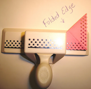
I was sitting here today, watching some videos on how to do different techniques over at Paper Craft Planet, wondering why I couldn’t think up something. I guess I’m just a day late and a dollar short! Well, I went back to my craft room to try and make a frame with a border punch, like in one of the videos. Mine didn't turn out right, but, while I was sitting there trying it out, the thought occurred to me about taking a square piece of paper and folding it in half diagonally, so I tried it. I’m not sure, but I don’t think anyone has done this yet, to use a border punch and punch all the way around a square without using a corner punch. I definitely was not ready to make a tutorial, but I gave it a try, you can just call this a redneck tutorial J.

Step 1 – I cut a piece of paper 3” x 3”. (I had already done step 2 before I took this picture)

Step 2 – Fold and score diagonally.

Step 3 – Place in border punch, with scored fold away from punch, I looked at the bottom of the punch and lined the point over at the far edge and punched. (Heavy weight cardstock may not work doubled in the punch.)
Step 4 – Turn the piece around and punch other side the same way.

Step 5 – Fold and line up holes in opposite diagonal direction, you can  score it, but the holes may not line up. Lineup holes with the diagram on the edge of the punch, making sure it is far enough into the punch to complete the row.
(I forgot to take a picture)
Step 6 – Turn the piece around and punch other side the same way.

Step 7 – Completed frame.

**Make both folds in the same direction, place the scored side away from you, the folds don’t show up so bad.**

Since I invented something, (at least I think I did) I wanted to show it off in a card. My brain went dead, what to do… what to do??? I needed an image that would fit and I needed some kind of layout. I used the sketch challenge over at Stamp TV, and will be entering this one in the Use It Tuesday challenge, since this is the first time I have used these two stamps, I just joined Paper Craft Planet, I’ll have to figure out how to post it there also, not to mention SCS.


Ok, card details……the image and sentiment is from a Clear Dollar Stamps set called Get Well Critters. I stamped the mouse on white cardstock with onyx black versafine, colored with prismacolored pencils and goo gone, dotted the eye with a black glaze pen, punched it out with a square punch, layered onto green cardstock, then on the pink frame. The dp is from my scrap pile, cut to match the Stamp TV sketch challenge, layered on white cardstock, with a pink base card. The sentiment was stamped in onyx black versafine onto a piece of pink cardstock cut out with a Cuttlebug Slider Die, with a ribbon run through it. Thanks for stopping by, I hope you enjoyed my redneck tutorial and I’d love to hear your comments.

Thursday, February 10, 2011

Deer Dreams

Here is a card for the color challenge that ends today at Stamp TV. I don’t think these colors do a thing for me, my brain just went dead everytime I tried to come up with something new.


While looking through the book I keep samples of my punches and dies in, I ran across the Quik Kutz deer die (I think instead of deer they should have called it a fawn) and an idea finally began to form, a fawn thinking about it’s Mother and Father. I used the GKD set Life is Good by Theresa Momber. The two small deer were stamped in onyx black versafine on pink and punched out with a scallop punch. The sentiment was stamped in versamark and embossed with detail black ep. The pink corner pieces were cut with a Sizzix Sizzlets Elegant Enhancements die. The dp is from a DCWV mat stack. It is layered on black and the base card and the Quik Kutz deer are my version of sweet mango. Thanks for stopping by and I’d love to hear your comments.

Friend's Hand

Oops, I did it again!! No I’m not Britany Spears, wish I had her money though. After making two cards correctly for the Stamp TV sketch challenge, and having a senior moment on my third card by cutting the dp backwards, I decided to make another card using the leftover piece of dp from the previous card. I had to cut the corner pieces backwards for them to work, so this card is backwards too, but like in my previous card………..why waste it.

This is another image from the Inkadinkado set Boxed Wishes. This time the image was stamped in really rust, cut out and embossed with a nestie rectangle, then layered on a piece of rust cardstock also cut and embossed with a nestie rectangle. The dp is layered on white and the base card is a blue-gray. Thanks for stopping by, I’d love to hear your comments.

Wonderful Day


I just love doing these challenges. Here is another card I made, for the Stamp TV sketch challenge and the Use It Tuesday challenge, after making the first two cards correctly,  I had a senior moment and cut the dp backwards, oh well, why waste it.

The image is from an Inkadinkado set called Box Wishes, stamped on white cardstock with versamark and embossed with Stampendous blue tinsel ep. The image was then cut out and embossed with a nestie rectangle.  The layer behind the image was a piece of white cardstock cut out with a nestie scallop rectangle, I ran a versamark pen along the edges and embossed with the same ep as the image. The dp is from my scrap pile more than likely from a DCWV stack, layered on white and the base card is a rust color. Thanks for stopping by, I’d love to hear your comments.

Wednesday, February 9, 2011

Flutterbys

While there is snow on the ground, and not much to do outside, I can play in my room. I made another card for the stamp tv sketch challenge and the Use It Tuesday Challenge.

This time I used an old SU set called Flutterbys, with the matching stencil. I got these on ebay a few years ago, and don’t think I have ever used them. I’m still trying to get my scrap pile down a little before dragging more new stuff out, and since the dp I was using had butterflies on it, figured the flutterby would be appropriate.  This is a two step stamping set, so first I stamped the chunky part with wild honey distress, then I stamped the outline with worn lipstick distress on white cardstock. I used the flutterby stencil and dry embossed, then cut out and embossed the image with an oval nestie. The layer behind the image and the layer behind the dp is a yellowish orange to match up with the dp. The base card is pink. The sentiment is from the GKD set Funny Farm and stamped in worn lipstick also. Thanks for stopping by and please leave me a comment, I’d love to hear from you.

Tuesday, February 8, 2011

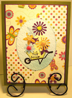
Faux Pressed Flowers

This card is for two different challenges, see this week’s sketch challenge at Stamp TV here, and this week's challenge at Use It Tuesdays here.


I decided to try the Faux Pressed Flowers technique for my card. The wheelbarrow and sentiment is from a GKD set Funny Farm, stamped on white cardstock with onyx black versafine, then colored with prismacolored pencils and goo gone, for the handle and leg SU markers were used. Tumbled glass distress ink was stippled all over the white, and sponged around the edge of the oval after it was cut out with an oval nestie. The flowers were punched out with a SU flower punch from some scrap paper in some matching colors to the dp, glued in place and then run through the cuttlebug with a houndstooth ef. The dp is from my scrap pile, layered onto purple with a green card base. After the card was put together, I dabbed glue on some of the flower centers and added Flowersoft from the pastel and rainbow sets. Thanks for looking and I would love to hear your comments.